Free
0
285
Nexus
By Priya Shah
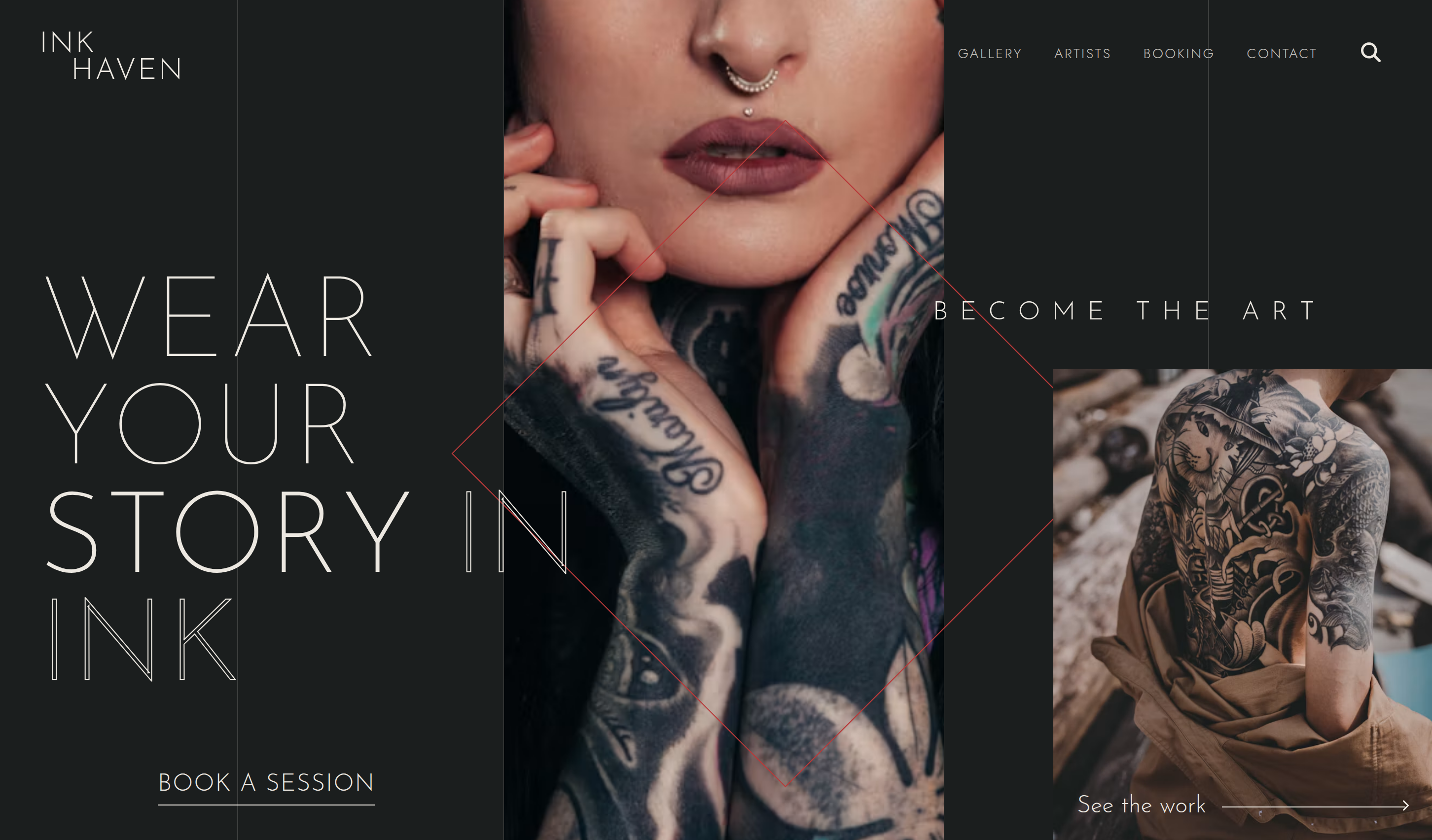
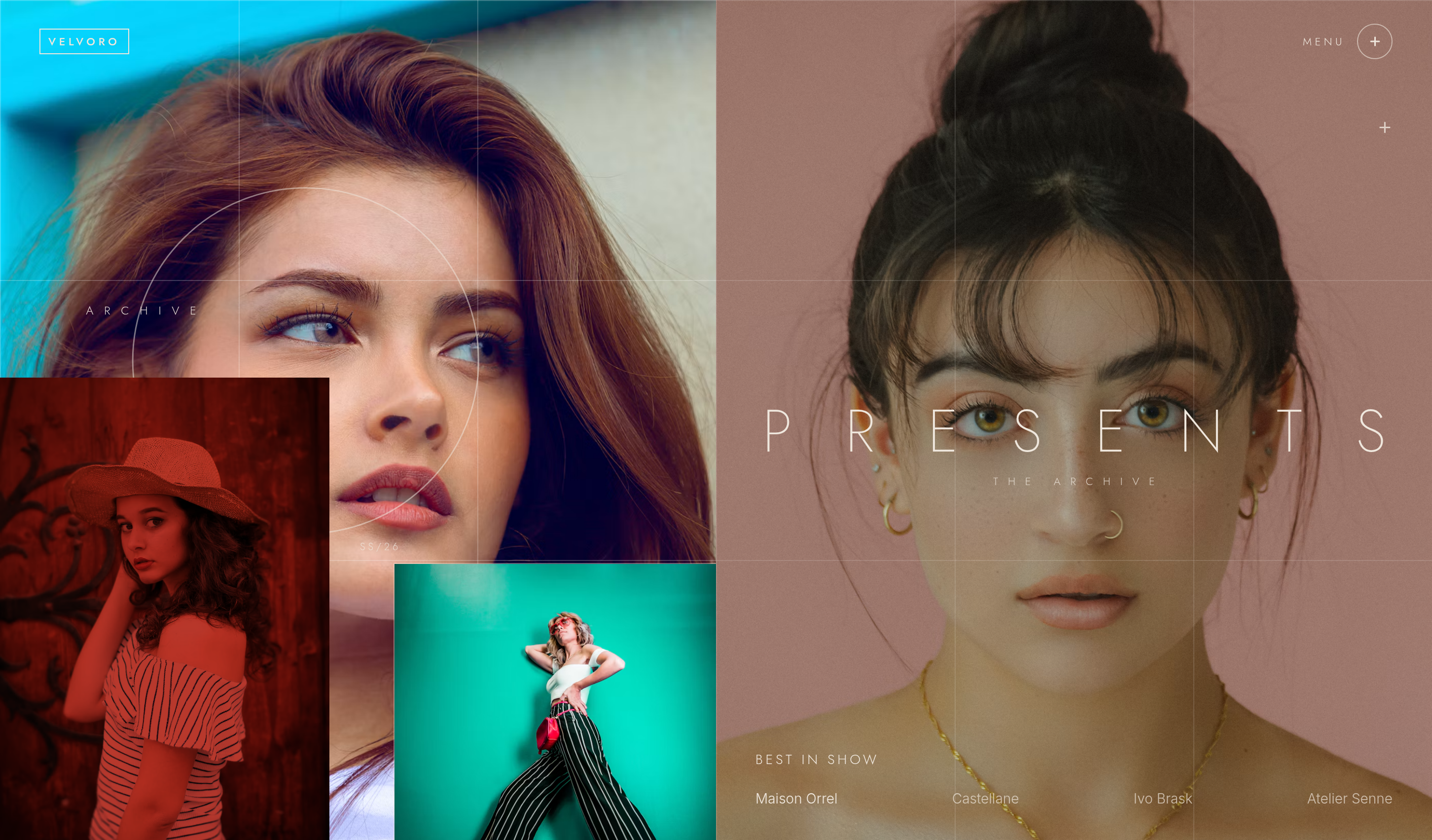
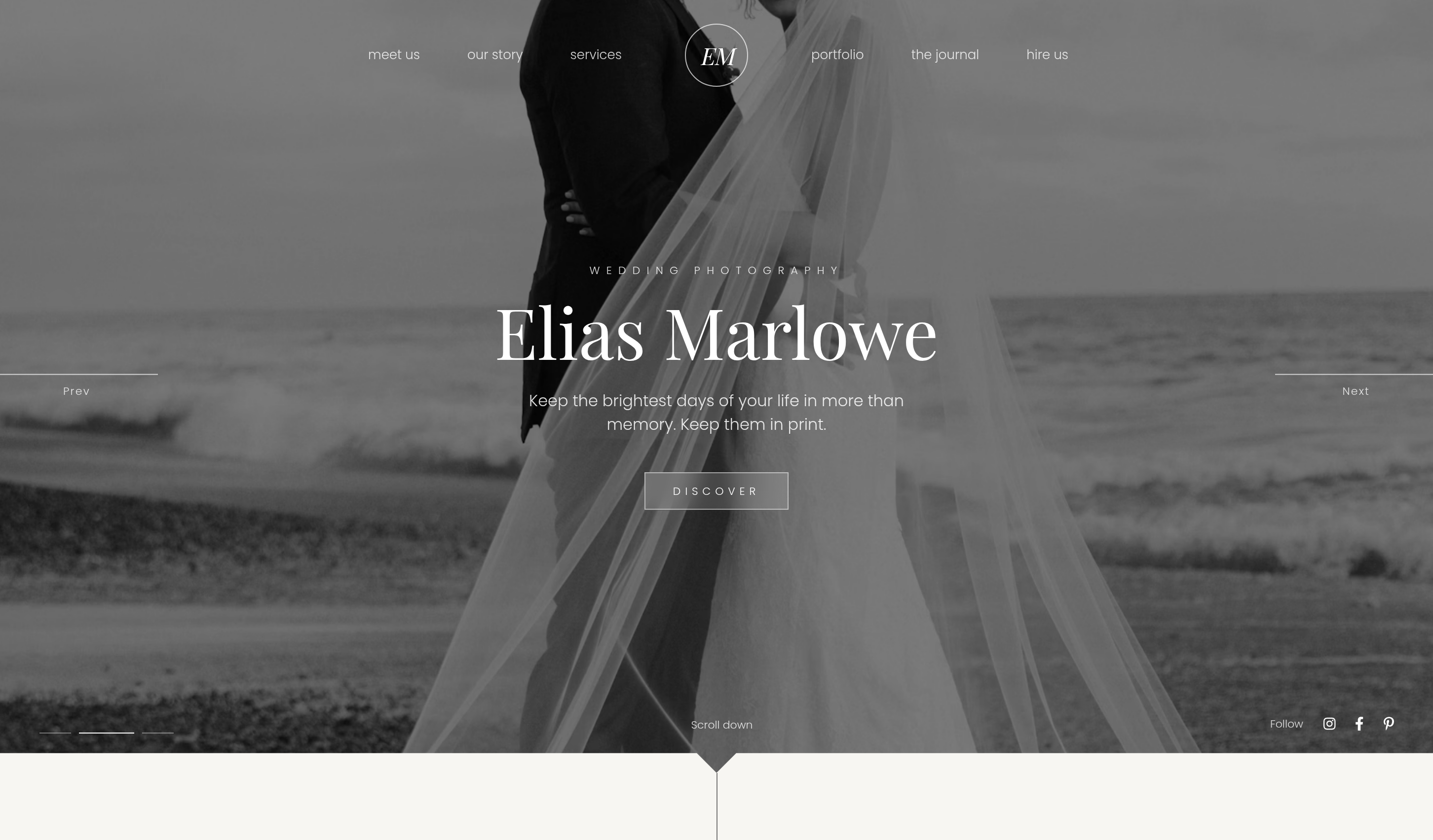
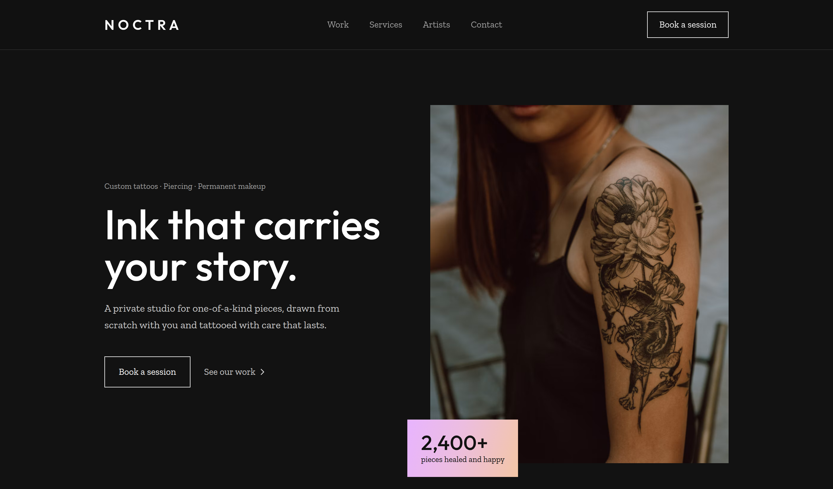
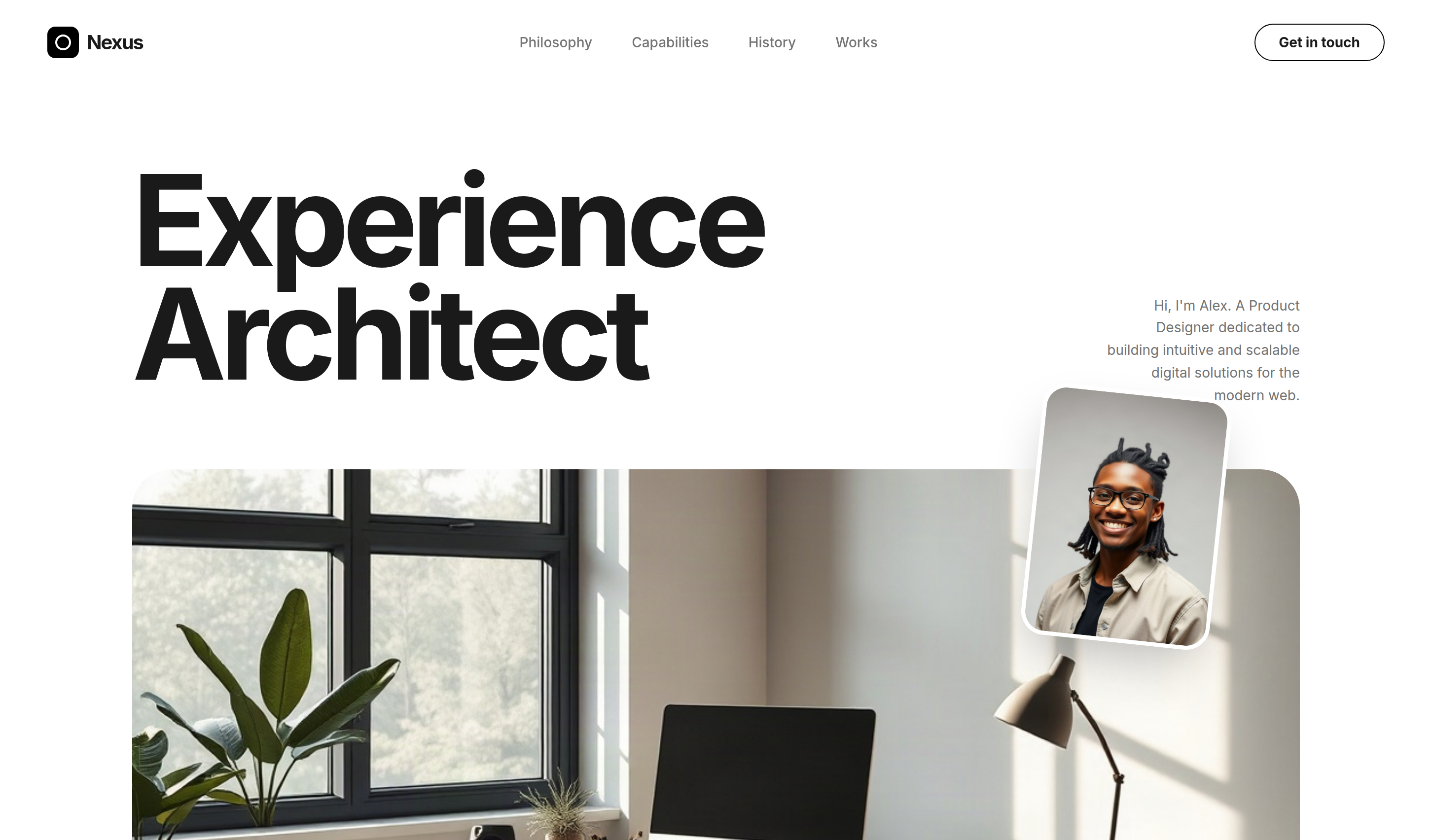
Nexus is a clean portfolio template for product designers, experience architects, and digital creatives showcasing services, work, and contact.
Download Codebase
Commercial License<!DOCTYPE html>
<html lang="en">
<head>
<script>
window.FontAwesomeConfig = {
autoReplaceSvg: 'nest'
};
</script>
<script src="https://cdnjs.cloudflare.com/ajax/libs/font-awesome/6.4.0/js/all.min.js" crossorigin="anonymous" referrerpolicy="no-referrer"></script>
<meta charset="UTF-8">
<meta name="viewport" content="width=device-width, initial-scale=1.0">
<title>Nexus | Tailwind CSS Product Designer Portfolio Template</title>
<meta name="description" content="Nexus is a clean Tailwind CSS portfolio template for product designers, experience architects, and digital creatives showcasing services, work, and contact.">
<meta name="keywords" content="Nexus, Tailwind CSS template, HTML website template, product designer portfolio, UX designer website, creative portfolio, responsive personal design">
<meta name="author" content="Let's templates">
<link rel="canonical" href="">
<meta property="og:type" content="product">
<meta property="og:site_name" content="Let's templates">
<meta property="og:locale" content="en_US">
<meta property="og:url" content="">
<meta property="og:title" content="Nexus | Tailwind CSS Product Designer Portfolio Template">
<meta property="og:description" content="A clean Tailwind CSS portfolio template for product designers, experience architects, and digital creatives showcasing services, work, and contact.">
<meta property="og:image" content="">
<meta property="og:image:alt" content="Nexus template preview">
<meta name="twitter:card" content="summary_large_image">
<meta name="twitter:url" content="">
<meta name="twitter:title" content="Nexus | Tailwind CSS Product Designer Portfolio Template">
<meta name="twitter:description" content="A clean Tailwind CSS portfolio template for product designers, experience architects, and digital creatives showcasing services, work, and contact.">
<meta name="twitter:image" content="">
<meta name="twitter:image:alt" content="Nexus template preview">
<script src="https://cdn.tailwindcss.com/3.4.17"></script>
<link rel="stylesheet" href="https://cdnjs.cloudflare.com/ajax/libs/font-awesome/6.0.0/css/all.min.css">
<link href="https://fonts.googleapis.com/css2?family=Inter:wght@300;400;500;600;700&display=swap" rel="stylesheet">
<style>
body {
font-family: 'Inter', sans-serif;
background-color: #ffffff;
color: #1a1a1a;
}
.text-huge {
font-size: clamp(3rem, 10vw, 8rem);
line-height: 0.9;
}
.logo-scroll {
display: flex;
overflow: hidden;
user-select: none;
gap: 2rem;
}
.logo-scroll-inner {
display: flex;
flex-shrink: 0;
gap: 2rem;
min-width: 100%;
animation: scroll 30s linear infinite;
}
@keyframes scroll {
from { transform: translateX(0); }
to { transform: translateX(-50%); }
}
</style>
</head>
<body class="antialiased">
<!-- block:start navbar -->
<header id="header" class="w-full px-6 py-6 md:px-12 flex items-center justify-between sticky top-0 bg-white/80 backdrop-blur-md z-50">
<div class="flex items-center space-x-2">
<div class="w-8 h-8 bg-black rounded-lg flex items-center justify-center">
<div class="w-4 h-4 border-2 border-white rounded-full"></div>
</div>
<span class="text-xl font-bold tracking-tighter">Nexus</span>
</div>
<nav class="hidden md:flex items-center space-x-10 text-sm font-medium text-neutral-500">
<a href="#about" class="hover:text-black transition-colors">Philosophy</a>
<a href="#services" class="hover:text-black transition-colors">Capabilities</a>
<a href="#experience" class="hover:text-black transition-colors">History</a>
<a href="#portfolio" class="hover:text-black transition-colors">Works</a>
</nav>
<a href="#contact" class="px-6 py-2 border border-black rounded-full text-sm font-bold hover:bg-black hover:text-white transition-all">
Get in touch
</a>
</header>
<!-- block:end navbar -->
<!-- block:start hero -->
<section id="hero" class="pt-20 pb-32 px-6 md:px-12 max-w-7xl mx-auto">
<div class="grid grid-cols-1 lg:grid-cols-12 gap-12 items-end">
<div class="lg:col-span-9">
<h1 class="text-huge font-bold tracking-tighter mb-8">
Experience<br>Architect
</h1>
</div>
<div class="lg:col-span-3 flex justify-end">
<div class="max-w-[200px] text-right text-sm text-neutral-500 leading-relaxed mb-4">
Hi, I'm Alex. A Product Designer dedicated to building intuitive and scalable digital solutions for the modern web.
</div>
</div>
</div>
<div class="relative mt-12">
<div class="w-full aspect-[21/9] rounded-[2.5rem] overflow-hidden bg-neutral-100">
<img class="w-full h-full object-cover" src="https://storage.googleapis.com/uxpilot-auth.appspot.com/gen_e8e56c7309_34d56674ac8e2699.png" alt="modern minimalist workspace with high-end tech, soft morning light, editorial photography" />
</div>
<div class="absolute -top-20 right-10 md:right-20 w-32 h-40 md:w-48 md:h-64 rounded-3xl overflow-hidden shadow-2xl border-4 border-white rotate-6">
<img class="w-full h-full object-cover" src="https://storage.googleapis.com/uxpilot-auth.appspot.com/gen_da2e1c47bb_8e573ebb1086276c.png" alt="portrait of a young creative professional smiling, studio lighting, neutral background" />
</div>
</div>
</section>
<!-- block:end hero -->
<!-- block:start clients -->
<section id="logos" class="py-12 border-y border-neutral-100">
<div class="logo-scroll">
<div class="logo-scroll-inner">
<div class="flex items-center space-x-12 px-6">
<span class="text-xl font-bold opacity-30 flex items-center"><i class="fa-brands fa-spotify mr-2"></i> Spotify</span>
<span class="text-xl font-bold opacity-30 flex items-center"><i class="fa-brands fa-slack mr-2"></i> Slack</span>
<span class="text-xl font-bold opacity-30 flex items-center"><i class="fa-brands fa-dropbox mr-2"></i> Dropbox</span>
<span class="text-xl font-bold opacity-30 flex items-center"><i class="fa-brands fa-figma mr-2"></i> Figma</span>
<span class="text-xl font-bold opacity-30 flex items-center"><i class="fa-brands fa-stripe mr-2"></i> Stripe</span>
<span class="text-xl font-bold opacity-30 flex items-center"><i class="fa-brands fa-airbnb mr-2"></i> Airbnb</span>
</div>
<div class="flex items-center space-x-12 px-6">
<span class="text-xl font-bold opacity-30 flex items-center"><i class="fa-brands fa-spotify mr-2"></i> Spotify</span>
<span class="text-xl font-bold opacity-30 flex items-center"><i class="fa-brands fa-slack mr-2"></i> Slack</span>
<span class="text-xl font-bold opacity-30 flex items-center"><i class="fa-brands fa-dropbox mr-2"></i> Dropbox</span>
<span class="text-xl font-bold opacity-30 flex items-center"><i class="fa-brands fa-figma mr-2"></i> Figma</span>
<span class="text-xl font-bold opacity-30 flex items-center"><i class="fa-brands fa-stripe mr-2"></i> Stripe</span>
<span class="text-xl font-bold opacity-30 flex items-center"><i class="fa-brands fa-airbnb mr-2"></i> Airbnb</span>
</div>
</div>
</div>
</section>
<!-- block:end clients -->
<!-- block:start about -->
<section id="about" class="py-32 px-6 md:px-12 max-w-7xl mx-auto">
<div class="flex flex-col md:flex-row justify-between items-start mb-16 space-y-6 md:space-y-0">
<div class="max-w-2xl">
<span class="inline-block px-4 py-1 bg-neutral-100 rounded-full text-[10px] uppercase font-bold tracking-widest mb-6">About the Craft</span>
<h2 class="text-4xl md:text-5xl font-bold tracking-tighter leading-tight">
Design is not just what it looks like; it's how it works and feels.
</h2>
</div>
<div class="max-w-xs text-sm text-neutral-500 leading-relaxed pt-12">
For me, every pixel serves a purpose. I believe in a philosophy where beauty is a byproduct of pure functionality.
</div>
</div>
<div class="grid grid-cols-1 lg:grid-cols-12 gap-12 items-center">
<div class="lg:col-span-7 relative group">
<div class="aspect-video rounded-[2.5rem] overflow-hidden bg-neutral-900">
<img class="w-full h-full object-cover opacity-60" src="https://storage.googleapis.com/uxpilot-auth.appspot.com/gen_8ee4fcc80f_151d3449d631f8e9.png" alt="abstract cinematic video frame of a creative process, hands sketching on a tablet" />
</div>
<div class="absolute inset-0 flex items-center justify-center">
<button class="w-20 h-20 bg-white rounded-full flex items-center justify-center text-black shadow-2xl hover:scale-110 transition-transform">
<i class="fa-solid fa-play ml-1"></i>
</button>
</div>
</div>
<div class="lg:col-span-5 space-y-12 lg:pl-12">
<div>
<div class="text-6xl font-bold tracking-tighter text-black">+450</div>
<p class="text-sm text-neutral-500 mt-2">Projects delivered with meticulous attention to detail and user satisfaction.</p>
</div>
<div>
<div class="text-6xl font-bold tracking-tighter text-black">+12</div>
<p class="text-sm text-neutral-500 mt-2">Years of experience navigating the evolving landscape of digital product design.</p>
</div>
</div>
</div>
</section>
<!-- block:end about -->
<!-- block:start features -->
<section id="services" class="py-32 bg-neutral-50 px-6 md:px-12">
<div class="max-w-7xl mx-auto">
<div class="grid grid-cols-1 lg:grid-cols-12 gap-12 mb-20">
<div class="lg:col-span-5">
<span class="inline-block px-4 py-1 bg-white rounded-full text-[10px] uppercase font-bold tracking-widest mb-6">Expertise</span>
<h2 class="text-4xl md:text-5xl font-bold tracking-tighter leading-tight mb-8">
Comprehensive solutions for digital ecosystems.
</h2>
<p class="text-neutral-500 max-w-sm mb-10">From initial strategy to final interaction, I help brands bridge the gap between vision and reality.</p>
<a href="#contact" class="inline-flex items-center px-8 py-4 bg-black text-white rounded-full text-sm font-bold hover:bg-neutral-800 transition-all">
Work with me
</a>
</div>
<div class="lg:col-span-7 grid grid-cols-1 md:grid-cols-2 gap-6">
<!-- Service 1 -->
<div class="bg-white p-10 rounded-[2rem] shadow-sm hover:shadow-xl transition-shadow border border-neutral-100 flex flex-col justify-between">
<div>
<h3 class="text-xl font-bold mb-4">Product Strategy</h3>
<p class="text-sm text-neutral-500 leading-relaxed">Defining clear roadmaps and value propositions for complex digital products.</p>
</div>
<div class="mt-8 flex justify-end">
<div class="w-10 h-10 rounded-full border border-neutral-100 flex items-center justify-center">
<i class="fa-solid fa-arrow-right text-xs"></i>
</div>
</div>
</div>
<!-- Service 2 -->
<div class="bg-white p-10 rounded-[2rem] shadow-sm hover:shadow-xl transition-shadow border border-neutral-100 flex flex-col justify-between">
<div>
<h3 class="text-xl font-bold mb-4">UX Architecture</h3>
<p class="text-sm text-neutral-500 leading-relaxed">Designing intuitive user flows and information structures that feel natural.</p>
</div>
<div class="mt-8 flex justify-end">
<div class="w-10 h-10 rounded-full border border-neutral-100 flex items-center justify-center">
<i class="fa-solid fa-arrow-right text-xs"></i>
</div>
</div>
</div>
<!-- Service 3 (Featured) -->
<div class="bg-black text-white p-10 rounded-[2rem] shadow-xl md:col-span-2 relative overflow-hidden group">
<div class="relative z-10 flex flex-col md:flex-row md:items-center justify-between h-full">
<div class="max-w-md">
<h3 class="text-2xl font-bold mb-4">Design Systems</h3>
<p class="text-sm text-neutral-300 leading-relaxed">Building scalable, consistent component libraries that empower development teams and ensure brand coherence.</p>
</div>
<div class="mt-8 md:mt-0 flex items-center space-x-4">
<i class="fa-solid fa-mouse-pointer text-white/20 text-4xl"></i>
<div class="w-12 h-12 rounded-full bg-white text-black flex items-center justify-center">
<i class="fa-solid fa-arrow-up-right-from-square text-sm"></i>
</div>
</div>
</div>
<div class="absolute -bottom-10 -right-10 opacity-10 group-hover:scale-110 transition-transform">
<i class="fa-solid fa-cubes text-[15rem]"></i>
</div>
</div>
</div>
</div>
</div>
</section>
<!-- block:end features -->
<!-- block:start about-2 -->
<section id="experience" class="py-32 px-6 md:px-12 max-w-7xl mx-auto">
<div class="grid grid-cols-1 lg:grid-cols-12 gap-12 items-start">
<div class="lg:col-span-5">
<span class="inline-block px-4 py-1 bg-neutral-100 rounded-full text-[10px] uppercase font-bold tracking-widest mb-6">Career Timeline</span>
<h2 class="text-4xl md:text-5xl font-bold tracking-tighter leading-tight mb-8">
Growth through collaboration.
</h2>
<p class="text-neutral-500">A journey of continuous learning and delivering value across diverse industries.</p>
</div>
<div class="lg:col-span-7 space-y-4">
<!-- Role 1 -->
<div class="group p-8 border-b border-neutral-100 hover:bg-neutral-50 transition-colors rounded-2xl flex flex-col md:flex-row justify-between items-start md:items-center">
<div>
<h3 class="text-xl font-bold">Principal Designer at Vertex Digital</h3>
<p class="text-sm text-neutral-500 mt-1">Leading the design language and cross-platform UX strategy for fintech giants.</p>
</div>
<div class="mt-4 md:mt-0 text-xl font-bold tracking-tighter text-neutral-400 group-hover:text-black">2021 — Present</div>
</div>
<!-- Role 2 -->
<div class="group p-8 border-b border-neutral-100 hover:bg-neutral-50 transition-colors rounded-2xl flex flex-col md:flex-row justify-between items-start md:items-center">
<div>
<h3 class="text-xl font-bold">Senior UI/UX at Nova Studio</h3>
<p class="text-sm text-neutral-500 mt-1">Crafting bespoke web experiences and mobile applications for global brands.</p>
</div>
<div class="mt-4 md:mt-0 text-xl font-bold tracking-tighter text-neutral-400 group-hover:text-black">2018 — 2021</div>
</div>
<!-- Role 3 -->
<div class="group p-8 border-b border-neutral-100 hover:bg-neutral-50 transition-colors rounded-2xl flex flex-col md:flex-row justify-between items-start md:items-center">
<div>
<h3 class="text-xl font-bold">Product Researcher at Kinetix</h3>
<p class="text-sm text-neutral-500 mt-1">Conducting deep user research and translating insights into actionable prototypes.</p>
</div>
<div class="mt-4 md:mt-0 text-xl font-bold tracking-tighter text-neutral-400 group-hover:text-black">2016 — 2018</div>
</div>
</div>
</div>
</section>
<!-- block:end about-2 -->
<!-- block:start gallery -->
<section id="portfolio" class="py-32 bg-neutral-50 px-6 md:px-12">
<div class="max-w-7xl mx-auto">
<div class="flex flex-col md:flex-row justify-between items-end mb-16 space-y-6 md:space-y-0">
<div>
<span class="inline-block px-4 py-1 bg-white rounded-full text-[10px] uppercase font-bold tracking-widest mb-6">Recent Works</span>
<h2 class="text-4xl md:text-5xl font-bold tracking-tighter">Crafting digital impact.</h2>
</div>
<div class="text-neutral-500 text-sm max-w-[200px] text-right">Exploring the intersection of aesthetics and code.</div>
</div>
<div class="grid grid-cols-1 md:grid-cols-2 lg:grid-cols-3 gap-8">
<!-- Project 1 -->
<div class="group cursor-pointer">
<div class="aspect-[4/5] rounded-[2.5rem] overflow-hidden bg-white mb-6 relative">
<img class="w-full h-full object-cover group-hover:scale-110 transition-transform duration-700" src="https://storage.googleapis.com/uxpilot-auth.appspot.com/gen_e7d2c9b7c7_d91d6ef733ad74d9.png" alt="mobile app interface on a modern smartphone, dark mode, high contrast, minimalist" />
<div class="absolute inset-0 bg-black/40 opacity-0 group-hover:opacity-100 transition-opacity flex items-center justify-center">
<div class="w-16 h-16 bg-white rounded-full flex items-center justify-center text-black">
<i class="fa-solid fa-arrow-up-right-from-square"></i>
</div>
</div>
</div>
<h3 class="text-xl font-bold mb-2">FinPulse Dashboard</h3>
<p class="text-xs uppercase tracking-widest text-neutral-400 font-bold">Fintech . SaaS</p>
</div>
<!-- Project 2 -->
<div class="group cursor-pointer">
<div class="aspect-[4/5] rounded-[2.5rem] overflow-hidden bg-white mb-6 relative">
<img class="w-full h-full object-cover group-hover:scale-110 transition-transform duration-700" src="https://storage.googleapis.com/uxpilot-auth.appspot.com/gen_f549c0cffe_c1992223e0c08003.png" alt="web dashboard interface with complex charts and data visualization, clean white theme" />
<div class="absolute inset-0 bg-black/40 opacity-0 group-hover:opacity-100 transition-opacity flex items-center justify-center">
<div class="w-16 h-16 bg-white rounded-full flex items-center justify-center text-black">
<i class="fa-solid fa-arrow-up-right-from-square"></i>
</div>
</div>
</div>
<h3 class="text-xl font-bold mb-2">Nexus Design System</h3>
<p class="text-xs uppercase tracking-widest text-neutral-400 font-bold">Tooling . Open Source</p>
</div>
<!-- Project 3 -->
<div class="group cursor-pointer">
<div class="aspect-[4/5] rounded-[2.5rem] overflow-hidden bg-white mb-6 relative">
<img class="w-full h-full object-cover group-hover:scale-110 transition-transform duration-700" src="https://storage.googleapis.com/uxpilot-auth.appspot.com/gen_4f86fa3e02_85dc48a5a30327c1.png" alt="e-commerce website preview on a laptop, high-fashion aesthetic, minimal layout" />
<div class="absolute inset-0 bg-black/40 opacity-0 group-hover:opacity-100 transition-opacity flex items-center justify-center">
<div class="w-16 h-16 bg-white rounded-full flex items-center justify-center text-black">
<i class="fa-solid fa-arrow-up-right-from-square"></i>
</div>
</div>
</div>
<h3 class="text-xl font-bold mb-2">Aura E-Commerce</h3>
<p class="text-xs uppercase tracking-widest text-neutral-400 font-bold">Fashion . Retail</p>
</div>
<!-- Project 4 -->
<div class="group cursor-pointer">
<div class="aspect-[4/5] rounded-[2.5rem] overflow-hidden bg-white mb-6 relative">
<img class="w-full h-full object-cover group-hover:scale-110 transition-transform duration-700" src="https://storage.googleapis.com/uxpilot-auth.appspot.com/gen_534b4f0030_c58c986909537437.png" alt="tablet interface showing a lifestyle magazine layout, editorial design" />
<div class="absolute inset-0 bg-black/40 opacity-0 group-hover:opacity-100 transition-opacity flex items-center justify-center">
<div class="w-16 h-16 bg-white rounded-full flex items-center justify-center text-black">
<i class="fa-solid fa-arrow-up-right-from-square"></i>
</div>
</div>
</div>
<h3 class="text-xl font-bold mb-2">Verse Magazine</h3>
<p class="text-xs uppercase tracking-widest text-neutral-400 font-bold">Editorial . Web3</p>
</div>
<!-- Project 5 (Featured) -->
<div class="group cursor-pointer md:col-span-2">
<div class="aspect-video md:aspect-[21/9] rounded-[2.5rem] overflow-hidden bg-neutral-900 mb-6 relative">
<img class="w-full h-full object-cover group-hover:scale-110 transition-transform duration-1000" src="https://storage.googleapis.com/uxpilot-auth.appspot.com/gen_6b4b8e917f_5668ea169ec905f7.png" alt="abstract colorful data visualization glowing in the dark, futuristic interface" />
<div class="absolute bottom-10 left-10 text-white z-10">
<h3 class="text-3xl font-bold mb-2">Quantum Analytics</h3>
<p class="text-xs uppercase tracking-widest text-white/60 font-bold">AI . Enterprise</p>
</div>
<div class="absolute inset-0 bg-gradient-to-t from-black/80 to-transparent"></div>
</div>
</div>
</div>
</div>
</section>
<!-- block:end gallery -->
<!-- block:start reviews -->
<section id="testimonial" class="py-32 px-6 md:px-12 max-w-5xl mx-auto text-center relative">
<div class="absolute top-10 left-1/2 -translate-x-1/2 opacity-5 pointer-events-none">
<i class="fa-solid fa-quote-left text-[20rem]"></i>
</div>
<div class="relative z-10">
<p class="text-2xl md:text-4xl font-medium tracking-tight leading-relaxed mb-12 italic text-neutral-800">
"Alex doesn't just design interfaces; they design experiences that resonate. The attention to detail and the ability to simplify complex problems is truly rare."
</p>
<div class="flex flex-col items-center">
<img src="https://storage.googleapis.com/uxpilot-auth.appspot.com/avatars/avatar-4.jpg" alt="Avatar" class="w-20 h-20 rounded-full border-4 border-white shadow-xl mb-4">
<div class="font-bold text-lg">Marcus Thorne</div>
<div class="text-sm text-neutral-400 uppercase tracking-widest font-bold">CTO, Vertex Digital</div>
</div>
</div>
</section>
<!-- block:end reviews -->
<!-- block:start cta -->
<section id="contact" class="py-20 px-6 md:px-12 bg-neutral-900 text-white overflow-hidden">
<div class="max-w-7xl mx-auto flex flex-col md:flex-row items-center justify-between space-y-12 md:space-y-0">
<h2 class="text-6xl md:text-8xl font-bold tracking-tighter leading-none">
Let's Build<br>The Future.
</h2>
<div class="relative">
<a href="mailto:hello@nexus.design" class="w-48 h-48 rounded-full bg-white text-black flex flex-col items-center justify-center group hover:scale-110 transition-transform duration-500 cursor-pointer">
<span class="text-xs uppercase font-bold tracking-widest mb-2">Hire Me</span>
<i class="fa-solid fa-arrow-up-right-from-square text-xl"></i>
</a>
<div class="absolute -top-4 -right-4 w-12 h-12 bg-neutral-700 rounded-full flex items-center justify-center animate-bounce">
<i class="fa-solid fa-envelope text-white"></i>
</div>
</div>
</div>
</section>
<!-- block:end cta -->
<!-- block:start footer -->
<footer id="footer" class="py-20 px-6 md:px-12 bg-neutral-900 text-neutral-500 border-t border-neutral-800">
<div class="max-w-7xl mx-auto">
<div class="grid grid-cols-1 md:grid-cols-4 gap-12 mb-20">
<div class="col-span-1 md:col-span-1">
<div class="flex items-center space-x-2 text-white mb-6">
<div class="w-8 h-8 bg-white rounded-lg flex items-center justify-center">
<div class="w-4 h-4 border-2 border-black rounded-full"></div>
</div>
<span class="text-xl font-bold tracking-tighter">Nexus</span>
</div>
<p class="text-sm leading-relaxed max-w-xs">
Pushing the boundaries of digital design. Creating experiences that are as functional as they are beautiful.
</p>
<div class="flex space-x-4 mt-8">
<a href="#" class="w-8 h-8 rounded-full border border-neutral-800 flex items-center justify-center hover:text-white transition-colors"><i class="fa-brands fa-x-twitter"></i></a>
<a href="#" class="w-8 h-8 rounded-full border border-neutral-800 flex items-center justify-center hover:text-white transition-colors"><i class="fa-brands fa-linkedin-in"></i></a>
<a href="#" class="w-8 h-8 rounded-full border border-neutral-800 flex items-center justify-center hover:text-white transition-colors"><i class="fa-brands fa-dribbble"></i></a>
</div>
</div>
<div class="md:col-span-1">
<h4 class="text-white font-bold mb-6 uppercase tracking-widest text-xs">Navigation</h4>
<ul class="space-y-4 text-sm">
<li><a href="#" class="hover:text-white transition-colors">Philosophy</a></li>
<li><a href="#" class="hover:text-white transition-colors">Capabilities</a></li>
<li><a href="#" class="hover:text-white transition-colors">Works</a></li>
<li><a href="#" class="hover:text-white transition-colors">Contact</a></li>
</ul>
</div>
<div class="md:col-span-1">
<h4 class="text-white font-bold mb-6 uppercase tracking-widest text-xs">Reach Out</h4>
<ul class="space-y-4 text-sm">
<li>hello@nexus.design</li>
<li>+1 (555) 0123-4567</li>
<li>San Francisco, CA</li>
</ul>
</div>
<div class="md:col-span-1">
<h4 class="text-white font-bold mb-6 uppercase tracking-widest text-xs">Newsletter</h4>
<p class="text-sm mb-6">Occasional insights on design and tech.</p>
<form class="flex">
<input type="email" placeholder="Email" class="bg-neutral-800 border-none rounded-l-full px-6 py-3 w-full text-sm focus:ring-0">
<button class="bg-white text-black px-6 py-3 rounded-r-full hover:bg-neutral-200 transition-colors">
<i class="fa-solid fa-paper-plane"></i>
</button>
</form>
</div>
</div>
<div class="pt-12 border-t border-neutral-800 flex flex-col md:flex-row justify-between items-center text-[10px] uppercase font-bold tracking-widest">
<div>© 2024 Nexus Design Studio. All rights reserved.</div>
<div class="flex space-x-8 mt-4 md:mt-0">
<a href="#" class="hover:text-white">Privacy Policy</a>
<a href="#" class="hover:text-white">Terms of Service</a>
</div>
</div>
</div>
</footer>
<!-- block:end footer -->
</body>
</html>
Unlimited access to all templates
Unlock our entire library of premium UI kits, dashboards, and landing pages. Renews automatically, cancel anytime.
$20
/ 3 months
or $60 / year
Get Unlimited Access