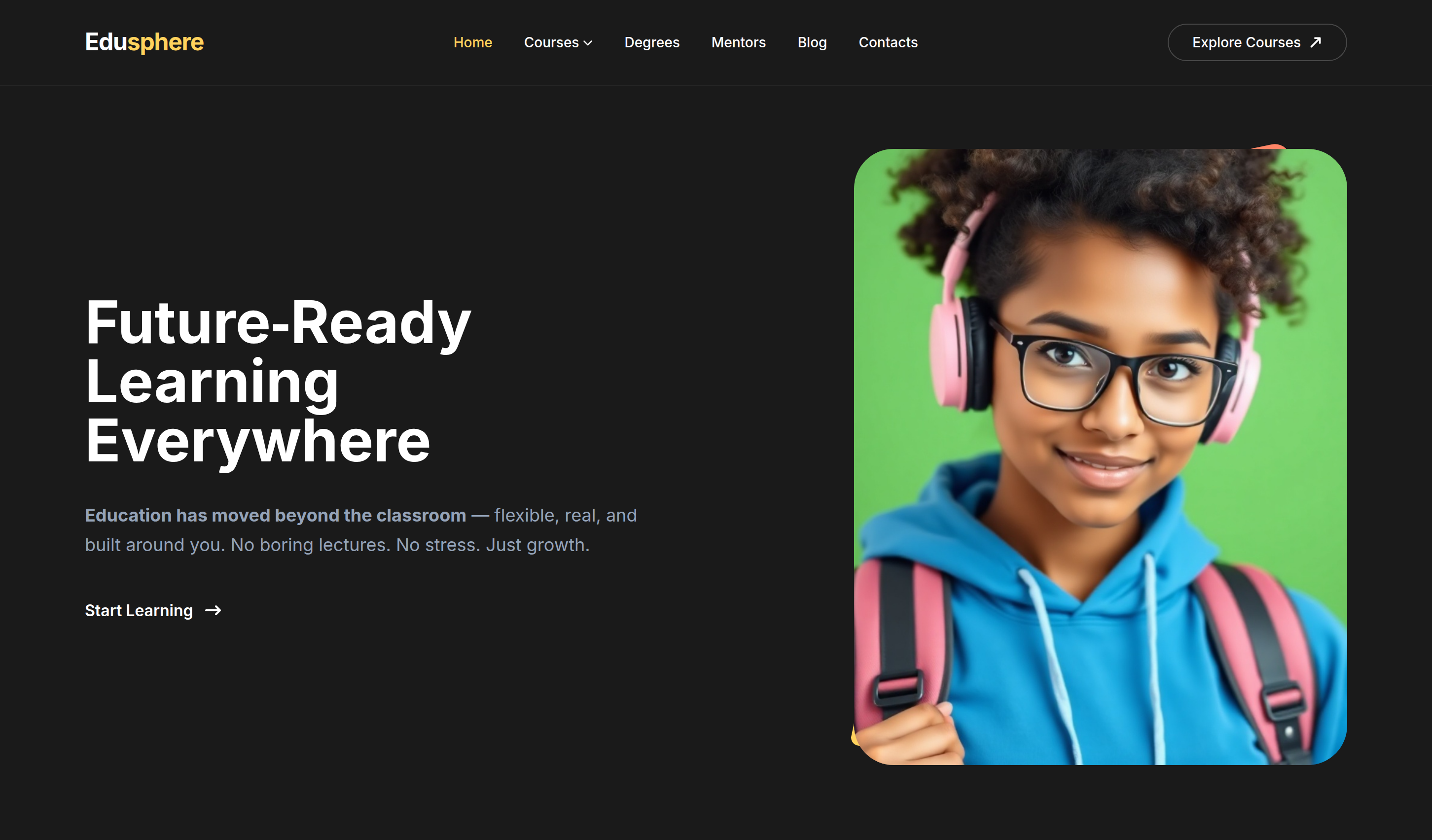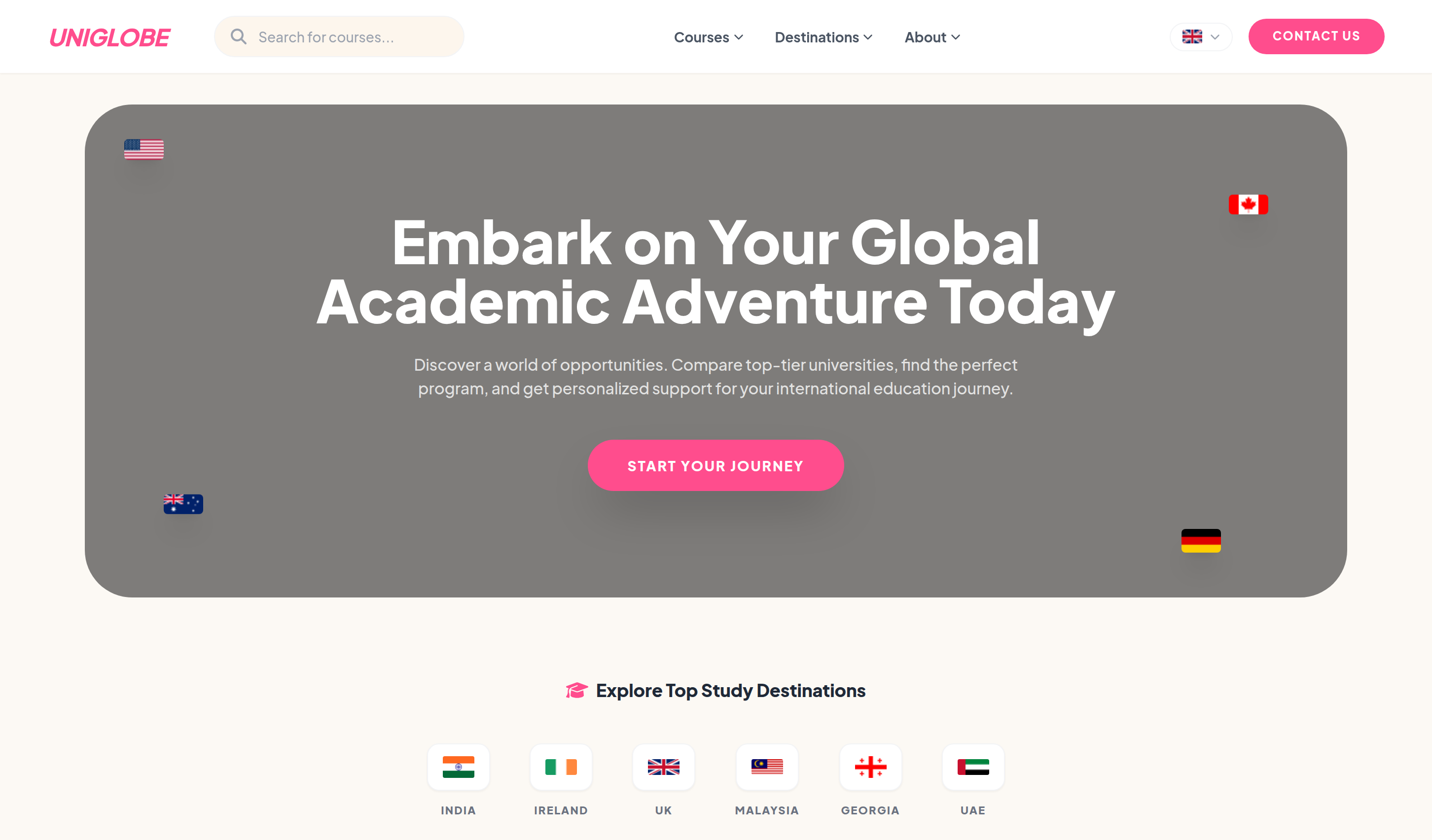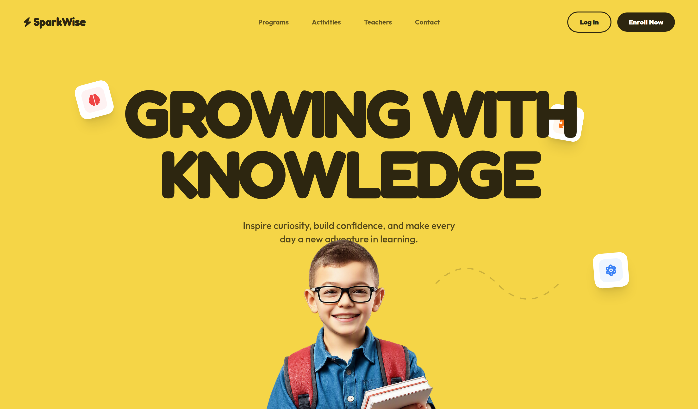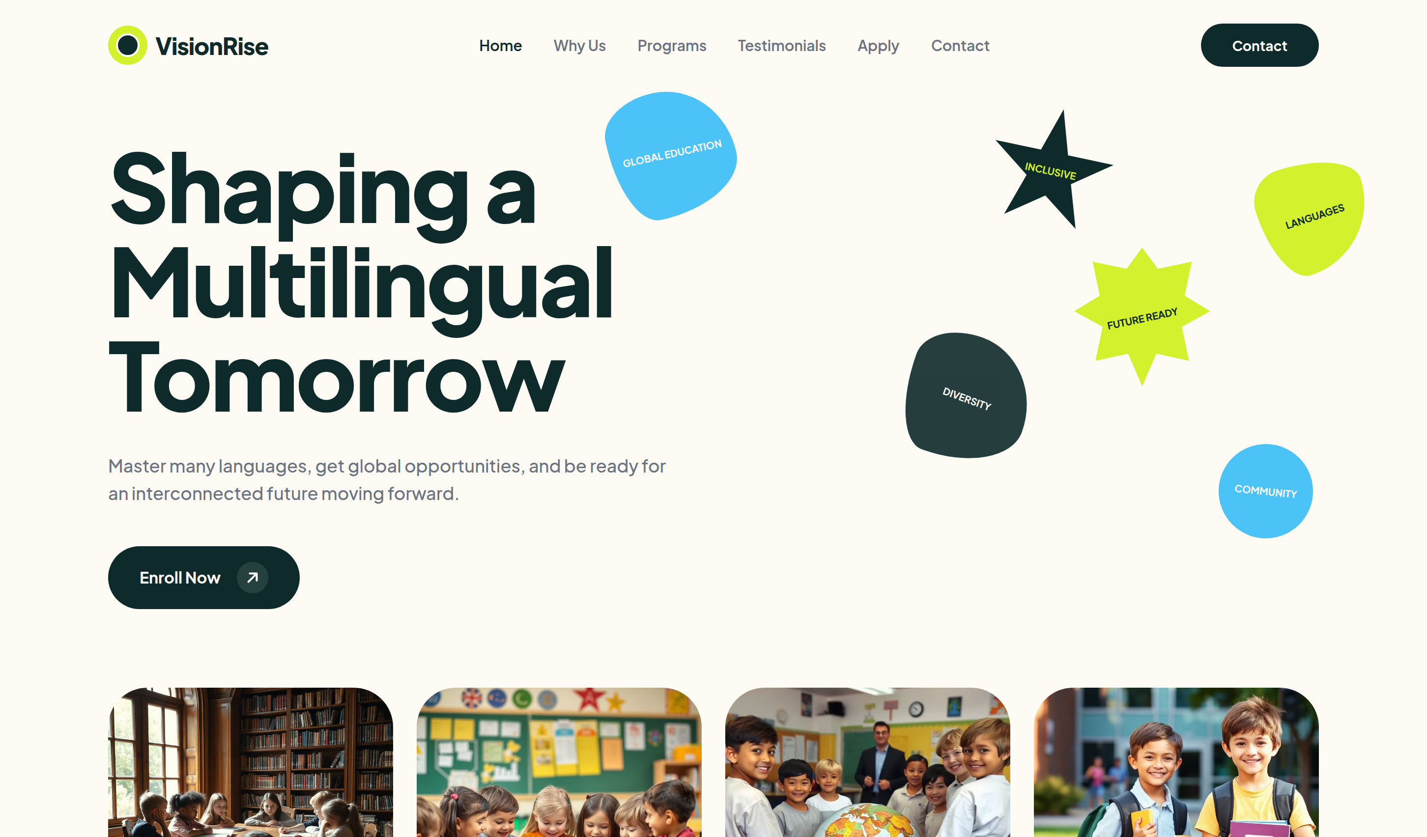
VisionRise UI Template - Let's templates
VisionRise preview 1
Premium
0 124

VisionRise

VisionRise is a welcoming multilingual school template for language programs, primary education, daycare, admissions, and campus information.

Live Demo
visionrise-tailwind.html
<html lang="en">

  <head>
    <script>
      window.FontAwesomeConfig = {
        autoReplaceSvg: 'nest'
      };
    </script>
    <script
      src="https://cdnjs.cloudflare.com/ajax/libs/font-awesome/6.4.0/js/all.min.js"
      crossorigin="anonymous" referrerpolicy="no-referrer"></script>
    <meta charset="UTF-8">
    <meta name="viewport" content="width=device-width, initial-scale=1.0">
    <title>VisionRise | Tailwind CSS Multilingual School Template</title>
    <meta name="description"
      content="VisionRise is a welcoming Tailwind CSS multilingual school template for language programs, primary education, daycare, admissions, and campus information.">
    <meta name="keywords"
      content="VisionRise, Tailwind CSS template, HTML website template, multilingual school template, education landing page, primary school, responsive daycare website">
    <meta name="author" content="Let's templates">
    <link rel="canonical" href="">

    <meta property="og:type" content="product">
    <meta property="og:site_name" content="Let's templates">
    <meta property="og:locale" content="en_US">
    <meta property="og:url" content="">
    <meta property="og:title" content="VisionRise | Tailwind CSS Multilingual School Template">
    <meta property="og:description" content="A welcoming Tailwind CSS multilingual school template for language programs, primary education, daycare, admissions, and campus information.">
    <meta property="og:image" content="">
    <meta property="og:image:alt" content="VisionRise template preview">

    <meta name="twitter:card" content="summary_large_image">
    <meta name="twitter:url" content="">
    <meta name="twitter:title" content="VisionRise | Tailwind CSS Multilingual School Template">
    <meta name="twitter:description" content="A welcoming Tailwind CSS multilingual school template for language programs, primary education, daycare, admissions, and campus information.">
    <meta name="twitter:image" content="">
    <meta name="twitter:image:alt" content="VisionRise template preview">
<!-- Scripts & Styles -->
    <script src="https://cdn.tailwindcss.com"></script>
    <link rel="stylesheet"
      href="https://cdnjs.cloudflare.com/ajax/libs/font-awesome/6.5.0/css/all.min.css">

    <!-- Fonts -->
    <link rel="preconnect" href="https://fonts.googleapis.com">
    <link rel="preconnect" href="https://fonts.gstatic.com" crossorigin="">
    <link
      href="https://fonts.googleapis.com/css2?family=Plus+Jakarta+Sans:wght@300;400;500;600;700;800&amp;display=swap"
      rel="stylesheet">

    <script>
      tailwind.config = {
        theme:
        {
          extend:
          {
            colors:
            {
              primary: '#0e2a2a', // Dark teal/navy
              secondary: '#d4f12d', // Lime green
              accent: '#38bdf8', // Sky blue
              bgSoft: '#fdfbf4' // Cream background
            },
            fontFamily:
            {
              sans: ['Plus Jakarta Sans', 'sans-serif'],
            }
          }
        }
      }
    </script>

    <style>
      html,
      body
      {
        max-width: 100%;
        overflow-x: hidden;
      }

      body
      {
        background-color: #fdfbf4;
      }

      .blob-mask
      {
        border-radius: 45% 55% 70% 30% / 30% 60% 40% 70%;
      }

      .blob-mask-alt
      {
        border-radius: 30% 70% 70% 30% / 30% 30% 70% 70%;
      }

      .star-shape
      {
        clip-path: polygon(50% 0%, 61% 35%, 98% 35%, 68% 57%, 79% 91%, 50% 70%, 21% 91%, 32% 57%, 2% 35%, 39% 35%);
      }

      @media (min-width: 1024px)
      {
        #vr-mobile-nav
        {
          display: none !important;
        }
      }
    </style>
    <style data-grapesjs-styles="true">
      #iduei
      {
        clip-path: polygon(50% 0%, 61% 15%, 85% 10%, 80% 34%, 98% 45%, 78% 56%, 83% 80%, 60% 75%, 50% 98%, 40% 75%, 17% 80%, 22% 56%, 2% 45%, 20% 34%, 15% 10%, 39% 15%);
      }
    </style>
  </head>

  <body class="text-primary font-sans">
    <!-- block:start navbar -->
    <header id="header" class="max-w-7xl mx-auto px-4 sm:px-6 py-5 sm:py-6">
      <div class="flex items-center justify-between gap-3 min-w-0">
        <div class="flex items-center gap-2 min-w-0">
          <div
            class="w-9 h-9 sm:w-10 sm:h-10 shrink-0 bg-secondary rounded-full flex items-center justify-center">
            <div class="w-5 h-5 sm:w-6 sm:h-6 bg-primary rounded-full border-2 border-white">
            </div>
          </div>
          <span class="text-xl sm:text-2xl font-extrabold tracking-tight truncate">VisionRise</span>
        </div>
        <nav
          class="hidden lg:flex items-center gap-8 text-[15px] font-semibold text-gray-500">
          <a href="#" class="text-primary hover:text-accent transition">Home</a>
          <a href="#" class="hover:text-accent transition">Why Us</a>
          <a href="#" class="hover:text-accent transition">Programs</a>
          <a href="#" class="hover:text-accent transition">Testimonials</a>
          <a href="#" class="hover:text-accent transition">Apply</a>
          <a href="#" class="hover:text-accent transition">Contact</a>
        </nav>
        <div class="flex items-center gap-2 shrink-0">
          <button
            class="hidden sm:inline-flex bg-primary text-white px-5 sm:px-8 py-2.5 sm:py-3 rounded-full text-xs sm:text-sm font-bold hover:bg-opacity-90 transition">
            Contact
          </button>
          <button type="button" id="vr-menu-btn"
            class="lg:hidden w-10 h-10 rounded-full border border-primary/15 flex items-center justify-center text-primary"
            aria-expanded="false" aria-controls="vr-mobile-nav" aria-label="Open menu">
            <i class="fa-solid fa-bars"></i>
          </button>
        </div>
      </div>
      <nav id="vr-mobile-nav"
        class="hidden mt-4 flex-col gap-3 rounded-[1.75rem] bg-white/80 border border-gray-100 px-5 py-4 text-sm font-semibold text-gray-600">
        <a href="#" class="text-primary">Home</a>
        <a href="#">Why Us</a>
        <a href="#">Programs</a>
        <a href="#">Testimonials</a>
        <a href="#">Apply</a>
        <a href="#">Contact</a>
      </nav>
      <script>
        (function () {
          var btn = document.getElementById('vr-menu-btn');
          var nav = document.getElementById('vr-mobile-nav');
          if (!btn || !nav) return;
          btn.addEventListener('click', function () {
            var open = nav.classList.contains('hidden');
            nav.classList.toggle('hidden', !open);
            nav.classList.toggle('flex', open);
            btn.setAttribute('aria-expanded', open ? 'true' : 'false');
            btn.setAttribute('aria-label', open ? 'Close menu' : 'Open menu');
          });
        })();
      </script>
    </header><!-- block:end navbar -->
    <!-- block:start hero -->
    <section id="hero" class="relative pt-12 pb-24 overflow-hidden">
      <!-- Floating shapes -->
      <div id="ikn2g"
        class="hidden lg:flex absolute w-32 h-32 bg-accent opacity-90 blob-mask items-center justify-center -rotate-12 top-0 left-[620px]">
        <span
          class="text-[10px] text-white font-bold text-center leading-none px-2 uppercase">Global
          Education</span></div>
      <div id="iduei"
        class="hidden lg:flex absolute top-40 right-[15%] w-36 h-36 bg-secondary items-center justify-center">
        <span
          class="text-[10px] text-primary font-bold text-center leading-none px-2 uppercase -rotate-12">Future
          Ready</span></div>
      <div class="max-w-7xl mx-auto px-4 sm:px-6">
        <div class="max-w-3xl min-w-0">
          <div id="ikn2g-2"
            class="hidden lg:flex absolute w-32 h-32 bg-primary opacity-90 blob-mask items-center justify-center rotate-[20deg] left-[920px] top-[250px]">
            <span
              class="text-[10px] text-white font-bold text-center leading-none px-2 uppercase">Diversity</span>
          </div>
          <div
            class="hidden lg:flex absolute w-28 h-28 bg-secondary blob-mask-alt items-center justify-center -rotate-[18deg] right-[4%] top-[72px]">
            <span
              class="text-[10px] text-primary font-bold text-center leading-none px-2 uppercase">Languages</span>
          </div>
          <div
            class="hidden lg:flex absolute w-24 h-24 bg-accent opacity-90 rounded-full items-center justify-center rotate-6 right-[8%] top-[360px]">
            <span
              class="text-[10px] text-white font-bold text-center leading-none px-2 uppercase">Community</span>
          </div>
          <div
            class="hidden lg:flex absolute w-32 h-32 bg-primary star-shape items-center justify-center rotate-12 right-[22%] top-[18px]">
            <span
              class="text-[10px] text-secondary font-bold text-center leading-none px-2 uppercase">Inclusive</span>
          </div>
          <h1
            class="text-[2.15rem] sm:text-6xl md:text-8xl font-black mb-8 leading-[1.08] tracking-tight break-words">
            Shaping a<br>
            <span class="text-primary">Multilingual</span><br>
            Tomorrow</h1>
          <p class="text-gray-500 text-lg font-medium max-w-xl mb-10">Master
            many languages, get global opportunities, and be ready for an
            interconnected future moving forward.
          </p><button
            class="bg-primary text-white px-8 py-4 rounded-full font-bold flex items-center gap-4 hover:gap-6 transition-all group">
            Enroll Now
            <div
              class="w-8 h-8 bg-white/10 rounded-full flex items-center justify-center">
              <i class="fa-solid fa-arrow-right -rotate-45"></i></div>
          </button>
        </div><!-- Hero images grid -->
        <div class="grid grid-cols-1 sm:grid-cols-2 lg:grid-cols-4 gap-6 mt-20">
          <div class="rounded-[2.5rem] overflow-hidden h-[250px]"><img
              src="https://storage.googleapis.com/uxpilot-auth.appspot.com/gen_946394dcc9_42508e97bc0a886a.png"
              alt="diverse group of children sitting at a wooden table in an old library, focused learning, natural lig"
              class="w-full h-full object-cover"></div>
          <div class="rounded-[2.5rem] overflow-hidden h-[250px]"><img
              src="https://storage.googleapis.com/uxpilot-auth.appspot.com/gen_1cbab9a12b_0bdbe3033689b2f7.png"
              alt="group of primary school children reading books together with a teacher, cheerful classroom atmospher"
              class="w-full h-full object-cover"></div>
          <div class="rounded-[2.5rem] overflow-hidden h-[250px]"><img
              src="https://storage.googleapis.com/uxpilot-auth.appspot.com/gen_2b9b127c8f_00c6a8a8658ed26e.png"
              alt="young students standing around a globe in a classroom, teacher in the background, educational enviro"
              class="w-full h-full object-cover"></div>
          <div class="rounded-[2.5rem] overflow-hidden h-[250px]"><img
              src="https://storage.googleapis.com/uxpilot-auth.appspot.com/gen_f57237d1ad_e966be3fe678fc94.png"
              alt="two young elementary students carrying backpacks and books, smiling, outdoor campus setting"
              class="w-full h-full object-cover"></div>
        </div>
      </div>
    </section><!-- block:end hero -->
    <!-- block:start about -->
    <section id="fluent-minds" class="py-24">
      <div class="max-w-7xl mx-auto px-4 sm:px-6">
        <div
          class="bg-white/50 border border-gray-100 rounded-[2.5rem] md:rounded-[4rem] p-5 sm:p-8 md:p-12 flex flex-col lg:flex-row items-center gap-8 lg:gap-16 min-w-0">
          <div class="w-full lg:w-1/2 rounded-[2rem] md:rounded-[3rem] overflow-hidden relative group min-w-0">
            <img
              src="https://storage.googleapis.com/uxpilot-auth.appspot.com/gen_eec7f48de8_d720cc115335ee9c.png"
              alt="group of smiling young girls looking at a globe in a library, bright school setting"
              class="w-full aspect-video object-cover">
            <div
              class="absolute bottom-4 left-4 right-4 sm:bottom-6 sm:left-6 sm:right-6 bg-white/90 backdrop-blur-md px-4 sm:px-8 py-3 sm:py-4 rounded-2xl sm:rounded-3xl flex justify-between items-center gap-3 min-w-0">
              <span class="font-bold text-sm sm:text-base truncate">Trilingual school</span><button
                class="shrink-0 bg-primary text-white p-3 rounded-full flex items-center justify-center hover:scale-110 transition"><i
                  class="fa-solid fa-arrow-right -rotate-45"></i></button></div>
          </div>
          <div class="lg:w-1/2">
            <h2 class="text-3xl sm:text-4xl md:text-5xl font-black mb-6 leading-tight">
              Strong Minds. Bright Global Futures.</h2>
            <p class="text-gray-500 font-medium mb-10 leading-relaxed">Our
              Future School empowers students with English, Spanish, and
              Mandarin fluency for global success. We think about building
              foundations across borders.</p><button
              class="bg-primary text-white px-8 py-4 rounded-full font-bold flex items-center gap-4 hover:gap-6 transition-all group">
              Get Started
              <div
                class="w-8 h-8 bg-white/10 rounded-full flex items-center justify-center">
                <i class="fa-solid fa-arrow-right -rotate-45"></i></div>
            </button>
          </div>
        </div>
      </div>
    </section><!-- block:end about -->
    <!-- block:start gallery -->
    <section id="tilted-images" class="py-12 overflow-x-hidden">
      <div class="max-w-7xl mx-auto px-8 sm:px-10 md:px-6">
        <div class="grid grid-cols-1 md:grid-cols-3 gap-8 md:gap-12">
          <div
            class="rounded-[3rem] overflow-hidden h-[400px] rotate-0 md:-rotate-6 shadow-2xl transition hover:rotate-0 duration-500">
            <img
              src="https://storage.googleapis.com/uxpilot-auth.appspot.com/gen_bb10231385_d1074cf0e15605a7.png"
              alt="preschool kids playing with colorful building blocks in a classroom, teacher supervising"
              class="w-full h-full object-cover"></div>
          <div
            class="rounded-[3rem] overflow-hidden h-[400px] rotate-0 md:rotate-2 shadow-2xl transition hover:rotate-0 duration-500">
            <img
              src="https://storage.googleapis.com/uxpilot-auth.appspot.com/gen_0389906478_ec43b0ec5822a17a.png"
              alt="female teacher assisting a young student with a tablet in an elementary classroom"
              class="w-full h-full object-cover"></div>
          <div
            class="rounded-[3rem] overflow-hidden h-[400px] rotate-0 md:rotate-12 shadow-2xl transition hover:rotate-0 duration-500">
            <img
              src="https://storage.googleapis.com/uxpilot-auth.appspot.com/gen_262056ee02_3527bff776d41645.png"
              alt="group of children looking at a globe together with curiosity, school project"
              class="w-full h-full object-cover"></div>
        </div>
      </div>
    </section><!-- block:end gallery -->
    <!-- block:start stats -->
    <section id="stats" class="py-24">
      <div class="max-w-7xl mx-auto px-4 sm:px-6">
        <div
          class="bg-[#f2f0e6] rounded-[2.5rem] md:rounded-[4rem] p-8 sm:p-12 md:p-20 relative overflow-hidden">
          <!-- Large ABC decorative text -->
          <div
            class="hidden md:flex absolute inset-0 items-center justify-center opacity-[0.03] select-none pointer-events-none">
            <span class="text-[40rem] font-black leading-none">ABC</span></div>
          <div
            class="relative z-10 grid grid-cols-1 lg:grid-cols-2 gap-16 items-center">
            <div id="i24ntw">
              <h2 class="text-3xl sm:text-4xl md:text-5xl font-black mb-8 leading-tight">
                Discover The Education Network Today</h2>
              <p
                class="text-gray-500 font-medium mb-12 max-w-lg leading-relaxed">
                Our innovative network offers immersive, multi-lingual education
                tailored to help children grow, thrive, and succeed globally.
              </p><button
                class="bg-primary text-white px-8 py-4 rounded-full font-bold flex items-center gap-4 hover:gap-6 transition-all group">
                Explore Programs
                <div
                  class="w-8 h-8 bg-white/10 rounded-full flex items-center justify-center">
                  <i class="fa-solid fa-arrow-right -rotate-45"></i></div>
              </button>
            </div>
            <div class="space-y-12">
              <div>
                <div class="text-6xl font-black text-primary mb-2">22</div>
                <p
                  class="text-gray-500 font-bold uppercase tracking-widest text-sm">
                  Daycares and Primary Schools</p>
              </div>
              <div class="pt-8 border-t border-gray-200">
                <div class="text-6xl font-black text-primary mb-2">2800</div>
                <p
                  class="text-gray-500 font-bold uppercase tracking-widest text-sm">
                  Children enrolled for 2024-2025</p>
              </div>
              <div class="pt-8 border-t border-gray-200">
                <div class="text-6xl font-black text-primary mb-2">24</div>
                <p
                  class="text-gray-500 font-bold uppercase tracking-widest text-sm">
                  Years of Innovation In Education</p>
              </div>
            </div>
          </div>
        </div>
      </div>
    </section><!-- block:end stats -->
    <!-- block:start reviews -->
    <section id="testimonials" class="py-24">
      <div class="max-w-7xl mx-auto px-4 sm:px-6">
        <h2 class="text-3xl sm:text-5xl font-black text-center mb-10 sm:mb-20">Parent Testimonial
        </h2>
        <div class="grid grid-cols-1 md:grid-cols-2 lg:grid-cols-4 gap-8">
          <!-- Testimonial card 1 -->
          <div
            class="bg-[#d5f1f1] p-8 sm:p-10 rounded-[3rem] flex flex-col justify-between min-h-[400px] relative overflow-hidden">
            <div
              class="absolute top-0 right-0 w-24 h-24 bg-accent opacity-20 blob-mask -translate-y-4 translate-x-4">
            </div>
            <p class="text-primary font-medium italic leading-relaxed text-sm">
              "Our child has flourished in this bilingual environment. The
              transition to English was seamless, and they've gained confidence
              in both languages!"</p>
            <div class="mt-8 flex justify-between items-end">
              <div>
                <h5 class="font-black text-lg">Emma L.</h5>
                <p
                  class="text-[10px] font-bold uppercase tracking-widest opacity-60">
                  Parent</p>
              </div>
            </div>
          </div><!-- Child image card 1 -->
          <div class="rounded-[3rem] overflow-hidden h-[400px]"><img
              src="https://storage.googleapis.com/uxpilot-auth.appspot.com/gen_b9422a2393_49fadf1d9a5cbff3.png"
              alt="portrait of a young primary school girl with pig tails, holding a blue notebook, smiling, outdoors b"
              class="w-full h-full object-cover"></div>
          <!-- Testimonial card 2 -->
          <div
            class="bg-[#f3f0e1] p-10 rounded-[3rem] flex flex-col justify-between min-h-[400px] relative overflow-hidden">
            <div
              class="absolute bottom-6 right-6 w-24 h-24 bg-secondary flex items-center justify-center star-shape">
              <span
                class="text-[8px] font-black uppercase text-primary">Parent</span>
            </div>
            <p class="text-primary font-medium italic leading-relaxed text-sm">
              "My child loves the multicultural environment. Not only is she
              learning new languages, but she's also gaining a broader
              perspective on the world."</p>
            <div class="mt-8">
              <h5 class="font-black text-lg">Jane D.</h5>
            </div>
          </div><!-- Child image card 2 -->
          <div class="rounded-[3rem] overflow-hidden h-[400px]"><img
              src="https://storage.googleapis.com/uxpilot-auth.appspot.com/gen_a14a5a9dbb_5f3fc244be2336a1.png"
              alt="portrait of a young school girl with long brown hair, wearing a white shirt, holding books, smiling "
              class="w-full h-full object-cover"></div>
        </div>
      </div>
    </section><!-- block:end reviews -->
    <!-- block:start footer -->
    <footer id="footer"
      class="bg-primary text-white pt-24 pb-12 relative overflow-hidden">
      <!-- Floating decorative shapes -->
      <div
        class="absolute top-0 left-0 w-48 h-48 bg-accent opacity-20 blob-mask -translate-x-1/2 -translate-y-1/2">
      </div>
      <div
        class="absolute bottom-0 right-0 w-64 h-64 bg-secondary opacity-20 star-shape translate-x-1/4 translate-y-1/4">
      </div>
      <div class="max-w-7xl mx-auto px-4 sm:px-6 relative z-10">
        <div
          class="grid grid-cols-1 md:grid-cols-2 lg:grid-cols-5 gap-16 mb-24">
          <div class="lg:col-span-2">
            <div class="flex items-center gap-2 mb-10">
              <div
                class="w-10 h-10 bg-secondary rounded-full flex items-center justify-center">
                <div class="w-6 h-6 bg-white rounded-full"></div>
              </div><span
                class="text-3xl font-extrabold tracking-tight">VisionRise</span>
            </div>
            <div class="flex gap-4"><a href="#"
                class="w-10 h-10 border border-white/20 rounded-full flex items-center justify-center hover:bg-white hover:text-primary transition"><i
                  class="fa-brands fa-facebook-f"></i></a><a href="#"
                class="w-10 h-10 border border-white/20 rounded-full flex items-center justify-center hover:bg-white hover:text-primary transition"><i
                  class="fa-brands fa-x-twitter"></i></a><a href="#"
                class="w-10 h-10 border border-white/20 rounded-full flex items-center justify-center hover:bg-white hover:text-primary transition"><i
                  class="fa-brands fa-instagram"></i></a><a href="#"
                class="w-10 h-10 border border-white/20 rounded-full flex items-center justify-center hover:bg-white hover:text-primary transition"><i
                  class="fa-brands fa-linkedin-in"></i></a></div>
          </div>
          <div>
            <h5
              class="text-xs font-black uppercase tracking-[0.2em] mb-8 text-secondary">
              Quick Links</h5>
            <ul class="space-y-4 text-sm font-medium text-white/60">
              <li><a href="#" class="hover:text-white transition">Home</a></li>
              <li><a href="#" class="hover:text-white transition">Why Us</a>
              </li>
              <li><a href="#" class="hover:text-white transition">Programs</a>
              </li>
              <li><a href="#" class="hover:text-white transition">Contact</a>
              </li>
            </ul>
          </div>
          <div class="lg:col-span-2">
            <h5
              class="text-xs font-black uppercase tracking-[0.2em] mb-8 text-secondary">
              Contact Us</h5>
            <ul class="space-y-6 text-sm font-medium text-white/60">
              <li class="flex items-center gap-4"><i
                  class="fa-solid fa-phone text-secondary"></i><span>(123)
                  456-7890</span></li>
              <li class="flex items-center gap-4"><i
                  class="fa-solid fa-envelope text-secondary"></i><span
                  id="iex0jj">info@vision.edu</span></li>
              <li class="flex items-center gap-4"><i
                  class="fa-solid fa-location-dot text-secondary"></i><span>123
                  Global Ave, City, Country</span></li>
            </ul>
          </div>
        </div>
        <div
          class="pt-8 border-t border-white/10 flex flex-col md:flex-row justify-between items-center gap-4 md:gap-6 text-[10px] font-black uppercase tracking-widest md:tracking-[0.2em] text-white/40 text-center">
          <p>© 2025 - All Rights Reserved</p>
          <div class="flex flex-wrap justify-center gap-6 md:gap-8"><a href="#"
              class="hover:text-white transition">Privacy Policy</a><a href="#"
              class="hover:text-white transition">Terms of Use</a></div>
        </div>
      </div>
    </footer><!-- block:end footer -->
  </body>

</html>

Unlimited access to all templates

Unlock our entire library of premium UI kits, dashboards, and landing pages. Renews automatically, cancel anytime.

€20 / 3 months or €60 / year
Get Unlimited Access
More Education Templates