Free
0
305
EcoNest
By Priya Shah
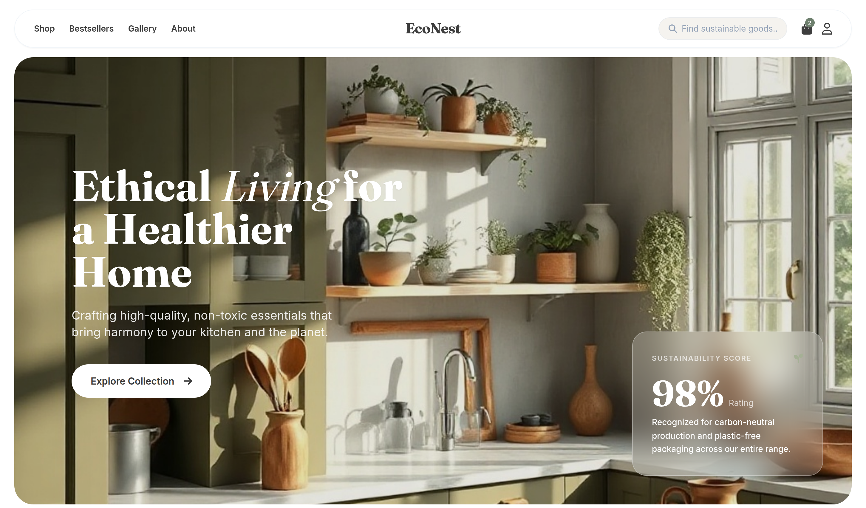
EcoNest is a modern e-commerce template for sustainable kitchenware, eco-friendly home essentials, ethical products, and conscious living brands.
Download Codebase
Commercial License<!DOCTYPE html>
<html lang="en">
<head>
<script>
window.FontAwesomeConfig = {
autoReplaceSvg: 'nest'
};
</script>
<script src="https://cdnjs.cloudflare.com/ajax/libs/font-awesome/6.4.0/js/all.min.js" crossorigin="anonymous" referrerpolicy="no-referrer"></script>
<meta charset="UTF-8">
<meta name="viewport" content="width=device-width, initial-scale=1.0">
<title>EcoNest | Tailwind CSS Sustainable Ecommerce Template</title>
<meta name="description" content="EcoNest is a modern Tailwind CSS ecommerce template for sustainable kitchenware, eco-friendly home essentials, ethical products, and conscious living brands.">
<meta name="keywords" content="EcoNest, Tailwind CSS template, HTML website template, sustainable ecommerce template, eco-friendly kitchenware, conscious living brand, ethical home goods, responsive online store">
<meta name="author" content="Let's templates">
<link rel="canonical" href="">
<meta property="og:type" content="product">
<meta property="og:site_name" content="Let's templates">
<meta property="og:locale" content="en_US">
<meta property="og:url" content="">
<meta property="og:title" content="EcoNest | Tailwind CSS Sustainable Ecommerce Template">
<meta property="og:description" content="A modern Tailwind CSS ecommerce template for sustainable kitchenware, eco-friendly home essentials, ethical products, and conscious living brands.">
<meta property="og:image" content="">
<meta property="og:image:alt" content="EcoNest template preview">
<meta name="twitter:card" content="summary_large_image">
<meta name="twitter:url" content="">
<meta name="twitter:title" content="EcoNest | Tailwind CSS Sustainable Ecommerce Template">
<meta name="twitter:description" content="A modern Tailwind CSS ecommerce template for sustainable kitchenware, eco-friendly home essentials, ethical products, and conscious living brands.">
<meta name="twitter:image" content="">
<meta name="twitter:image:alt" content="EcoNest template preview">
<script src="https://cdn.tailwindcss.com/3.4.17"></script>
<link rel="stylesheet" href="https://cdnjs.cloudflare.com/ajax/libs/font-awesome/6.6.0/css/all.min.css">
<link href="https://fonts.googleapis.com/css2?family=Fraunces:opsz,wght@9..144,400;9..144,700&family=Inter:wght@400;500;600&display=swap" rel="stylesheet">
<script>
tailwind.config = {
theme: {
extend: {
fontFamily: {
serif: ['Fraunces', 'serif'],
sans: ['Inter', 'sans-serif'],
},
colors: {
sage: '#6d7f6d',
cream: '#f5f3ef',
earth: '#3d3d3d',
leaf: '#a5b095',
}
}
}
}
</script>
<style>
.font-title { font-family: 'Fraunces', serif; }
.no-scrollbar::-webkit-scrollbar { display: none; }
.no-scrollbar { -ms-overflow-style: none; scrollbar-width: none; }
</style>
</head>
<body class="bg-white text-earth font-sans antialiased">
<!-- block:start navbar -->
<header id="header" class="fixed top-0 w-full z-50 px-6 py-4">
<nav class="max-w-[1600px] mx-auto flex items-center justify-between bg-white/70 backdrop-blur-md rounded-full px-8 py-3 border border-slate-100 shadow-sm">
<div class="flex items-center gap-10">
<div class="hidden lg:flex items-center gap-6 text-sm font-semibold text-earth">
<a href="#" class="hover:opacity-60 transition-opacity">Shop</a>
<a href="#" class="hover:opacity-60 transition-opacity">Bestsellers</a>
<a href="#" class="hover:opacity-60 transition-opacity">Gallery</a>
<a href="#" class="hover:opacity-60 transition-opacity">About</a>
</div>
</div>
<a href="#" class="font-title text-2xl font-bold tracking-tight absolute left-1/2 -translate-x-1/2">EcoNest</a>
<div class="flex items-center gap-6">
<div class="hidden md:flex items-center bg-cream rounded-full px-4 py-2 gap-2 border border-slate-200/50">
<i class="fa-solid fa-magnifying-glass text-slate-400 text-sm"></i>
<input type="text" placeholder="Find sustainable goods..." class="bg-transparent outline-none text-sm w-40 placeholder:text-slate-400">
</div>
<div class="flex items-center gap-4">
<a href="#" class="relative hover:scale-110 transition-transform">
<i class="fa-solid fa-bag-shopping text-xl"></i>
<span class="absolute -top-1 -right-1 bg-sage text-white text-[10px] w-4 h-4 flex items-center justify-center rounded-full">2</span>
</a>
<a href="#" class="hover:scale-110 transition-transform">
<i class="fa-regular fa-user text-xl"></i>
</a>
<button class="lg:hidden text-xl"><i class="fa-solid fa-bars"></i></button>
</div>
</div>
</nav>
</header>
<!-- block:end navbar -->
<main>
<!-- block:start hero -->
<section id="hero" class="pt-24 px-6 mb-20">
<div class="max-w-[1600px] mx-auto relative rounded-[2rem] overflow-hidden h-[750px]">
<img class="w-full h-full object-cover" src="https://storage.googleapis.com/uxpilot-auth.appspot.com/gen_25a0b23684_206ca2ba54d58332.png" alt="Serene sunlit sustainable kitchen with olive green cabinets, wooden shelves with plants, and various" />
<div class="absolute inset-0 bg-black/10"></div>
<!-- Hero Content -->
<div class="absolute inset-0 flex flex-col justify-center px-12 md:px-24">
<div class="max-w-xl text-white">
<h1 class="font-title text-5xl md:text-7xl font-bold leading-[1.1] mb-6 drop-shadow-sm">
Ethical <span class="italic font-normal">Living</span> for a Healthier Home
</h1>
<p class="text-lg md:text-xl opacity-90 mb-10 leading-relaxed max-w-md">
Crafting high-quality, non-toxic essentials that bring harmony to your kitchen and the planet.
</p>
<a href="#" class="inline-flex items-center gap-4 bg-white text-earth px-8 py-4 rounded-full font-bold hover:bg-cream transition-all group">
Explore Collection
<i class="fa-solid fa-arrow-right group-hover:translate-x-2 transition-transform"></i>
</a>
</div>
</div>
<!-- Stats Badge -->
<div class="absolute bottom-12 right-12 bg-white/20 backdrop-blur-xl border border-white/30 rounded-3xl p-8 text-white max-w-xs hidden md:block">
<div class="flex items-center justify-between mb-4">
<span class="text-xs font-bold uppercase tracking-widest opacity-70">Sustainability Score</span>
<i class="fa-solid fa-seedling text-leaf"></i>
</div>
<div class="flex items-baseline gap-2 mb-2">
<span class="text-6xl font-title font-bold">98%</span>
<span class="text-sm opacity-70">Rating</span>
</div>
<p class="text-sm font-medium leading-relaxed">
Recognized for carbon-neutral production and plastic-free packaging across our entire range.
</p>
</div>
</div>
</section>
<!-- block:end hero -->
<!-- block:start products -->
<section id="bestsellers" class="px-6 mb-32">
<div class="max-w-[1600px] mx-auto">
<div class="flex flex-col md:flex-row justify-between items-end mb-12 gap-6">
<div>
<p class="text-sage font-bold text-sm uppercase tracking-widest mb-2">Consciously Curated</p>
<h2 class="font-title text-4xl md:text-5xl font-bold">Our Iconic <span class="italic font-normal">Essentials</span></h2>
</div>
<a href="#" class="flex items-center gap-2 font-bold text-earth border-b-2 border-earth/20 hover:border-earth transition-all pb-1 group">
Browse all items
<i class="fa-solid fa-arrow-right text-xs group-hover:translate-x-1 transition-transform"></i>
</a>
</div>
<div class="grid grid-cols-1 sm:grid-cols-2 lg:grid-cols-4 gap-8">
<!-- Product 1 -->
<div class="group cursor-pointer">
<div class="relative aspect-[4/5] rounded-[2rem] overflow-hidden bg-cream mb-6">
<img class="w-full h-full object-cover group-hover:scale-110 transition-transform duration-700" src="https://storage.googleapis.com/uxpilot-auth.appspot.com/gen_8c520751fc_e569ea844a49f17d.png" alt="minimalist sage green reusable stainless steel water bottle on a clean textured background" />
<div class="absolute top-6 left-6 flex flex-col gap-2">
<span class="bg-sage text-white text-[10px] font-bold uppercase tracking-widest px-3 py-1.5 rounded-full shadow-sm">Eco Choice</span>
</div>
<button class="absolute bottom-6 right-6 w-12 h-12 bg-white rounded-full flex items-center justify-center opacity-0 group-hover:opacity-100 transition-opacity shadow-xl">
<i class="fa-solid fa-plus"></i>
</button>
</div>
<div class="flex justify-between items-start">
<div>
<h3 class="font-bold text-lg mb-1 group-hover:text-sage transition-colors">Infinity Flask</h3>
<p class="text-sm text-slate-500 mb-3 italic">Carbon-Neutral Drinkware</p>
<p class="font-title font-bold text-xl">$44.00</p>
</div>
<div class="flex gap-1.5">
<div class="w-4 h-4 rounded-full bg-sage ring-1 ring-offset-2 ring-sage"></div>
<div class="w-4 h-4 rounded-full bg-[#d1d5db]"></div>
<div class="w-4 h-4 rounded-full bg-[#1f2937]"></div>
</div>
</div>
</div>
<!-- Product 2 -->
<div class="group cursor-pointer">
<div class="relative aspect-[4/5] rounded-[2rem] overflow-hidden bg-cream mb-6">
<img class="w-full h-full object-cover group-hover:scale-110 transition-transform duration-700" src="https://storage.googleapis.com/uxpilot-auth.appspot.com/gen_e9f981c212_a381eb0138a5a3fd.png" alt="modern mustard yellow ceramic dutch oven and small pot on a light background, minimalist kitchenware" />
<div class="absolute top-6 left-6">
<span class="bg-white/80 backdrop-blur-md text-earth text-[10px] font-bold uppercase tracking-widest px-3 py-1.5 rounded-full shadow-sm">Limited Edition</span>
</div>
<button class="absolute bottom-6 right-6 w-12 h-12 bg-white rounded-full flex items-center justify-center opacity-0 group-hover:opacity-100 transition-opacity shadow-xl">
<i class="fa-solid fa-plus"></i>
</button>
</div>
<div class="flex justify-between items-start">
<div>
<h3 class="font-bold text-lg mb-1 group-hover:text-sage transition-colors">Terra Cotta Series</h3>
<p class="text-sm text-slate-500 mb-3 italic">Non-Toxic Cookware</p>
<p class="font-title font-bold text-xl">$128.00</p>
</div>
<div class="flex gap-1.5">
<div class="w-4 h-4 rounded-full bg-[#eab308]"></div>
<div class="w-4 h-4 rounded-full bg-sage"></div>
</div>
</div>
</div>
<!-- Product 3 -->
<div class="group cursor-pointer">
<div class="relative aspect-[4/5] rounded-[2rem] overflow-hidden bg-cream mb-6">
<img class="w-full h-full object-cover group-hover:scale-110 transition-transform duration-700" src="https://storage.googleapis.com/uxpilot-auth.appspot.com/gen_6dc94c6900_df968246a0ef0709.png" alt="premium minimalist glass and wood electric kettle on a modern kitchen counter" />
<div class="absolute top-6 left-6">
<span class="bg-earth text-white text-[10px] font-bold uppercase tracking-widest px-3 py-1.5 rounded-full shadow-sm">Best Seller</span>
</div>
<button class="absolute bottom-6 right-6 w-12 h-12 bg-white rounded-full flex items-center justify-center opacity-0 group-hover:opacity-100 transition-opacity shadow-xl">
<i class="fa-solid fa-plus"></i>
</button>
</div>
<div class="flex justify-between items-start">
<div>
<h3 class="font-bold text-lg mb-1 group-hover:text-sage transition-colors">PureSip Glass Kettle</h3>
<p class="text-sm text-slate-500 mb-3 italic">BPA-Free Brewing</p>
<p class="font-title font-bold text-xl">$95.00</p>
</div>
</div>
</div>
<!-- Product 4 -->
<div class="group cursor-pointer">
<div class="relative aspect-[4/5] rounded-[2rem] overflow-hidden bg-cream mb-6">
<img class="w-full h-full object-cover group-hover:scale-110 transition-transform duration-700" src="https://storage.googleapis.com/uxpilot-auth.appspot.com/gen_d73be56f01_622e59be6944a55d.png" alt="artisanal bamboo kitchen utensil set in a textured ceramic container, sustainable lifestyle" />
<div class="absolute top-6 left-6">
<span class="bg-leaf text-white text-[10px] font-bold uppercase tracking-widest px-3 py-1.5 rounded-full shadow-sm">Sustainable</span>
</div>
<button class="absolute bottom-6 right-6 w-12 h-12 bg-white rounded-full flex items-center justify-center opacity-0 group-hover:opacity-100 transition-opacity shadow-xl">
<i class="fa-solid fa-plus"></i>
</button>
</div>
<div class="flex justify-between items-start">
<div>
<h3 class="font-bold text-lg mb-1 group-hover:text-sage transition-colors">Organic Bamboo Set</h3>
<p class="text-sm text-slate-500 mb-3 italic">Biodegradable Tools</p>
<p class="font-title font-bold text-xl">$32.00</p>
</div>
</div>
</div>
</div>
</div>
</section>
<!-- block:end products -->
<!-- block:start gallery -->
<section id="craftsmanship" class="px-6 mb-32">
<div class="max-w-[1600px] mx-auto relative rounded-[3rem] overflow-hidden h-[600px] flex items-center">
<img class="absolute inset-0 w-full h-full object-cover" src="https://storage.googleapis.com/uxpilot-auth.appspot.com/gen_1afe61bae6_da1cbbf6c74f8056.png" alt="Modern minimal kitchen island with sustainable wood finishes and marble top, large windows with natu" />
<div class="absolute inset-0 bg-gradient-to-r from-black/40 to-transparent"></div>
<div class="relative z-10 px-12 md:px-24 max-w-2xl text-white">
<h2 class="font-title text-4xl md:text-6xl font-bold leading-tight mb-8">
Vessels for your <span class="italic font-normal">Morning Rituals</span> & Evening Gatherings
</h2>
<p class="text-lg opacity-90 mb-10 leading-relaxed">
Every piece in our collection is thoughtfully sourced from renewable materials and designed to last for generations. We believe in quality over quantity, and slow craftsmanship over mass production.
</p>
<a href="#" class="inline-flex items-center gap-3 font-bold border-b-2 border-white/40 hover:border-white transition-all pb-1 group">
Read Our Material Story
<i class="fa-solid fa-chevron-right text-xs group-hover:translate-x-1 transition-transform"></i>
</a>
</div>
</div>
</section>
<!-- block:end gallery -->
<!-- block:start clients -->
<section id="values" class="px-6 mb-32">
<div class="max-w-[1600px] mx-auto">
<div class="grid grid-cols-1 md:grid-cols-3 gap-6">
<div class="bg-cream rounded-3xl p-10 flex items-center gap-8 group hover:bg-sage/10 transition-colors">
<div class="w-16 h-16 bg-white rounded-2xl flex items-center justify-center text-sage text-2xl shadow-sm group-hover:scale-110 transition-transform">
<i class="fa-solid fa-leaf"></i>
</div>
<div>
<h4 class="font-title font-bold text-xl mb-1">Natural Finish</h4>
<p class="text-sm text-slate-500 font-medium">Free from synthetic coatings.</p>
</div>
</div>
<div class="bg-cream rounded-3xl p-10 flex items-center gap-8 group hover:bg-sage/10 transition-colors">
<div class="w-16 h-16 bg-white rounded-2xl flex items-center justify-center text-sage text-2xl shadow-sm group-hover:scale-110 transition-transform">
<i class="fa-solid fa-earth-americas"></i>
</div>
<div>
<h4 class="font-title font-bold text-xl mb-1">Eco Innovation</h4>
<p class="text-sm text-slate-500 font-medium">Lowering our footprint yearly.</p>
</div>
</div>
<div class="bg-cream rounded-3xl p-10 flex items-center gap-8 group hover:bg-sage/10 transition-colors">
<div class="w-16 h-16 bg-white rounded-2xl flex items-center justify-center text-sage text-2xl shadow-sm group-hover:scale-110 transition-transform">
<i class="fa-solid fa-recycle"></i>
</div>
<div>
<h4 class="font-title font-bold text-xl mb-1">Circular Material</h4>
<p class="text-sm text-slate-500 font-medium">Recycled and fully recyclable.</p>
</div>
</div>
</div>
</div>
</section>
<!-- block:end clients -->
<!-- block:start products-2 -->
<section id="categories" class="px-6 mb-32">
<div class="max-w-[1600px] mx-auto">
<div class="text-center mb-16">
<p class="text-sage font-bold text-sm uppercase tracking-widest mb-2">Shop by Category</p>
<h2 class="font-title text-4xl md:text-5xl font-bold">Curate Your <span class="italic font-normal">Sanctuary</span></h2>
</div>
<div class="grid grid-cols-1 sm:grid-cols-2 lg:grid-cols-4 gap-6">
<!-- Cat 1 -->
<div class="relative rounded-[2.5rem] overflow-hidden group h-[500px]">
<img class="w-full h-full object-cover group-hover:scale-110 transition-transform duration-1000" src="https://storage.googleapis.com/uxpilot-auth.appspot.com/gen_c3a451e52b_470c46c84c6c6276.png" alt="artisanal handmade ceramic coffee mug on a rustic wooden pedestal, soft directional light" />
<div class="absolute inset-0 bg-black/20 group-hover:bg-black/40 transition-colors"></div>
<div class="absolute inset-0 flex flex-col justify-end p-10 items-center">
<h3 class="text-white font-title text-2xl font-bold mb-6">Drinkware</h3>
<a href="#" class="bg-white text-earth px-8 py-3 rounded-full font-bold text-sm opacity-0 group-hover:opacity-100 transition-all translate-y-4 group-hover:translate-y-0">Shop Now</a>
</div>
</div>
<!-- Cat 2 -->
<div class="relative rounded-[2.5rem] overflow-hidden group h-[500px]">
<img class="w-full h-full object-cover group-hover:scale-110 transition-transform duration-1000" src="https://storage.googleapis.com/uxpilot-auth.appspot.com/gen_59b50fab8e_1bf86c3748e0c50e.png" alt="minimalist reusable wooden cutlery set on a natural linen background" />
<div class="absolute inset-0 bg-black/20 group-hover:bg-black/40 transition-colors"></div>
<div class="absolute inset-0 flex flex-col justify-end p-10 items-center">
<h3 class="text-white font-title text-2xl font-bold mb-6">Tableware</h3>
<a href="#" class="bg-white text-earth px-8 py-3 rounded-full font-bold text-sm opacity-0 group-hover:opacity-100 transition-all translate-y-4 group-hover:translate-y-0">Shop Now</a>
</div>
</div>
<!-- Cat 3 -->
<div class="relative rounded-[2.5rem] overflow-hidden group h-[500px]">
<img class="w-full h-full object-cover group-hover:scale-110 transition-transform duration-1000" src="https://storage.googleapis.com/uxpilot-auth.appspot.com/gen_9f657a4084_a95376fccdb246bd.png" alt="collection of sustainable bamboo cooking spoons and turners in a ceramic jar" />
<div class="absolute inset-0 bg-black/20 group-hover:bg-black/40 transition-colors"></div>
<div class="absolute inset-0 flex flex-col justify-end p-10 items-center">
<h3 class="text-white font-title text-2xl font-bold mb-6">Utensils</h3>
<a href="#" class="bg-white text-earth px-8 py-3 rounded-full font-bold text-sm opacity-0 group-hover:opacity-100 transition-all translate-y-4 group-hover:translate-y-0">Shop Now</a>
</div>
</div>
<!-- Cat 4 -->
<div class="relative rounded-[2.5rem] overflow-hidden group h-[500px]">
<img class="w-full h-full object-cover group-hover:scale-110 transition-transform duration-1000" src="https://storage.googleapis.com/uxpilot-auth.appspot.com/gen_d0cbb82c22_c1141b31c22788d8.png" alt="premium glass water pitcher with a wooden lid on a modern table" />
<div class="absolute inset-0 bg-black/20 group-hover:bg-black/40 transition-colors"></div>
<div class="absolute inset-0 flex flex-col justify-end p-10 items-center">
<h3 class="text-white font-title text-2xl font-bold mb-6">Accessories</h3>
<a href="#" class="bg-white text-earth px-8 py-3 rounded-full font-bold text-sm opacity-0 group-hover:opacity-100 transition-all translate-y-4 group-hover:translate-y-0">Shop Now</a>
</div>
</div>
</div>
</div>
</section>
<!-- block:end products-2 -->
<!-- block:start gallery-2 -->
<section id="gallery" class="px-6 mb-32">
<div class="max-w-[1600px] mx-auto">
<div class="flex items-center justify-between mb-12">
<h2 class="font-title text-3xl md:text-4xl font-bold">Inspiration for <span class="italic font-normal">Daily Rituals</span></h2>
<div class="flex gap-4">
<button class="w-12 h-12 rounded-full border border-slate-200 flex items-center justify-center hover:bg-earth hover:text-white transition-all"><i class="fa-solid fa-chevron-left text-sm"></i></button>
<button class="w-12 h-12 rounded-full border border-slate-200 flex items-center justify-center hover:bg-earth hover:text-white transition-all"><i class="fa-solid fa-chevron-right text-sm"></i></button>
</div>
</div>
<div class="flex gap-6 overflow-x-auto no-scrollbar pb-8">
<div class="min-w-[300px] aspect-square rounded-3xl overflow-hidden relative group shrink-0">
<img class="w-full h-full object-cover" src="https://storage.googleapis.com/uxpilot-auth.appspot.com/gen_23f5e2d6dd_e4842ac511fd6688.png" alt="flat lay of various organic kitchen tools on a light background, aesthetic and clean" />
<div class="absolute bottom-6 left-6 text-white opacity-0 group-hover:opacity-100 transition-opacity">
<p class="font-bold text-sm">Zero Waste Living</p>
</div>
</div>
<div class="min-w-[300px] aspect-square rounded-3xl overflow-hidden relative group shrink-0">
<img class="w-full h-full object-cover" src="https://storage.googleapis.com/uxpilot-auth.appspot.com/gen_093230d09a_364f264982211ebd.png" alt="close up of artisanal wooden plates with organic food, warm lighting" />
<div class="absolute bottom-6 left-6 text-white opacity-0 group-hover:opacity-100 transition-opacity">
<p class="font-bold text-sm">Sustainable Dining</p>
</div>
</div>
<div class="min-w-[300px] aspect-square rounded-3xl overflow-hidden relative group shrink-0">
<img class="w-full h-full object-cover" src="https://storage.googleapis.com/uxpilot-auth.appspot.com/gen_850ae9d44c_55cc2d2e08746eff.png" alt="minimalist shelf with eco-friendly glass jars and wooden utensils" />
<div class="absolute bottom-6 left-6 text-white opacity-0 group-hover:opacity-100 transition-opacity">
<p class="font-bold text-sm">The Pantry Edit</p>
</div>
</div>
<div class="min-w-[300px] aspect-square rounded-3xl overflow-hidden relative group shrink-0">
<img class="w-full h-full object-cover" src="https://storage.googleapis.com/uxpilot-auth.appspot.com/gen_ab94e456c0_cbd785e0e1895d9c.png" alt="hands holding a stack of artisanal ceramic bowls, earthy tones" />
<div class="absolute bottom-6 left-6 text-white opacity-0 group-hover:opacity-100 transition-opacity">
<p class="font-bold text-sm">Craftsmanship</p>
</div>
</div>
<div class="min-w-[300px] aspect-square rounded-3xl overflow-hidden relative group shrink-0">
<img class="w-full h-full object-cover" src="https://storage.googleapis.com/uxpilot-auth.appspot.com/gen_9a6ffe1a45_ad61a2dc5fc5aac6.png" alt="eco-friendly coffee brewing set on a marble counter" />
<div class="absolute bottom-6 left-6 text-white opacity-0 group-hover:opacity-100 transition-opacity">
<p class="font-bold text-sm">Morning Routine</p>
</div>
</div>
</div>
</div>
</section>
<!-- block:end gallery-2 -->
<!-- block:start reviews -->
<section id="reviews" class="px-6 mb-32">
<div class="max-w-[1600px] mx-auto bg-cream rounded-[3rem] p-12 md:p-24">
<div class="grid grid-cols-1 lg:grid-cols-12 gap-16 items-center">
<div class="lg:col-span-4">
<div class="flex items-baseline gap-2 mb-4">
<span class="font-title text-7xl font-bold">4.9</span>
<span class="text-xl text-slate-400">/5</span>
</div>
<p class="text-sm font-bold uppercase tracking-widest text-sage mb-6">Trusted by 50,000+ homes</p>
<div class="flex gap-1 text-sage text-sm mb-10">
<i class="fa-solid fa-star"></i><i class="fa-solid fa-star"></i><i class="fa-solid fa-star"></i><i class="fa-solid fa-star"></i><i class="fa-solid fa-star"></i>
</div>
<p class="text-slate-500 leading-relaxed italic">
"We are dedicated to providing products that not only serve your home but also preserve our planet for future generations."
</p>
</div>
<div class="lg:col-span-8">
<div class="flex gap-6 overflow-x-auto no-scrollbar py-6">
<!-- Review 1 -->
<div class="min-w-[350px] bg-white rounded-3xl p-10 shadow-sm shrink-0">
<div class="flex gap-1 text-sage text-[10px] mb-6">
<i class="fa-solid fa-star"></i><i class="fa-solid fa-star"></i><i class="fa-solid fa-star"></i><i class="fa-solid fa-star"></i><i class="fa-solid fa-star"></i>
</div>
<p class="text-earth font-medium leading-relaxed mb-8">
"EcoNest's glass jars are absolute perfection. They've transformed my pantry into a plastic-free sanctuary that feels so chic and organized."
</p>
<div class="flex items-center gap-4">
<img src="https://storage.googleapis.com/uxpilot-auth.appspot.com/avatars/avatar-1.jpg" class="w-10 h-10 rounded-full" alt="Reviewer">
<div>
<p class="font-bold text-sm">Amelia Watts</p>
<p class="text-[10px] text-slate-400 font-bold uppercase tracking-widest">Sustainability Blogger</p>
</div>
</div>
</div>
<!-- Review 2 -->
<div class="min-w-[350px] bg-white rounded-3xl p-10 shadow-sm shrink-0">
<div class="flex gap-1 text-sage text-[10px] mb-6">
<i class="fa-solid fa-star"></i><i class="fa-solid fa-star"></i><i class="fa-solid fa-star"></i><i class="fa-solid fa-star"></i><i class="fa-solid fa-star"></i>
</div>
<p class="text-earth font-medium leading-relaxed mb-8">
"The bamboo utensil set is not only beautiful but incredibly durable. I use them daily and they still look brand new. Truly impressive quality."
</p>
<div class="flex items-center gap-4">
<img src="https://storage.googleapis.com/uxpilot-auth.appspot.com/avatars/avatar-2.jpg" class="w-10 h-10 rounded-full" alt="Reviewer">
<div>
<p class="font-bold text-sm">Julian Carter</p>
<p class="text-[10px] text-slate-400 font-bold uppercase tracking-widest">Executive Chef</p>
</div>
</div>
</div>
</div>
</div>
</div>
</div>
</section>
<!-- block:end reviews -->
<!-- block:start about -->
<section id="commitment" class="px-6 mb-32 text-center">
<div class="max-w-4xl mx-auto">
<div class="flex flex-wrap justify-center items-center gap-4 mb-10">
<div class="w-16 h-12 rounded-full overflow-hidden shrink-0 inline-block">
<img class="w-full h-full object-cover" src="https://storage.googleapis.com/uxpilot-auth.appspot.com/gen_2a1473ee13_cd367c5d568bf925.png" alt="close up of hands working with natural clay" />
</div>
<h2 class="font-title text-4xl md:text-6xl font-bold inline leading-tight">
Our journey to a <span class="italic font-normal">waste-free</span> future begins in the heart of your home.
</h2>
</div>
<p class="text-xl text-slate-500 leading-relaxed max-w-2xl mx-auto font-medium">
Through radical transparency, ethical sourcing, and compostable packaging, we're redesigning everyday commerce.
</p>
</div>
</section>
<!-- block:end about -->
<!-- block:start newsletter -->
<section id="newsletter" class="px-6 mb-20">
<div class="max-w-[1600px] mx-auto bg-earth rounded-[3rem] p-12 md:p-24 text-white overflow-hidden relative">
<!-- Decorative Images -->
<div class="absolute top-0 right-0 w-1/3 h-full opacity-20 pointer-events-none hidden lg:block">
<div class="grid grid-cols-2 gap-4 rotate-12 translate-x-20">
<div class="space-y-4">
<div class="h-64 rounded-3xl overflow-hidden"><img class="w-full h-full object-cover" src="https://storage.googleapis.com/uxpilot-auth.appspot.com/gen_f8a7a9dcf6_1f6968e810f2f372.png" alt="aesthetic shot of olive wood kitchen tools" /></div>
<div class="h-48 rounded-3xl overflow-hidden"><img class="w-full h-full object-cover" src="https://storage.googleapis.com/uxpilot-auth.appspot.com/gen_0c533ff46c_1cd5c77bdd41b171.png" alt="minimalist ceramic bowl with fresh fruit" /></div>
</div>
<div class="space-y-4 pt-12">
<div class="h-48 rounded-3xl overflow-hidden"><img class="w-full h-full object-cover" src="https://storage.googleapis.com/uxpilot-auth.appspot.com/gen_d2eaf50bdf_281716eaf0e0ef13.png" alt="clean aesthetic of glass jars with spices" /></div>
<div class="h-64 rounded-3xl overflow-hidden"><img class="w-full h-full object-cover" src="https://storage.googleapis.com/uxpilot-auth.appspot.com/gen_1197f81824_a2e7ecdb197e2b8e.png" alt="artisanal clay coffee pour over set" /></div>
</div>
</div>
</div>
<div class="relative z-10 max-w-2xl">
<span class="text-sage font-bold text-sm uppercase tracking-widest mb-6 block">Join the Circle</span>
<h2 class="font-title text-5xl md:text-7xl font-bold leading-tight mb-8">
Get 10% Off <br> Your First Order
</h2>
<p class="text-lg opacity-70 mb-12 max-w-md">
Subscribe for eco-friendly tips, seasonal recipes, and exclusive access to our sustainable new arrivals.
</p>
<form class="flex flex-col sm:flex-row gap-4 max-w-lg">
<input type="email" placeholder="Email address" class="flex-grow bg-white/10 border border-white/20 rounded-full px-8 py-4 focus:outline-none focus:bg-white/20 transition-all placeholder:text-white/40">
<button type="submit" class="bg-sage text-white px-10 py-4 rounded-full font-bold hover:bg-leaf transition-all whitespace-nowrap">Subscribe</button>
</form>
<p class="mt-6 text-[10px] uppercase tracking-widest font-bold opacity-40">By signing up you agree to our privacy policy.</p>
</div>
</div>
</section>
<!-- block:end newsletter -->
</main>
<!-- block:start footer -->
<footer id="footer" class="pt-24 pb-12 px-6 border-t border-slate-100">
<div class="max-w-[1600px] mx-auto">
<div class="grid grid-cols-1 md:grid-cols-12 gap-16 mb-24">
<div class="md:col-span-4">
<a href="#" class="font-title text-4xl font-bold tracking-tight mb-8 block">EcoNest</a>
<p class="text-slate-500 leading-relaxed max-w-xs mb-10 font-medium">
Elevating home essentials through conscious design and planetary respect.
</p>
<div class="flex gap-4">
<a href="#" class="w-10 h-10 rounded-full border border-slate-100 flex items-center justify-center hover:bg-sage hover:text-white transition-all"><i class="fa-brands fa-instagram"></i></a>
<a href="#" class="w-10 h-10 rounded-full border border-slate-100 flex items-center justify-center hover:bg-sage hover:text-white transition-all"><i class="fa-brands fa-pinterest"></i></a>
<a href="#" class="w-10 h-10 rounded-full border border-slate-100 flex items-center justify-center hover:bg-sage hover:text-white transition-all"><i class="fa-brands fa-x-twitter"></i></a>
</div>
</div>
<div class="md:col-span-2">
<h4 class="font-bold uppercase tracking-widest text-xs mb-8">Shop</h4>
<ul class="space-y-4 text-sm font-medium text-slate-500">
<li><a href="#" class="hover:text-sage transition-colors">Drinkware</a></li>
<li><a href="#" class="hover:text-sage transition-colors">Tableware</a></li>
<li><a href="#" class="hover:text-sage transition-colors">Cookware</a></li>
<li><a href="#" class="hover:text-sage transition-colors">Accessories</a></li>
</ul>
</div>
<div class="md:col-span-2">
<h4 class="font-bold uppercase tracking-widest text-xs mb-8">Support</h4>
<ul class="space-y-4 text-sm font-medium text-slate-500">
<li><a href="#" class="hover:text-sage transition-colors">Shipping</a></li>
<li><a href="#" class="hover:text-sage transition-colors">Returns</a></li>
<li><a href="#" class="hover:text-sage transition-colors">Sizing Guide</a></li>
<li><a href="#" class="hover:text-sage transition-colors">FAQ</a></li>
</ul>
</div>
<div class="md:col-span-4">
<h4 class="font-bold uppercase tracking-widest text-xs mb-8">Visit Us</h4>
<p class="text-sm font-medium text-slate-500 leading-relaxed mb-6">
1248 Earth Way, <br>
Coastal Haven, CA 94102
</p>
<a href="#" class="inline-flex items-center gap-2 font-bold text-sage border-b border-sage hover:opacity-70 transition-opacity">
Get Directions
</a>
</div>
</div>
<div class="pt-12 border-t border-slate-100 flex flex-col md:flex-row justify-between items-center gap-6">
<div class="flex items-center gap-8 text-[10px] font-bold uppercase tracking-[0.2em] text-slate-400">
<p>© 2026 EcoNest Inc.</p>
<a href="#" class="hover:text-earth transition-colors">Privacy</a>
<a href="#" class="hover:text-earth transition-colors">Terms</a>
</div>
<div class="font-title text-[10vw] font-bold leading-none text-slate-50 select-none pointer-events-none">EcoNest</div>
</div>
</div>
</footer>
<!-- block:end footer -->
</body>
</html>
Unlimited access to all templates
Unlock our entire library of premium UI kits, dashboards, and landing pages. Renews automatically, cancel anytime.
$20
/ 3 months
or $60 / year
Get Unlimited Access