Premium
1
152
Velaro
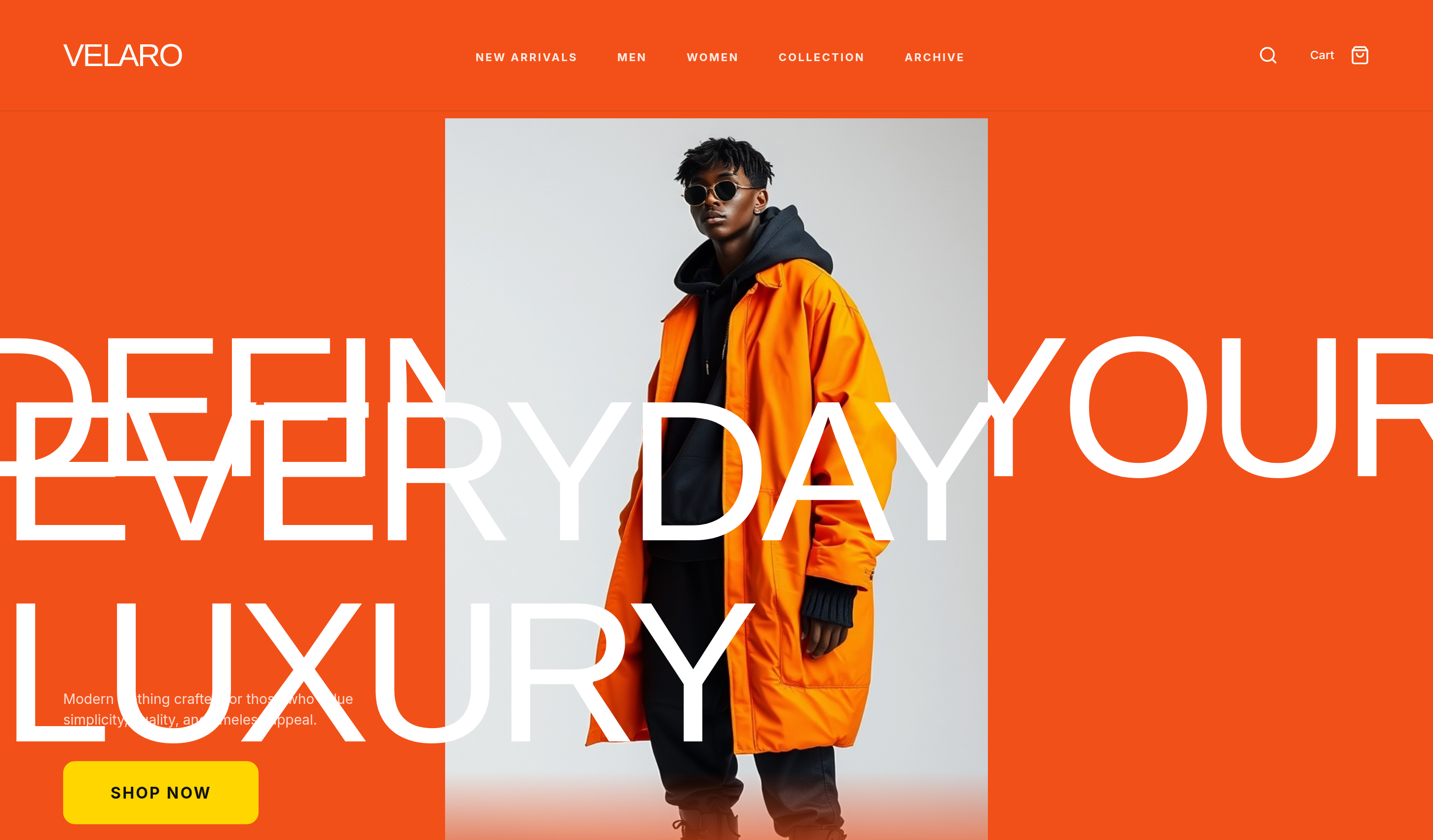
Velaro is a bold fashion website template for showcasing modern clothing, premium streetwear, and everyday luxury collections.
Download Codebase
Commercial License<!DOCTYPE html>
<html lang="en">
<head>
<script>
window.FontAwesomeConfig = {
autoReplaceSvg: 'nest'
};
</script>
<script src="https://cdn.tailwindcss.com"></script>
<link rel="stylesheet" href="https://cdnjs.cloudflare.com/ajax/libs/font-awesome/6.4.0/css/all.min.css">
<script src="https://cdnjs.cloudflare.com/ajax/libs/font-awesome/6.4.0/js/all.min.js" crossorigin="anonymous" referrerpolicy="no-referrer"></script>
<meta charset="utf-8">
<meta name="viewport" content="width=device-width, initial-scale=1.0">
<title>Velaro | Tailwind CSS Fashion Ecommerce Template</title>
<meta name="description" content="Velaro is a bold Tailwind CSS fashion website template for showcasing modern clothing, premium streetwear, and everyday luxury collections.">
<meta name="keywords" content="Velaro, Tailwind CSS template, HTML website template, fashion website template, streetwear landing page, modern clothing, responsive ecommerce design">
<meta name="author" content="Let's templates">
<link rel="canonical" href="">
<meta property="og:type" content="product">
<meta property="og:site_name" content="Let's templates">
<meta property="og:locale" content="en_US">
<meta property="og:url" content="">
<meta property="og:title" content="Velaro | Tailwind CSS Fashion Ecommerce Template">
<meta property="og:description" content="A bold Tailwind CSS fashion website template for showcasing modern clothing, premium streetwear, and everyday luxury collections.">
<meta property="og:image" content="">
<meta property="og:image:alt" content="Velaro template preview">
<meta name="twitter:card" content="summary_large_image">
<meta name="twitter:url" content="">
<meta name="twitter:title" content="Velaro | Tailwind CSS Fashion Ecommerce Template">
<meta name="twitter:description" content="A bold Tailwind CSS fashion website template for showcasing modern clothing, premium streetwear, and everyday luxury collections.">
<meta name="twitter:image" content="">
<meta name="twitter:image:alt" content="Velaro template preview">
<!-- Fonts -->
<link rel="preconnect" href="https://fonts.googleapis.com">
<link rel="preconnect" href="https://fonts.gstatic.com" crossorigin>
<link href="https://fonts.googleapis.com/css2?family=Inter:wght@400;500;700&display=swap" rel="stylesheet">
<style>
:root {
--color-orange: #f25019;
--color-softorange: #ff7847;
--color-yellow: #ffd600;
--color-charcoal: #121212;
--color-alabaster: #ffffff;
--container-max: 1200px;
}
/* Base Reset */
* { box-sizing: border-box; margin: 0; padding: 0; }
html, body { max-width: 100%; overflow-x: clip; }
body {
font-family: 'Inter', sans-serif;
background-color: var(--color-orange);
color: var(--color-alabaster);
line-height: 1.5;
}
.container {
max-width: var(--container-max);
margin: 0 auto;
padding: 0 2rem;
}
/* Layout Helpers */
.flex { display: flex; }
.flex-column { flex-direction: column; }
.grid { display: grid; }
.items-center { align-items: center; }
.justify-center { justify-content: center; }
.justify-between { justify-content: space-between; }
.gap-4 { gap: 1rem; }
.gap-8 { gap: 2rem; }
.w-full { width: 100%; }
.h-full { height: 100%; }
.relative { position: relative; }
.absolute { position: absolute; }
.inset-0 { top: 0; left: 0; right: 0; bottom: 0; }
.text-center { text-align: center; }
.uppercase { text-transform: uppercase; }
.font-impact {
font-family: 'Impact', 'Arial Narrow Bold', sans-serif;
text-transform: uppercase;
font-stretch: extra-condensed;
letter-spacing: -0.05em;
}
.grain {
position: fixed;
inset: 0;
background-image: url("https://grainy-gradients.vercel.app/noise.svg");
filter: contrast(150%) brightness(100%);
opacity: 0.2;
pointer-events: none;
z-index: 100;
}
/* Navigation */
header#header {
position: fixed;
top: 0;
left: 0;
width: 100%;
z-index: 1000;
padding: 2rem 4rem;
display: flex;
justify-content: space-between;
align-items: center;
color: #fff;
background: rgba(242, 80, 25, 0.96);
backdrop-filter: blur(16px);
-webkit-backdrop-filter: blur(16px);
box-shadow: 0 1px 0 rgba(0, 0, 0, 0.08);
}
.logo {
font-size: 2rem;
text-decoration: none;
color: white;
display: flex;
align-items: center;
gap: 0.5rem;
}
nav ul {
display: flex;
list-style: none;
gap: 2.5rem;
}
nav a {
font-size: 11px;
font-weight: 700;
letter-spacing: 0.15em;
color: rgba(255, 255, 255, 0.9);
text-decoration: none;
white-space: nowrap;
transition: color 0.3s ease;
}
nav a:hover { color: #fff; }
.nav-actions {
display: flex;
align-items: center;
gap: 2rem;
}
/* Hero Section */
.hero-section {
height: 900px;
position: relative;
overflow: hidden;
display: flex;
flex-direction: column;
justify-content: center;
}
.hero-title {
font-size: 14vw;
line-height: 1;
z-index: 10;
margin: 0;
}
.hero-title-break { display: inline; }
.backdrop-blur {
backdrop-filter: blur(12px);
-webkit-backdrop-filter: blur(12px);
background: rgba(255, 255, 255, 0.1);
}
.image-mask {
mask-image: linear-gradient(to bottom, black 85%, transparent 100%);
-webkit-mask-image: linear-gradient(to bottom, black 85%, transparent 100%);
}
.hero-assets {
display: flex;
align-items: center;
margin-left: -1.5rem;
}
.asset-box {
width: 8vw;
height: 8vw;
border-radius: 1rem;
overflow: hidden;
border: 1px solid rgba(255,255,255,0.1);
margin-left: -1rem;
box-shadow: 0 10px 30px rgba(0,0,0,0.2);
}
/* Marquee */
@keyframes marquee {
0% { transform: translateX(0); }
100% { transform: translateX(-50%); }
}
.animate-marquee {
display: inline-block;
white-space: nowrap;
animation: marquee 20s linear infinite;
}
.marquee-section {
padding: 3rem 0;
border-top: 1px solid rgba(255,255,255,0.1);
border-bottom: 1px solid rgba(255,255,255,0.1);
overflow: hidden;
}
/* Bento Grid */
.bento-grid {
display: grid;
gap: 1.5rem;
grid-template-columns: repeat(4, 1fr);
grid-template-rows: repeat(2, 400px);
}
.col-span-2 { grid-column: span 2; }
.row-span-2 { grid-row: span 2; }
.feature-card {
background: #f8f8f8;
border-radius: 1.5rem;
overflow: hidden;
color: var(--color-charcoal);
}
.feature-card.dark {
background: var(--color-charcoal);
color: white;
padding: 3rem;
display: flex;
flex-direction: column;
justify-content: space-between;
}
.btn-custom {
padding: 1.25rem 3rem;
border-radius: 0.75rem;
font-weight: 900;
letter-spacing: 0.1em;
transition: all 0.3s ease;
text-transform: uppercase;
border: none;
background: var(--color-yellow);
color: var(--color-charcoal);
cursor: pointer;
text-decoration: none;
display: inline-block;
}
.btn-custom:hover {
transform: translateY(-4px);
box-shadow: 0 10px 20px rgba(0,0,0,0.2);
}
/* Pricing/Membership Cards */
.pricing-grid {
display: grid;
grid-template-columns: repeat(3, 1fr);
gap: 2rem;
}
.price-card {
background: white;
color: var(--color-charcoal);
padding: 2.5rem;
border-radius: 1.5rem;
border: 1px solid #eee;
display: flex;
flex-direction: column;
}
.price-card.featured {
border: 2px solid var(--color-charcoal);
position: relative;
}
/* Information */
.info-section {
padding: 100px 0;
color: var(--color-alabaster);
background: var(--color-charcoal);
}
.info-heading {
font-size: clamp(2.75rem, 8vw, 4rem);
line-height: 0.9;
margin-bottom: 1rem;
}
.info-intro {
max-width: 28rem;
margin-bottom: 3.5rem;
color: rgba(255, 255, 255, 0.55);
}
.info-grid {
display: grid;
grid-template-columns: 1.1fr 1fr;
gap: 2.5rem;
align-items: stretch;
}
.info-photo {
overflow: hidden;
min-height: 320px;
border-radius: 1.5rem;
}
.info-photo img {
width: 100%;
height: 100%;
object-fit: cover;
}
.info-list {
display: grid;
grid-template-columns: 1fr 1fr;
gap: 1.25rem;
}
.info-card {
padding: 1.75rem;
background: rgba(255, 255, 255, 0.04);
border: 1px solid rgba(255, 255, 255, 0.08);
border-radius: 1.25rem;
}
.info-card h3 {
margin-bottom: 0.5rem;
font-size: 1.15rem;
}
.info-card p {
font-size: 14px;
line-height: 1.6;
color: rgba(255, 255, 255, 0.55);
}
.info-index {
display: block;
margin-bottom: 0.85rem;
color: var(--color-yellow);
font-size: 11px;
font-weight: 700;
letter-spacing: 0.16em;
}
/* Contact */
.contact-section {
padding: 100px 0;
color: var(--color-charcoal);
background: var(--color-alabaster);
}
.contact-heading {
font-size: clamp(2.75rem, 8vw, 4rem);
line-height: 0.9;
margin-bottom: 1rem;
}
.contact-grid {
display: grid;
grid-template-columns: 1fr 1fr;
gap: 4rem;
align-items: start;
}
.contact-copy {
max-width: 28rem;
margin-bottom: 2.5rem;
color: #666;
}
.contact-meta {
display: grid;
gap: 1.5rem;
}
.contact-meta h3 {
margin-bottom: 0.35rem;
font-size: 11px;
font-weight: 700;
letter-spacing: 0.16em;
text-transform: uppercase;
color: #999;
}
.contact-meta p,
.contact-meta a {
font-size: 1.05rem;
line-height: 1.6;
color: var(--color-charcoal);
text-decoration: none;
}
.contact-meta a:hover { color: var(--color-orange); }
.contact-form {
display: grid;
gap: 1rem;
padding: 2.5rem;
background: #f8f8f8;
border-radius: 1.5rem;
}
.field-row {
display: grid;
grid-template-columns: 1fr 1fr;
gap: 1rem;
}
.field label {
display: block;
margin-bottom: 0.45rem;
font-size: 11px;
font-weight: 700;
letter-spacing: 0.14em;
text-transform: uppercase;
color: #888;
}
.field input,
.field textarea {
width: 100%;
padding: 0.95rem 1.1rem;
border: 1px solid #eee;
border-radius: 0.75rem;
background: #fff;
color: var(--color-charcoal);
font-family: inherit;
font-size: 14px;
}
.field input:focus,
.field textarea:focus {
outline: 2px solid var(--color-orange);
outline-offset: 1px;
}
.field textarea { min-height: 8rem; resize: vertical; }
.contact-form .btn-custom {
justify-self: start;
margin-top: 0.5rem;
}
#information,
#contact { scroll-margin-top: 1.25rem; }
@media (min-width: 1025px) {
#information,
#contact { scroll-margin-top: 7.5rem; }
}
/* Footer */
footer {
background: var(--color-charcoal);
padding: 5rem 4rem 2rem;
}
.footer-grid {
display: grid;
grid-template-columns: 2fr 1fr 1fr;
gap: 4rem;
margin-bottom: 4rem;
}
@media (max-width: 1024px) {
header#header {
position: sticky;
flex-wrap: wrap;
gap: 0.65rem 1rem;
padding: 1rem 1.5rem 0.85rem;
background: rgba(242, 80, 25, 0.96);
}
header#header nav {
order: 3;
flex: 1 1 100%;
}
header#header nav ul {
flex-wrap: nowrap;
justify-content: space-between;
gap: 0.5rem;
width: 100%;
}
header#header nav a {
display: inline-block;
padding: 0.4rem 0;
font-size: 10px;
letter-spacing: 0.1em;
}
.logo { font-size: 1.65rem; }
.nav-actions {
margin-left: auto;
gap: 1rem;
}
}
@media (max-width: 768px) {
header#header { padding: 0.85rem 1.25rem 0.9rem; }
.hero-section {
height: auto;
min-height: 0;
padding: 2.15rem 1.25rem 2.75rem;
justify-content: flex-start;
align-items: center;
}
.hero-headline-top,
.hero-model,
.hero-headline-bottom,
.hero-cta {
position: relative !important;
inset: auto !important;
top: auto !important;
right: auto !important;
bottom: auto !important;
left: auto !important;
margin: 0 !important;
width: 100%;
z-index: auto !important;
}
.hero-headline-top {
display: flex;
justify-content: center;
}
.hero-headline-top > div {
margin-top: 0 !important;
flex-wrap: wrap;
justify-content: center;
gap: 0.15rem 0.6rem;
}
.hero-assets { display: none; }
.hero-title {
font-size: clamp(3.25rem, 18vw, 4.5rem);
}
.hero-headline-bottom {
margin-top: -1.15rem !important;
z-index: 3 !important;
}
.hero-headline-bottom .hero-title {
font-size: clamp(2.35rem, 13vw, 3.25rem);
line-height: 0.82;
text-align: center;
}
.hero-title-break { display: block; }
.hero-model {
display: flex;
justify-content: center;
z-index: 1 !important;
margin: 0.85rem 0 0 !important;
}
.hero-model .image-mask {
width: min(270px, 72vw) !important;
height: min(400px, 52vh) !important;
}
.hero-cta {
max-width: 22rem !important;
margin: 1.25rem auto 0 !important;
text-align: center;
display: flex;
flex-direction: column;
align-items: center;
pointer-events: auto;
}
.hero-cta p {
margin-bottom: 1.25rem;
}
.bento-grid { grid-template-columns: 1fr; grid-template-rows: auto; }
.pricing-grid { grid-template-columns: 1fr; }
.info-grid,
.info-list,
.contact-grid,
.field-row { grid-template-columns: 1fr; }
.info-photo { min-height: 240px; }
.contact-form { padding: 1.5rem; }
.contact-form .btn-custom { width: 100%; text-align: center; }
.footer-grid { grid-template-columns: 1fr; }
}
</style>
</head>
<body>
<div class="grain"></div>
<!-- block:start navbar -->
<header id="header">
<div>
<a href="#" class="logo font-impact">
VELARO
</a>
</div>
<nav>
<ul>
<li><a href="#">NEW ARRIVALS</a></li>
<li><a href="#">MEN</a></li>
<li><a href="#">WOMEN</a></li>
<li><a href="#">COLLECTION</a></li>
<li><a href="#">ARCHIVE</a></li>
</ul>
</nav>
<div class="nav-actions">
<svg width="20" height="20" viewBox="0 0 24 24" fill="none" stroke="currentColor" stroke-width="2" stroke-linecap="round" stroke-linejoin="round"><circle cx="11" cy="11" r="8"></circle><line x1="21" y1="21" x2="16.65" y2="16.65"></line></svg>
<div class="flex items-center gap-4" style="font-size: 12px; font-weight: 500;">
Cart
<svg width="20" height="20" viewBox="0 0 24 24" fill="none" stroke="currentColor" stroke-width="2" stroke-linecap="round" stroke-linejoin="round"><path d="M6 2L3 6v14a2 2 0 0 0 2 2h14a2 2 0 0 0 2-2V6l-3-4Z"></path><line x1="3" y1="6" x2="21" y2="6"></line><path d="M16 10a4 4 0 0 1-8 0"></path></svg>
</div>
</div>
</header>
<!-- block:end navbar -->
<main>
<!-- block:start hero -->
<section id="hero" class="hero-section">
<div class="hero-headline-top absolute inset-0 flex flex-column items-center justify-center pointer-events-none" style="z-index: 1;">
<div class="flex items-center gap-4" style="margin-top: -5vw;">
<h1 class="hero-title font-impact">DEFINE</h1>
<div class="hero-assets mt-3">
<div class="asset-box bg-yellow" style="transform: rotate(-5deg);">
<img class="w-full h-full object-cover" src="https://storage.googleapis.com/uxpilot-auth.appspot.com/gen_48f227cdb1_d3c01d367129450d.png" alt="modern floral silk shirt detail, warm studio lighting, fashion product photography" />
</div>
<div class="asset-box bg-white rounded-circle" style="border: 4px solid var(--color-orange);">
<img class="w-full h-full object-cover" src="https://storage.googleapis.com/uxpilot-auth.appspot.com/gen_24298bfdf1_b91c3eaad8f5e5df.png" alt="fashion editorial portrait of a woman, minimal makeup, high-end aesthetic, soft natural lighting" />
</div>
<div class="asset-box backdrop-blur flex items-center justify-center">
<span class="font-impact" style="font-size: 3rem;">V</span>
</div>
</div>
<h1 class="hero-title font-impact">YOUR</h1>
</div>
</div>
<!-- Central Subject -->
<div class="hero-model absolute inset-0 flex justify-center items-end pointer-events-none" style="z-index: 2;">
<div class="image-mask" style="width: 550px; height: 780px;">
<img class="w-full h-full object-cover" style="object-position: top; transform: scale(1.1);" src="https://storage.googleapis.com/uxpilot-auth.appspot.com/gen_d959d2a8cd_7bb393754b109640.png" alt="full body high fashion model wearing oversized luxury streetwear, minimal background, orange and cha" />
</div>
</div>
<div class="hero-headline-bottom absolute inset-0 flex items-center justify-center pointer-events-none" style="z-index: 3; margin-top: 18vw;">
<h1 class="hero-title font-impact">EVERYDAY <span class="hero-title-break">LUXURY</span></h1>
</div>
<!-- Shop Button Floating -->
<div class="hero-cta absolute" style="left: 4rem; bottom: 4rem; z-index: 4; max-width: 300px;">
<p style="font-size: 14px; opacity: 0.8; margin-bottom: 2rem;">Modern clothing crafted for those who value simplicity, quality, and timeless appeal.</p>
<a href="#" class="btn-custom">SHOP NOW</a>
</div>
</section>
<!-- block:end hero -->
<!-- block:start marquee -->
<section id="marquee" class="marquee-section">
<div class="animate-marquee">
<h2 class="font-impact" style="font-size: 8rem; display: inline-block; padding: 0 2rem;">
VELARO — NEW ARRIVALS — ATELIER 2026 — VELARO — NEW ARRIVALS — ATELIER 2026 —
</h2>
<h2 class="font-impact" style="font-size: 8rem; display: inline-block; padding: 0 2rem;">
VELARO — NEW ARRIVALS — ATELIER 2026 — VELARO — NEW ARRIVALS — ATELIER 2026 —
</h2>
</div>
</section>
<!-- block:end marquee -->
<!-- block:start features -->
<section id="features" style="padding: 100px 0; background: var(--color-alabaster);">
<div class="container">
<div class="bento-grid">
<div class="feature-card col-span-2 row-span-2">
<img class="w-full h-full object-cover" src="https://storage.googleapis.com/uxpilot-auth.appspot.com/gen_645d5f68fc_bd95ca564e7db29a.png" alt="luxury minimal fashion studio shot, clean architectural lines, premium texture" />
</div>
<div class="feature-card">
<img class="w-full h-full object-cover" src="https://storage.googleapis.com/uxpilot-auth.appspot.com/gen_0e801c6b12_a56d354561f6d563.png" alt="close up of premium fabric texture, high resolution, minimalist aesthetic" />
</div>
<div class="feature-card dark">
<h3 style="font-size: 2.5rem; line-height: 1.1;">Crafted for the bold.</h3>
<p style="opacity: 0.7;">Every piece is a statement of intention and restraint.</p>
</div>
<div class="feature-card col-span-2">
<img class="w-full h-full object-cover" src="https://storage.googleapis.com/uxpilot-auth.appspot.com/gen_29562c62b8_91fc7eb268b818ca.png" alt="fashion editorial composition, luxury apparel, minimalist background" />
</div>
</div>
</div>
</section>
<!-- block:end features -->
<!-- block:start pricing -->
<section id="membership" style="padding: 100px 0; background: #fff;">
<div class="container">
<h2 class="font-impact" style="font-size: 4rem; margin-bottom: 1rem; color: #121212;">Join the Circle</h2>
<p style="color: #666; margin-bottom: 4rem;">Three ways to engage with Velaro—choose your level of access.</p>
<div class="pricing-grid">
<div class="price-card">
<h3 style="font-size: 1.5rem; margin-bottom: 1rem;">The Enthusiast</h3>
<p style="font-size: 14px; color: #666; margin-bottom: 2rem;">Early look at seasonal drops and member-only styling notes.</p>
<a href="#" class="btn-custom" style="background: transparent; border: 1px solid #121212; text-align: center; margin-top: auto;">Become a Member</a>
</div>
<div class="price-card featured">
<div style="position: absolute; top: -12px; left: 2rem; background: #121212; color: white; padding: 4px 12px; font-size: 10px; font-weight: 700; border-radius: 4px;">RECOMMENDED</div>
<h3 style="font-size: 1.5rem; margin-bottom: 1rem;">The Collector</h3>
<p style="font-size: 14px; color: #666; margin-bottom: 2rem;">Private previews, exclusive drops, and dedicated support.</p>
<a href="#" class="btn-custom" style="background: #121212; color: white; text-align: center; margin-top: auto;">Become a Member</a>
</div>
<div class="price-card">
<h3 style="font-size: 1.5rem; margin-bottom: 1rem;">The Atelier VIP</h3>
<p style="font-size: 14px; color: #666; margin-bottom: 2rem;">Full backstage access and one-on-one design consultations.</p>
<a href="#" class="btn-custom" style="background: transparent; border: 1px solid #121212; text-align: center; margin-top: auto;">Become a Member</a>
</div>
</div>
</div>
</section>
<!-- block:end pricing -->
<!-- block:start about -->
<section id="information" class="info-section">
<div class="container">
<%
info_items = [
["01", "Shipping", "Complimentary tracked shipping on orders over $250. Packed by hand in the atelier."],
["02", "Care", "Each piece ships with a care card. Lifetime repair on construction, on us."],
["03", "Fittings", "Private appointments in Paris and New York for collectors and first-time clients."],
["04", "Returns", "Thirty days to live with it. Free returns if the line isn’t right."]
]
%>
<h2 class="font-impact info-heading">The<br /> Details</h2>
<p class="info-intro">Everything you need before you wear it—from worldwide shipping to archival care in the atelier.</p>
<div class="info-grid">
<div class="info-photo">
<img src="https://storage.googleapis.com/uxpilot-auth.appspot.com/gen_29562c62b8_91fc7eb268b818ca.png" alt="fashion editorial composition of luxury apparel in a minimalist atelier, warm natural light" />
</div>
<div class="info-list">
<% info_items.each do |index, title, copy| %>
<article class="info-card">
<span class="info-index"><%= index %></span>
<h3><%= title %></h3>
<p><%= copy %></p>
</article>
<% end %>
</div>
</div>
</div>
</section>
<!-- block:end about -->
<!-- block:start contact -->
<section id="contact" class="contact-section">
<div class="container">
<div class="contact-grid">
<div>
<h2 class="font-impact contact-heading">Write the<br /> Atelier</h2>
<p class="contact-copy">Questions about a drop, a fitting, or an archival piece? The studio reads every note.</p>
<div class="contact-meta">
<div>
<h3>Paris Atelier</h3>
<p>14 Rue de Turenne<br />75004 Paris, France</p>
</div>
<div>
<h3>Studio hours</h3>
<p>Monday–Friday, 10:00–18:00 CET</p>
</div>
<div>
<h3>Direct</h3>
<p>
<a href="mailto:hello@velaro.com">hello@velaro.com</a><br />
<a href="tel:+33142000000">+33 1 42 00 00 00</a>
</p>
</div>
</div>
</div>
<form class="contact-form" action="#contact" method="get" onsubmit="return false;">
<div class="field-row">
<div class="field">
<label for="velaro-name">Name</label>
<input id="velaro-name" name="name" type="text" autocomplete="name" placeholder="Your name" />
</div>
<div class="field">
<label for="velaro-email">Email</label>
<input id="velaro-email" name="email" type="email" autocomplete="email" placeholder="you@example.com" />
</div>
</div>
<div class="field">
<label for="velaro-subject">Subject</label>
<input id="velaro-subject" name="subject" type="text" placeholder="Fittings, orders, press…" />
</div>
<div class="field">
<label for="velaro-message">Message</label>
<textarea id="velaro-message" name="message" placeholder="How can the atelier help?"></textarea>
</div>
<button class="btn-custom" type="submit">Send message</button>
</form>
</div>
</div>
</section>
<!-- block:end contact -->
</main>
<!-- block:start footer -->
<footer id="footer">
<div class="container">
<div class="footer-grid">
<div>
<span class="font-impact" style="font-size: 6rem; line-height: 1;">VELARO</span>
<p style="opacity: 0.5; margin-top: 2rem; max-width: 400px;">A new standard in everyday luxury—crafted for those who move through the world with intention.</p>
</div>
<nav>
<ul style="display: flex; flex-direction: column; gap: 1rem; list-style: none;">
<li><a href="#" style="font-size: 1.5rem; color: white; text-decoration: none;">New Arrivals</a></li>
<li><a href="#" style="font-size: 1.5rem; color: white; text-decoration: none;">Collections</a></li>
<li><a href="#" style="font-size: 1.5rem; color: white; text-decoration: none;">Journal</a></li>
</ul>
</nav>
<nav>
<ul style="display: flex; flex-direction: column; gap: 1rem; list-style: none;">
<li><a href="#information" style="font-size: 1.5rem; color: white; text-decoration: none;">About</a></li>
<li><a href="#" style="font-size: 1.5rem; color: white; text-decoration: none;">Press</a></li>
<li><a href="#contact" style="font-size: 1.5rem; color: white; text-decoration: none;">Contact</a></li>
</ul>
</nav>
</div>
<div style="padding-top: 3rem; border-top: 1px solid rgba(255,255,255,0.1); display: flex; justify-content: space-between; align-items: center;">
<div style="display: flex; align-items: center; gap: 0.5rem; font-size: 12px; font-weight: 700;">
<div style="width: 8px; height: 8px; background: #22c55e; border-radius: 50%;"></div>
AVAILABLE WORLDWIDE
</div>
<p style="font-size: 12px; opacity: 0.3;">© 2026 Velaro Inc. All rights reserved.</p>
</div>
</div>
</footer>
<!-- block:end footer -->
</body>
</html>Unlimited access to all templates
Unlock our entire library of premium UI kits, dashboards, and landing pages. Renews automatically, cancel anytime.
€20
/ 3 months
or €60 / year
Get Unlimited Access