Free
0
2
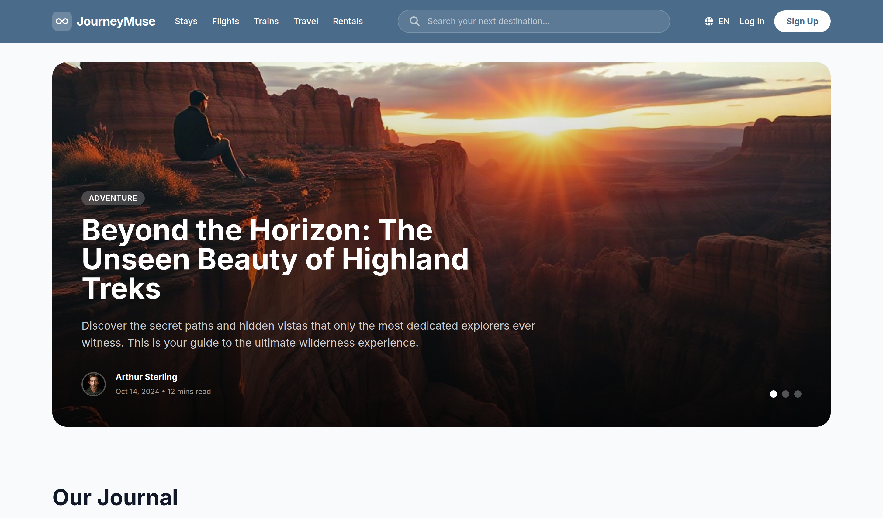
JourneyMuse
JourneyMuse is a polished travel blog template for destination stories, practical guides, adventure journals, and inspiring editorial content.
Download Codebase
Commercial License<!DOCTYPE html>
<html lang="en">
<head>
<script>
window.FontAwesomeConfig = {
autoReplaceSvg: 'nest'
};
</script>
<script src="https://cdnjs.cloudflare.com/ajax/libs/font-awesome/6.4.0/js/all.min.js" crossorigin="anonymous" referrerpolicy="no-referrer"></script>
<meta charset="UTF-8">
<meta name="viewport" content="width=device-width, initial-scale=1.0">
<title>JourneyMuse | Tailwind CSS Travel Blog Template</title>
<meta name="description" content="JourneyMuse is a polished Tailwind CSS travel blog template for destination stories, practical guides, adventure journals, and inspiring editorial content.">
<meta name="keywords" content="JourneyMuse, Tailwind CSS template, HTML website template, travel blog template, adventure journal, destination guides, responsive editorial design">
<meta name="author" content="Let's templates">
<link rel="canonical" href="">
<meta property="og:type" content="product">
<meta property="og:site_name" content="Let's templates">
<meta property="og:locale" content="en_US">
<meta property="og:url" content="">
<meta property="og:title" content="JourneyMuse | Tailwind CSS Travel Blog Template">
<meta property="og:description" content="A polished Tailwind CSS travel blog template for destination stories, practical guides, adventure journals, and inspiring editorial content.">
<meta property="og:image" content="">
<meta property="og:image:alt" content="JourneyMuse template preview">
<meta name="twitter:card" content="summary_large_image">
<meta name="twitter:url" content="">
<meta name="twitter:title" content="JourneyMuse | Tailwind CSS Travel Blog Template">
<meta name="twitter:description" content="A polished Tailwind CSS travel blog template for destination stories, practical guides, adventure journals, and inspiring editorial content.">
<meta name="twitter:image" content="">
<meta name="twitter:image:alt" content="JourneyMuse template preview">
<script src="https://cdn.tailwindcss.com"></script>
<link rel="stylesheet" href="https://cdnjs.cloudflare.com/ajax/libs/font-awesome/6.4.0/css/all.min.css">
<link href="https://fonts.googleapis.com/css2?family=Inter:wght@300;400;500;600;700&display=swap" rel="stylesheet">
<style>
@view-transition {
navigation: auto;
}
::view-transition-old(root) {
animation: 180ms ease-out both page-fade-out;
}
::view-transition-new(root) {
animation: 220ms ease-in both page-fade-in;
}
@keyframes page-fade-out {
to { opacity: 0; }
}
@keyframes page-fade-in {
from { opacity: 0; }
}
@media (prefers-reduced-motion: reduce) {
::view-transition-old(root),
::view-transition-new(root) {
animation: none;
}
}
body {
font-family: 'Inter', sans-serif;
}
.line-clamp-2 {
display: -webkit-box;
-webkit-line-clamp: 2;
-webkit-box-orient: vertical;
overflow: hidden;
}
</style>
</head>
<body class="bg-gray-50 text-gray-900">
<!-- block:start navbar -->
<nav id="header" class="bg-[#4a6b8a] text-white py-4 px-4 sm:px-6 lg:px-8">
<div class="max-w-7xl mx-auto flex flex-col md:flex-row items-center justify-between gap-4">
<div class="flex w-full flex-col items-center gap-4 lg:w-auto lg:flex-row lg:gap-8">
<a href="index.html" class="flex items-center gap-2">
<div class="w-8 h-8 bg-white/20 rounded-lg flex items-center justify-center">
<i class="fa-solid fa-infinity text-white"></i>
</div>
<span class="text-xl font-bold tracking-tight">JourneyMuse</span>
</a>
<div class="flex max-w-full items-center gap-6 overflow-x-auto whitespace-nowrap text-sm font-medium">
<a href="stays.html" class="hover:text-white/80 transition-colors">Stays</a>
<a href="flights.html" class="hover:text-white/80 transition-colors">Flights</a>
<a href="trains.html" class="hover:text-white/80 transition-colors">Trains</a>
<a href="travel.html" class="hover:text-white/80 transition-colors underline underline-offset-8">Travel</a>
<a href="rentals.html" class="hover:text-white/80 transition-colors">Rentals</a>
</div>
</div>
<div class="flex flex-1 max-w-md w-full relative">
<input type="text" placeholder="Search your next destination..." class="w-full bg-white/10 border border-white/20 rounded-full py-2 px-5 pl-12 text-sm focus:outline-none focus:ring-2 focus:ring-white/30 transition-all placeholder:text-white/60">
<i class="fa-solid fa-magnifying-glass absolute left-5 top-1/2 -translate-y-1/2 text-white/60"></i>
</div>
<div class="flex items-center gap-4">
<div class="hidden sm:flex items-center gap-2 text-sm font-medium">
<i class="fa-solid fa-globe"></i>
<span>EN</span>
</div>
<a href="#" class="text-sm font-medium hover:text-white/80">Log In</a>
<a href="#" class="bg-white text-[#4a6b8a] px-5 py-2 rounded-full text-sm font-bold hover:bg-gray-100 transition-colors">Sign Up</a>
</div>
</div>
</nav>
<!-- block:end navbar -->
<!-- block:start hero -->
<header id="hero" class="relative px-4 sm:px-6 lg:px-8 py-8">
<div data-hero-carousel aria-roledescription="carousel" aria-label="Featured travel stories" class="max-w-7xl mx-auto relative rounded-3xl overflow-hidden h-[500px] sm:h-[600px]">
<div data-hero-slide aria-hidden="false" class="absolute inset-0 transition-opacity duration-700 opacity-100">
<img class="absolute inset-0 w-full h-full object-cover" src="https://storage.googleapis.com/uxpilot-auth.appspot.com/gen_33c1bfafb6_67d6d1fd19f1de82.png" alt="Traveler overlooking red rock canyons at sunset" />
<div class="absolute inset-0 bg-gradient-to-t from-black/80 via-black/30 to-transparent"></div>
<div class="absolute bottom-0 left-0 p-8 sm:p-12 w-full">
<div class="max-w-3xl">
<span class="inline-block px-3 py-1 bg-white/20 backdrop-blur-md rounded-full text-white text-xs font-bold uppercase tracking-wider mb-4">Adventure</span>
<h1 class="text-3xl sm:text-4xl lg:text-5xl font-bold text-white mb-6 leading-tight">Beyond the Horizon: The Unseen Beauty of Highland Treks</h1>
<p class="text-white/80 text-lg mb-8 line-clamp-2">Discover the secret paths and hidden vistas that only the most dedicated explorers ever witness. This is your guide to the ultimate wilderness experience.</p>
<div class="flex items-center gap-4">
<img class="w-10 h-10 rounded-full border-2 border-white/30" src="https://storage.googleapis.com/uxpilot-auth.appspot.com/avatars/avatar-4.jpg" alt="Arthur Sterling" />
<div class="text-white">
<span class="block text-sm font-bold">Arthur Sterling</span>
<span class="text-xs text-white/60">Oct 14, 2024 • 12 mins read</span>
</div>
</div>
</div>
</div>
</div>
<div data-hero-slide aria-hidden="true" class="absolute inset-0 transition-opacity duration-700 opacity-0 pointer-events-none">
<img class="absolute inset-0 w-full h-full object-cover" src="https://storage.googleapis.com/uxpilot-auth.appspot.com/gen_267f86f764_73cd430d0dc6e00c.png" alt="Colorful Mediterranean market filled with spices and textiles" />
<div class="absolute inset-0 bg-gradient-to-t from-black/80 via-black/30 to-transparent"></div>
<div class="absolute bottom-0 left-0 p-8 sm:p-12 w-full">
<div class="max-w-3xl">
<span class="inline-block px-3 py-1 bg-white/20 backdrop-blur-md rounded-full text-white text-xs font-bold uppercase tracking-wider mb-4">Culture</span>
<h2 class="text-3xl sm:text-4xl lg:text-5xl font-bold text-white mb-6 leading-tight">The Spice Route: Flavors of the Mediterranean</h2>
<p class="text-white/80 text-lg mb-8 line-clamp-2">Follow the aromas of coastal markets and meet the cooks preserving generations of Mediterranean tradition.</p>
<div class="flex items-center gap-4">
<img class="w-10 h-10 rounded-full border-2 border-white/30" src="https://storage.googleapis.com/uxpilot-auth.appspot.com/avatars/avatar-2.jpg" alt="Julian Cross" />
<div class="text-white">
<span class="block text-sm font-bold">Julian Cross</span>
<span class="text-xs text-white/60">Oct 10, 2024 • 15 mins read</span>
</div>
</div>
</div>
</div>
</div>
<div data-hero-slide aria-hidden="true" class="absolute inset-0 transition-opacity duration-700 opacity-0 pointer-events-none">
<img class="absolute inset-0 w-full h-full object-cover" src="https://storage.googleapis.com/uxpilot-auth.appspot.com/gen_bf62e48b50_179e7dd367983ce4.png" alt="High-speed train crossing a snowy mountain landscape" />
<div class="absolute inset-0 bg-gradient-to-t from-black/80 via-black/30 to-transparent"></div>
<div class="absolute bottom-0 left-0 p-8 sm:p-12 w-full">
<div class="max-w-3xl">
<span class="inline-block px-3 py-1 bg-white/20 backdrop-blur-md rounded-full text-white text-xs font-bold uppercase tracking-wider mb-4">Slow Travel</span>
<h2 class="text-3xl sm:text-4xl lg:text-5xl font-bold text-white mb-6 leading-tight">The Quiet Magic of Crossing Europe by Rail</h2>
<p class="text-white/80 text-lg mb-8 line-clamp-2">Trade airport queues for panoramic windows and rediscover the landscapes between Europe’s great cities.</p>
<div class="flex items-center gap-4">
<img class="w-10 h-10 rounded-full border-2 border-white/30" src="https://storage.googleapis.com/uxpilot-auth.appspot.com/avatars/avatar-5.jpg" alt="Leo Sterling" />
<div class="text-white">
<span class="block text-sm font-bold">Leo Sterling</span>
<span class="text-xs text-white/60">Oct 05, 2024 • 6 mins read</span>
</div>
</div>
</div>
</div>
</div>
<div class="absolute bottom-8 right-8 sm:bottom-12 sm:right-12 z-10 flex gap-2" aria-label="Choose featured story">
<button type="button" data-hero-dot aria-label="Show story 1" aria-current="true" class="w-3 h-3 rounded-full bg-white transition-colors"></button>
<button type="button" data-hero-dot aria-label="Show story 2" aria-current="false" class="w-3 h-3 rounded-full bg-white/30 transition-colors hover:bg-white/60"></button>
<button type="button" data-hero-dot aria-label="Show story 3" aria-current="false" class="w-3 h-3 rounded-full bg-white/30 transition-colors hover:bg-white/60"></button>
</div>
</div>
</header>
<script>
document.querySelectorAll('[data-hero-carousel]').forEach((carousel) => {
const slides = Array.from(carousel.querySelectorAll('[data-hero-slide]'));
const dots = Array.from(carousel.querySelectorAll('[data-hero-dot]'));
const reduceMotion = window.matchMedia('(prefers-reduced-motion: reduce)').matches;
let activeIndex = 0;
let rotation;
const showSlide = (index) => {
activeIndex = (index + slides.length) % slides.length;
slides.forEach((slide, slideIndex) => {
const isActive = slideIndex === activeIndex;
slide.classList.toggle('opacity-100', isActive);
slide.classList.toggle('opacity-0', !isActive);
slide.classList.toggle('pointer-events-none', !isActive);
slide.setAttribute('aria-hidden', String(!isActive));
});
dots.forEach((dot, dotIndex) => {
const isActive = dotIndex === activeIndex;
dot.classList.toggle('bg-white', isActive);
dot.classList.toggle('bg-white/30', !isActive);
dot.setAttribute('aria-current', String(isActive));
});
};
const stopRotation = () => window.clearInterval(rotation);
const startRotation = () => {
if (reduceMotion) return;
stopRotation();
rotation = window.setInterval(() => showSlide(activeIndex + 1), 6000);
};
dots.forEach((dot, index) => dot.addEventListener('click', () => {
showSlide(index);
startRotation();
}));
carousel.addEventListener('mouseenter', stopRotation);
carousel.addEventListener('mouseleave', startRotation);
carousel.addEventListener('focusin', stopRotation);
carousel.addEventListener('focusout', startRotation);
carousel.addEventListener('keydown', (event) => {
if (event.key === 'ArrowLeft') showSlide(activeIndex - 1);
if (event.key === 'ArrowRight') showSlide(activeIndex + 1);
});
startRotation();
});
</script>
<!-- block:end hero -->
<!-- block:start blog -->
<section id="blog" class="px-4 sm:px-6 lg:px-8 py-16">
<div class="max-w-7xl mx-auto">
<div class="mb-12">
<h2 class="text-4xl font-bold text-gray-900 mb-2">Our Journal</h2>
<p class="text-gray-500 max-w-2xl">Fuel your wanderlust with curated stories, practical guides, and breathtaking snapshots from the most remarkable corners of the globe.</p>
</div>
<!-- Filters -->
<div class="flex flex-col sm:flex-row justify-between items-start sm:items-center gap-6 mb-12 border-b border-gray-200 pb-6">
<div class="flex flex-wrap gap-2" aria-label="Filter journal posts">
<button type="button" data-blog-filter="all" aria-pressed="true" class="px-5 py-2 rounded-full bg-[#4a6b8a] text-white text-sm font-bold transition-colors">All</button>
<button type="button" data-blog-filter="destinations" aria-pressed="false" class="px-5 py-2 rounded-full hover:bg-gray-100 text-gray-600 text-sm font-medium transition-colors">Destinations</button>
<button type="button" data-blog-filter="gastronomy" aria-pressed="false" class="px-5 py-2 rounded-full hover:bg-gray-100 text-gray-600 text-sm font-medium transition-colors">Gastronomy</button>
<button type="button" data-blog-filter="lifestyle" aria-pressed="false" class="px-5 py-2 rounded-full hover:bg-gray-100 text-gray-600 text-sm font-medium transition-colors">Lifestyle</button>
<button type="button" data-blog-filter="travel-hacks" aria-pressed="false" class="px-5 py-2 rounded-full hover:bg-gray-100 text-gray-600 text-sm font-medium transition-colors">Travel Hacks</button>
</div>
<div class="flex items-center gap-3">
<span class="text-sm text-gray-400">Sort by:</span>
<button class="flex items-center gap-2 text-sm font-bold border border-gray-200 rounded-lg px-4 py-2 hover:bg-white transition-colors">
Latest First
<i class="fa-solid fa-chevron-down text-[10px]"></i>
</button>
</div>
</div>
<!-- Grid -->
<div data-blog-grid class="grid grid-cols-1 md:grid-cols-2 lg:grid-cols-3 gap-x-8 gap-y-16">
<!-- Card 1 -->
<article data-blog-category="destinations">
<a href="blog-post.html" class="group block cursor-pointer">
<div class="relative rounded-2xl overflow-hidden mb-6 h-64">
<img class="w-full h-full object-cover transition-transform duration-500 group-hover:scale-110" src="https://storage.googleapis.com/uxpilot-auth.appspot.com/gen_3d8b989939_173ef9971ff06185.png" alt="serene lakeside mountain range reflecting in calm water, sunrise lighting" />
<span class="absolute top-4 left-4 px-3 py-1 bg-white/20 backdrop-blur-md rounded-full text-white text-[10px] font-bold uppercase tracking-wider">Nature</span>
</div>
<div class="space-y-3">
<div class="text-xs font-semibold text-gray-400">Oct 12, 2024 • 8 mins read</div>
<h3 class="text-xl font-bold leading-tight group-hover:text-[#4a6b8a] transition-colors">Chasing the Aurora: A Guide to Nordic Nights</h3>
<p class="text-gray-500 text-sm line-clamp-2">Everything you need to know about witnessing the northern lights, from the best viewing spots to camera settings for perfect captures.</p>
<div class="flex items-center gap-3 pt-2">
<img class="w-8 h-8 rounded-full" src="https://storage.googleapis.com/uxpilot-auth.appspot.com/avatars/avatar-1.jpg" alt="Author" />
<span class="text-sm font-semibold text-gray-700">Elara Thorne</span>
</div>
</div>
</a>
</article>
<!-- Card 2 -->
<article data-blog-category="gastronomy">
<a href="blog-post.html" class="group block cursor-pointer">
<div class="relative rounded-2xl overflow-hidden mb-6 h-64">
<img class="w-full h-full object-cover transition-transform duration-500 group-hover:scale-110" src="https://storage.googleapis.com/uxpilot-auth.appspot.com/gen_267f86f764_73cd430d0dc6e00c.png" alt="busy mediterranean street market with colorful spices and textiles" />
<span class="absolute top-4 left-4 px-3 py-1 bg-white/20 backdrop-blur-md rounded-full text-white text-[10px] font-bold uppercase tracking-wider">Culture</span>
</div>
<div class="space-y-3">
<div class="text-xs font-semibold text-gray-400">Oct 10, 2024 • 15 mins read</div>
<h3 class="text-xl font-bold leading-tight group-hover:text-[#4a6b8a] transition-colors">The Spice Route: Flavors of the Mediterranean</h3>
<p class="text-gray-500 text-sm line-clamp-2">Embark on a culinary journey across coastal markets, uncovering the ancient spices that define world-class Mediterranean cuisine.</p>
<div class="flex items-center gap-3 pt-2">
<img class="w-8 h-8 rounded-full" src="https://storage.googleapis.com/uxpilot-auth.appspot.com/avatars/avatar-2.jpg" alt="Author" />
<span class="text-sm font-semibold text-gray-700">Julian Cross</span>
</div>
</div>
</a>
</article>
<!-- Card 3 -->
<article data-blog-category="lifestyle">
<a href="blog-post.html" class="group block cursor-pointer">
<div class="relative rounded-2xl overflow-hidden mb-6 h-64">
<img class="w-full h-full object-cover transition-transform duration-500 group-hover:scale-110" src="https://storage.googleapis.com/uxpilot-auth.appspot.com/gen_3aca99feb2_01c3ea07b2d524e0.png" alt="sleek digital nomad setup with laptop and coffee overlooking a tropical beach" />
<span class="absolute top-4 left-4 px-3 py-1 bg-white/20 backdrop-blur-md rounded-full text-white text-[10px] font-bold uppercase tracking-wider">Work/Life</span>
</div>
<div class="space-y-3">
<div class="text-xs font-semibold text-gray-400">Oct 08, 2024 • 10 mins read</div>
<h3 class="text-xl font-bold leading-tight group-hover:text-[#4a6b8a] transition-colors">Remote Freedom: Working from the Tropics</h3>
<p class="text-gray-500 text-sm line-clamp-2">How to balance professional productivity with the ultimate island lifestyle. Tips on connectivity, community, and co-working spaces.</p>
<div class="flex items-center gap-3 pt-2">
<img class="w-8 h-8 rounded-full" src="https://storage.googleapis.com/uxpilot-auth.appspot.com/avatars/avatar-3.jpg" alt="Author" />
<span class="text-sm font-semibold text-gray-700">Sophia Lane</span>
</div>
</div>
</a>
</article>
<!-- Card 4 -->
<article data-blog-category="travel-hacks">
<a href="blog-post.html" class="group block cursor-pointer">
<div class="relative rounded-2xl overflow-hidden mb-6 h-64">
<img class="w-full h-full object-cover transition-transform duration-500 group-hover:scale-110" src="https://storage.googleapis.com/uxpilot-auth.appspot.com/gen_bf62e48b50_179e7dd367983ce4.png" alt="minimalist high-speed train cutting through a snowy mountain landscape" />
<span class="absolute top-4 left-4 px-3 py-1 bg-white/20 backdrop-blur-md rounded-full text-white text-[10px] font-bold uppercase tracking-wider">Transport</span>
</div>
<div class="space-y-3">
<div class="text-xs font-semibold text-gray-400">Oct 05, 2024 • 6 mins read</div>
<h3 class="text-xl font-bold leading-tight group-hover:text-[#4a6b8a] transition-colors">Slow Travel: The Magic of Rail Journeys</h3>
<p class="text-gray-500 text-sm line-clamp-2">Rediscover the romance of the rails. Why taking the train is the best way to soak in the changing landscapes of continental Europe.</p>
<div class="flex items-center gap-3 pt-2">
<img class="w-8 h-8 rounded-full" src="https://storage.googleapis.com/uxpilot-auth.appspot.com/avatars/avatar-5.jpg" alt="Author" />
<span class="text-sm font-semibold text-gray-700">Leo Sterling</span>
</div>
</div>
</a>
</article>
<!-- Card 5 -->
<article data-blog-category="travel-hacks">
<a href="blog-post.html" class="group block cursor-pointer">
<div class="relative rounded-2xl overflow-hidden mb-6 h-64">
<img class="w-full h-full object-cover transition-transform duration-500 group-hover:scale-110" src="https://storage.googleapis.com/uxpilot-auth.appspot.com/gen_dd9cced0fe_082058f16dcadb4d.png" alt="organized travel backpack with camera gear and maps on a wooden floor" />
<span class="absolute top-4 left-4 px-3 py-1 bg-white/20 backdrop-blur-md rounded-full text-white text-[10px] font-bold uppercase tracking-wider">Hacks</span>
</div>
<div class="space-y-3">
<div class="text-xs font-semibold text-gray-400">Oct 03, 2024 • 12 mins read</div>
<h3 class="text-xl font-bold leading-tight group-hover:text-[#4a6b8a] transition-colors">Minimalist Packing for Global Adventures</h3>
<p class="text-gray-500 text-sm line-clamp-2">The ultimate checklist for traveling light without missing the essentials. Master the art of the carry-on for any climate.</p>
<div class="flex items-center gap-3 pt-2">
<img class="w-8 h-8 rounded-full" src="https://storage.googleapis.com/uxpilot-auth.appspot.com/avatars/avatar-6.jpg" alt="Author" />
<span class="text-sm font-semibold text-gray-700">Mia Sato</span>
</div>
</div>
</a>
</article>
<!-- Card 6 -->
<article data-blog-category="destinations">
<a href="blog-post.html" class="group block cursor-pointer">
<div class="relative rounded-2xl overflow-hidden mb-6 h-64">
<img class="w-full h-full object-cover transition-transform duration-500 group-hover:scale-110" src="https://storage.googleapis.com/uxpilot-auth.appspot.com/gen_99ffee4161_0d36c38250d426a0.png" alt="ancient stone temple ruins overgrown with tropical vines in the jungle" />
<span class="absolute top-4 left-4 px-3 py-1 bg-white/20 backdrop-blur-md rounded-full text-white text-[10px] font-bold uppercase tracking-wider">History</span>
</div>
<div class="space-y-3">
<div class="text-xs font-semibold text-gray-400">Oct 01, 2024 • 20 mins read</div>
<h3 class="text-xl font-bold leading-tight group-hover:text-[#4a6b8a] transition-colors">Echoes of the Past: Forgotten Jungle Cities</h3>
<p class="text-gray-500 text-sm line-clamp-2">Deep inside the rainforests of Southeast Asia lie ruins that tell stories of civilizations lost to time. A trek into history.</p>
<div class="flex items-center gap-3 pt-2">
<img class="w-8 h-8 rounded-full" src="https://storage.googleapis.com/uxpilot-auth.appspot.com/avatars/avatar-7.jpg" alt="Author" />
<span class="text-sm font-semibold text-gray-700">Oliver West</span>
</div>
</div>
</a>
</article>
</div>
<!-- Pagination -->
<div class="mt-16 flex justify-center">
<div class="flex items-center gap-2">
<button class="w-10 h-10 flex items-center justify-center rounded-lg border border-gray-200 hover:bg-gray-100 transition-colors">
<i class="fa-solid fa-chevron-left text-sm"></i>
</button>
<button class="w-10 h-10 flex items-center justify-center rounded-lg bg-[#4a6b8a] text-white font-bold">1</button>
<button class="w-10 h-10 flex items-center justify-center rounded-lg border border-gray-200 hover:bg-gray-100 transition-colors">2</button>
<button class="w-10 h-10 flex items-center justify-center rounded-lg border border-gray-200 hover:bg-gray-100 transition-colors">3</button>
<button class="w-10 h-10 flex items-center justify-center rounded-lg border border-gray-200 hover:bg-gray-100 transition-colors">4</button>
<button class="w-10 h-10 flex items-center justify-center rounded-lg border border-gray-200 hover:bg-gray-100 transition-colors">5</button>
<button class="w-10 h-10 flex items-center justify-center rounded-lg border border-gray-200 hover:bg-gray-100 transition-colors">
<i class="fa-solid fa-chevron-right text-sm"></i>
</button>
</div>
</div>
</div>
</section>
<!-- block:end blog -->
<script>
document.querySelectorAll('[data-blog-grid]').forEach((grid) => {
const section = grid.closest('section');
const filters = section.querySelectorAll('[data-blog-filter]');
const posts = grid.querySelectorAll('[data-blog-category]');
const inactiveClasses = ['text-gray-600', 'font-medium', 'hover:bg-gray-100'];
filters.forEach((button) => {
button.addEventListener('click', () => {
const selectedCategory = button.dataset.blogFilter;
filters.forEach((filter) => {
const isActive = filter === button;
filter.setAttribute('aria-pressed', String(isActive));
filter.classList.toggle('bg-[#4a6b8a]', isActive);
filter.classList.toggle('text-white', isActive);
filter.classList.toggle('font-bold', isActive);
inactiveClasses.forEach((className) => filter.classList.toggle(className, !isActive));
});
posts.forEach((post) => {
post.hidden = selectedCategory !== 'all' && post.dataset.blogCategory !== selectedCategory;
});
});
});
});
</script>
<!-- block:start cta -->
<section id="promo" class="px-4 sm:px-6 lg:px-8 pb-24">
<div class="max-w-7xl mx-auto">
<div class="grid grid-cols-1 lg:grid-cols-12 gap-8">
<!-- Left Promo Card -->
<div class="lg:col-span-4 relative rounded-3xl overflow-hidden min-h-[400px] flex flex-col justify-between p-10 group">
<img class="absolute inset-0 w-full h-full object-cover transition-transform duration-700 group-hover:scale-105" src="https://storage.googleapis.com/uxpilot-auth.appspot.com/gen_ee0d4e5e17_661bdbfaf92fdd03.png" alt="modern architectural hotel villa with glass walls overlooking a foggy valley" />
<div class="absolute inset-0 bg-black/40"></div>
<div class="relative z-10">
<div class="w-12 h-12 bg-white/20 backdrop-blur-md rounded-2xl flex items-center justify-center mb-6">
<i class="fa-solid fa-bed text-white"></i>
</div>
<h3 class="text-3xl font-bold text-white mb-4">Elevate your stay experience</h3>
<p class="text-white/80 text-sm">Curated luxury accommodations that redefine what it means to be away from home.</p>
</div>
<div class="relative z-10">
<button class="bg-white text-[#4a6b8a] px-6 py-3 rounded-xl font-bold text-sm flex items-center gap-2 hover:bg-gray-100 transition-all">
Book Your Retreat
<i class="fa-solid fa-arrow-right"></i>
</button>
</div>
</div>
<!-- Right Promo Card -->
<div class="lg:col-span-8 flex flex-col gap-8">
<!-- Large Background Text Card -->
<div class="relative rounded-3xl overflow-hidden flex-1 min-h-[300px] flex items-center justify-center group">
<img class="absolute inset-0 w-full h-full object-cover transition-transform duration-700 group-hover:scale-105" src="https://storage.googleapis.com/uxpilot-auth.appspot.com/gen_171fb79234_096bd6318351118f.png" alt="top view of a coastal road winding along white cliffs and turquoise water, bright daylight" />
<div class="absolute inset-0 bg-black/20"></div>
<h2 class="relative z-10 text-3xl sm:text-4xl md:text-5xl font-black text-white text-center px-8 leading-tight drop-shadow-lg">
CRAFTING MEMORIES THAT<br>LAST A LIFETIME
</h2>
</div>
<!-- Counter Block -->
<div class="relative rounded-3xl overflow-hidden h-32 flex items-center p-8 group">
<img class="absolute inset-0 w-full h-full object-cover grayscale opacity-30 group-hover:opacity-50 transition-opacity" src="https://storage.googleapis.com/uxpilot-auth.appspot.com/gen_a8a241e045_c175ede7204cb362.png" alt="aerial view of a cyclist traveling on a long straight desert road" />
<div class="absolute inset-0 bg-[#4a6b8a]/90"></div>
<div class="relative z-10 flex items-center justify-between w-full">
<div>
<span class="block text-white/60 text-xs font-bold uppercase tracking-[0.2em] mb-1">Guides Released</span>
<span class="text-4xl font-black text-white">1,248</span>
</div>
<i class="fa-solid fa-map-location-dot text-4xl text-white/20"></i>
</div>
</div>
</div>
</div>
</div>
</section>
<!-- block:end cta -->
<!-- block:start footer -->
<footer id="footer" class="bg-white border-t border-gray-100 pt-20 pb-12 px-4 sm:px-6 lg:px-8">
<div class="max-w-7xl mx-auto">
<div class="grid grid-cols-1 md:grid-cols-2 lg:grid-cols-4 gap-12 mb-16">
<!-- Branding -->
<div class="space-y-6">
<a href="index.html" class="flex items-center gap-2">
<div class="w-8 h-8 bg-[#4a6b8a] rounded-lg flex items-center justify-center text-white">
<i class="fa-solid fa-infinity"></i>
</div>
<span class="text-xl font-bold tracking-tight">JourneyMuse</span>
</a>
<p class="text-gray-500 text-sm leading-relaxed">Our mission is to empower global explorers with sustainable tools, expert insights, and seamless planning for every journey.</p>
</div>
<!-- Links -->
<div>
<h4 class="text-sm font-bold uppercase tracking-widest text-gray-400 mb-6">Company</h4>
<ul class="space-y-4 text-sm font-medium text-gray-600">
<li><a href="#" class="hover:text-[#4a6b8a] transition-colors">About Our Story</a></li>
<li><a href="#" class="hover:text-[#4a6b8a] transition-colors underline decoration-2 decoration-[#4a6b8a] underline-offset-4">The Journal</a></li>
<li><a href="#" class="hover:text-[#4a6b8a] transition-colors">Careers</a></li>
<li><a href="#" class="hover:text-[#4a6b8a] transition-colors">Partnerships</a></li>
</ul>
</div>
<!-- Support -->
<div>
<h4 class="text-sm font-bold uppercase tracking-widest text-gray-400 mb-6">Explore</h4>
<ul class="space-y-4 text-sm font-medium text-gray-600">
<li><a href="#" class="hover:text-[#4a6b8a] transition-colors">Destination Guides</a></li>
<li><a href="#" class="hover:text-[#4a6b8a] transition-colors">Luxury Collection</a></li>
<li><a href="#" class="hover:text-[#4a6b8a] transition-colors">Help Center</a></li>
<li><a href="#" class="hover:text-[#4a6b8a] transition-colors">Privacy Policy</a></li>
</ul>
</div>
<!-- Newsletter -->
<div class="space-y-6">
<h4 class="text-sm font-bold uppercase tracking-widest text-gray-400 mb-6">Stay Inspired</h4>
<div class="relative">
<input type="email" placeholder="Email address" class="w-full bg-gray-50 border border-gray-200 rounded-xl py-3 px-4 pr-24 text-sm focus:outline-none focus:ring-2 focus:ring-[#4a6b8a]/20">
<button class="absolute right-1 top-1 bottom-1 bg-[#4a6b8a] text-white px-4 rounded-lg text-xs font-bold hover:bg-[#3a5b7a] transition-colors">Join</button>
</div>
<div class="flex gap-4 pt-2">
<a href="#" class="w-8 h-8 rounded-full bg-gray-50 flex items-center justify-center text-gray-400 hover:bg-[#4a6b8a] hover:text-white transition-all"><i class="fa-brands fa-instagram text-xs"></i></a>
<a href="#" class="w-8 h-8 rounded-full bg-gray-50 flex items-center justify-center text-gray-400 hover:bg-[#4a6b8a] hover:text-white transition-all"><i class="fa-brands fa-x-twitter text-xs"></i></a>
<a href="#" class="w-8 h-8 rounded-full bg-gray-50 flex items-center justify-center text-gray-400 hover:bg-[#4a6b8a] hover:text-white transition-all"><i class="fa-brands fa-facebook-f text-xs"></i></a>
<a href="#" class="w-8 h-8 rounded-full bg-gray-50 flex items-center justify-center text-gray-400 hover:bg-[#4a6b8a] hover:text-white transition-all"><i class="fa-brands fa-youtube text-xs"></i></a>
</div>
</div>
</div>
<div class="pt-8 border-t border-gray-100 flex flex-col sm:flex-row justify-between items-center gap-4 text-xs font-medium text-gray-400">
<p>© 2024 JourneyMuse. All rights reserved.</p>
<div class="flex gap-6">
<a href="#" class="hover:text-gray-600 transition-colors">Privacy</a>
<a href="#" class="hover:text-gray-600 transition-colors">Terms</a>
<a href="#" class="hover:text-gray-600 transition-colors">Cookie Policy</a>
</div>
</div>
</div>
</footer>
<!-- block:end footer -->
</body>
</html>
Unlimited access to all templates
Unlock our entire library of premium UI kits, dashboards, and landing pages. Renews automatically, cancel anytime.
€20
/ 3 months
or €60 / year
Get Unlimited Access