Free
0
323
Bold Horizon
By Jonah Hale
Bold Horizon is a bold consulting template for business transformation firms, case studies, leadership insights, and corporate strategy teams.
Download Codebase
Commercial License<!DOCTYPE html>
<html lang="en">
<head>
<script>
window.FontAwesomeConfig = {
autoReplaceSvg: 'nest'
};
</script>
<script src="https://cdnjs.cloudflare.com/ajax/libs/font-awesome/6.4.0/js/all.min.js" crossorigin="anonymous" referrerpolicy="no-referrer"></script>
<meta charset="UTF-8">
<meta name="viewport" content="width=device-width, initial-scale=1.0">
<title>Bold Horizon | Tailwind CSS Business Transformation Template</title>
<meta name="description" content="Bold Horizon is a bold Tailwind CSS consulting template for business transformation firms, case studies, leadership insights, and corporate strategy teams.">
<meta name="keywords" content="Bold Horizon, Tailwind CSS template, HTML website template, business transformation, management consulting, case study landing page, responsive corporate design">
<meta name="author" content="Let's templates">
<link rel="canonical" href="">
<meta property="og:type" content="product">
<meta property="og:site_name" content="Let's templates">
<meta property="og:locale" content="en_US">
<meta property="og:url" content="">
<meta property="og:title" content="Bold Horizon | Tailwind CSS Business Transformation Template">
<meta property="og:description" content="A bold Tailwind CSS consulting template for business transformation firms, case studies, leadership insights, and corporate strategy teams.">
<meta property="og:image" content="">
<meta property="og:image:alt" content="Bold Horizon template preview">
<meta name="twitter:card" content="summary_large_image">
<meta name="twitter:url" content="">
<meta name="twitter:title" content="Bold Horizon | Tailwind CSS Business Transformation Template">
<meta name="twitter:description" content="A bold Tailwind CSS consulting template for business transformation firms, case studies, leadership insights, and corporate strategy teams.">
<meta name="twitter:image" content="">
<meta name="twitter:image:alt" content="Bold Horizon template preview">
<script src="https://cdn.tailwindcss.com/3.4.17"></script>
<link rel="stylesheet" href="https://cdnjs.cloudflare.com/ajax/libs/font-awesome/6.0.0/css/all.min.css">
<link href="https://fonts.googleapis.com/css2?family=Archivo:wght@400;700;900&family=Inter:wght@300;400;500&display=swap" rel="stylesheet">
<style>
html {
overflow-x: hidden;
}
body {
font-family: 'Inter', sans-serif;
background-color: #ffffff;
color: #000000;
overflow-x: hidden;
}
h1, h2, h3, .font-bold-title {
font-family: 'Archivo', sans-serif;
text-transform: uppercase;
}
.text-huge {
font-size: clamp(2.75rem, 11vw, 18rem);
line-height: 0.85;
letter-spacing: -0.04em;
}
.text-mega {
font-size: clamp(2rem, 7.5vw, 8rem);
line-height: 0.92;
letter-spacing: -0.03em;
}
.hide-scrollbar::-webkit-scrollbar {
display: none;
}
.hide-scrollbar {
-ms-overflow-style: none;
scrollbar-width: none;
}
</style>
</head>
<body class="antialiased overflow-x-hidden">
<!-- block:start hero -->
<section id="hero" class="pt-6 sm:pt-10 overflow-hidden">
<div class="px-4 sm:px-6 md:px-12 max-w-full">
<h1 class="text-huge font-black mb-6 sm:mb-10 text-center break-words px-1">BOLD HORIZON</h1>
<div class="relative w-full max-w-full h-[320px] sm:h-[420px] md:h-[700px] overflow-hidden mb-8 sm:mb-12 rounded-xl md:rounded-none">
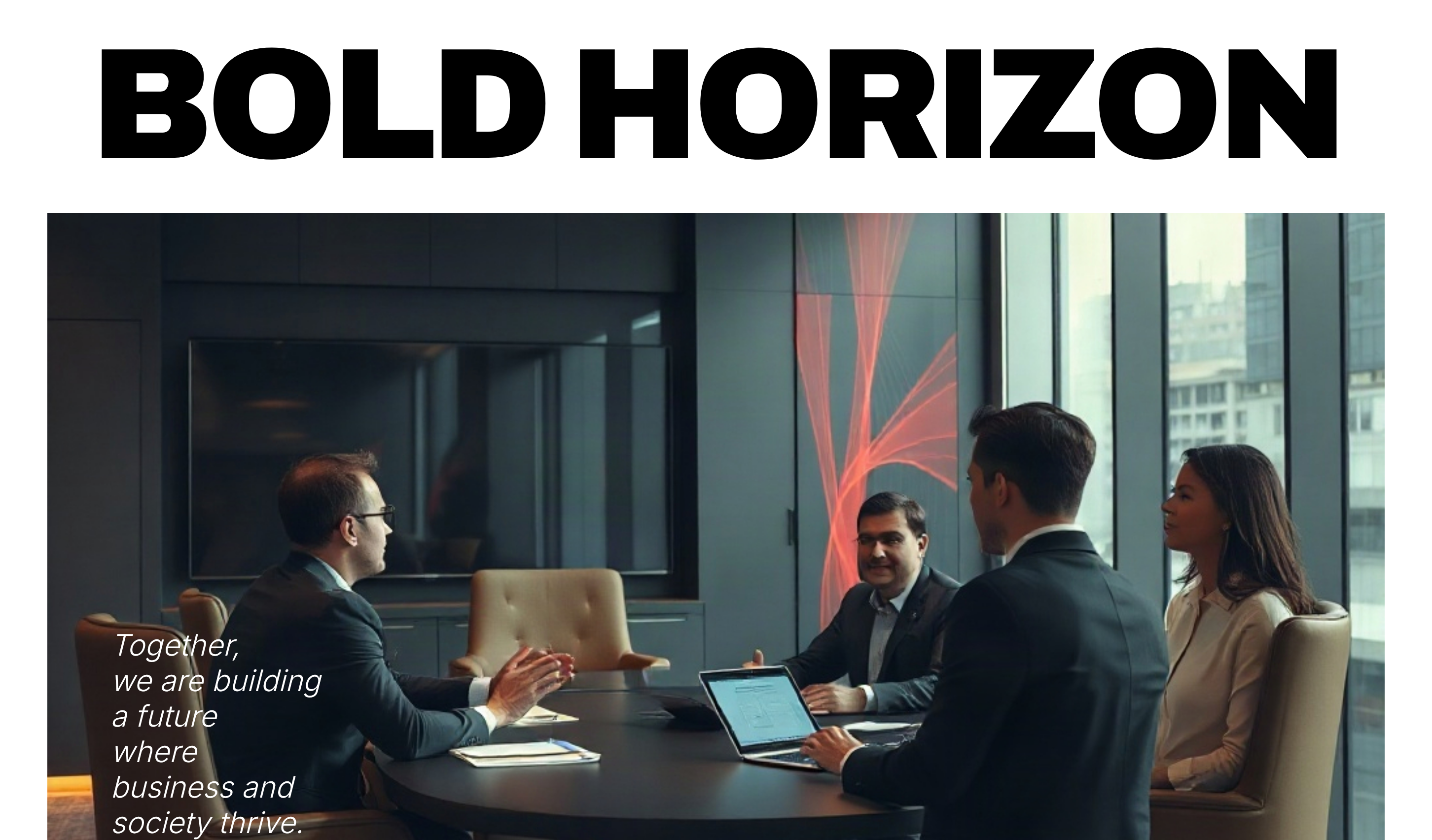
<img class="w-full h-full object-cover" src="https://storage.googleapis.com/uxpilot-auth.appspot.com/gen_263b578d49_9e3945c3a3b9198c.png" alt="corporate boardroom meeting with professionals discussing strategy, high-end office interior, cinema" />
<div class="absolute inset-0 flex flex-col justify-end p-5 sm:p-8 md:p-16">
<p class="text-white text-base sm:text-xl md:text-3xl max-w-xl font-light italic leading-tight">
Together,<br>we are building<br>a future<br>where<br>business and<br>society thrive.
</p>
</div>
</div>
<div class="border-t border-b border-black py-4 sm:py-6 text-[10px] uppercase font-bold tracking-widest">
<div class="flex flex-col sm:flex-row sm:items-center sm:justify-between gap-4">
<div class="flex flex-wrap items-center justify-center sm:justify-start gap-x-2 gap-y-1">
<span>EST. 2004</span>
<span class="opacity-30 hidden sm:inline">•</span>
<span>LOS ANGELES, CA</span>
</div>
<div class="flex items-center justify-center sm:justify-end gap-3">
<a href="#ask-us" class="bg-black text-white px-5 sm:px-6 py-2 rounded-full hover:bg-neutral-800 transition-colors whitespace-nowrap">Book a Call</a>
<button
id="hero-menu-button"
type="button"
class="md:hidden w-10 h-10 rounded-full border border-black/20 flex items-center justify-center shrink-0"
aria-label="Open navigation"
aria-expanded="false"
aria-controls="hero-navigation"
>
<span id="hero-menu-icon-open" aria-hidden="true"><i class="fa-solid fa-bars text-sm"></i></span>
<span id="hero-menu-icon-close" class="hidden" aria-hidden="true"><i class="fa-solid fa-xmark text-sm"></i></span>
</button>
</div>
</div>
<nav
id="hero-navigation"
class="hidden md:flex flex-col md:flex-row flex-wrap justify-center gap-3 md:gap-10 mt-4 md:mt-6 pt-4 md:pt-0 border-t md:border-t-0 border-black/10 text-center md:text-left"
aria-label="Primary navigation"
>
<a href="#case-study" class="hover:opacity-50 transition-opacity">Industries</a>
<a href="#support" class="hover:opacity-50 transition-opacity">Capabilities</a>
<a href="#content-grid" class="hover:opacity-50 transition-opacity">Our Insights</a>
<a href="#footer" class="hover:opacity-50 transition-opacity">Locations</a>
<a href="#footer" class="hover:opacity-50 transition-opacity">Careers</a>
<a href="#podcast" class="hover:opacity-50 transition-opacity">About Us</a>
</nav>
</div>
</div>
</section>
<!-- block:end hero -->
<!-- block:start features -->
<section id="case-study" class="py-16 md:py-32 bg-[#f9f9f9] overflow-hidden">
<div class="max-w-7xl mx-auto px-4 sm:px-6">
<div class="text-center mb-10 md:mb-16">
<span class="text-xs font-bold uppercase tracking-widest mb-4 block">New Transformation Case</span>
<h2 class="text-mega font-black px-2">Transforming<br>Together</h2>
</div>
<div class="grid grid-cols-1 md:grid-cols-12 gap-8 md:gap-12 items-center">
<div class="md:col-span-3 space-y-4 order-2 md:order-1">
<div class="text-2xl font-black">JUN, 2022</div>
<div class="text-[10px] font-bold uppercase tracking-widest border-b border-black pb-2">Project Kickoff</div>
<p class="text-xs leading-relaxed text-neutral-600">
Cocoon Retail Group, a global retail company, was struggling with declining profitability due to outdated digital infrastructure and fragmented data systems. Their operations lacked transparency, decision-making was slow, and employees were unable to access reliable insights in real time.
</p>
</div>
<div class="md:col-span-6 relative aspect-[3/4] overflow-hidden order-1 md:order-2">
<img class="w-full h-full object-cover grayscale" src="https://storage.googleapis.com/uxpilot-auth.appspot.com/gen_27ffef5a52_7c10caed4f7c2276.png" alt="two male professionals in stylish suits standing together, minimal high-fashion photography style" />
<div class="absolute bottom-6 sm:bottom-8 left-0 right-0 text-center px-4">
<div class="text-white text-xl sm:text-2xl font-black italic">COCOON</div>
<div class="text-white text-[10px] uppercase tracking-[0.25em] sm:tracking-[0.4em]">Retail Group</div>
</div>
</div>
<div class="md:col-span-3 space-y-4 text-left md:text-right order-3">
<div class="text-2xl font-black">NOV, 2022</div>
<div class="text-[10px] font-bold uppercase tracking-widest border-b border-black pb-2">Project Completion</div>
<p class="text-xs leading-relaxed text-neutral-600">
As a result of the transformation, Cocoon Retail Group achieved greater efficiency across all business operations and significantly improved transparency in decision-making. The new digital ecosystem allowed teams to collaborate more effectively and rely on accurate, real-time insights.
</p>
</div>
</div>
<div class="max-w-3xl mx-auto text-center mt-12 md:mt-24 px-2">
<p class="text-lg sm:text-xl md:text-2xl italic font-light leading-relaxed mb-8 md:mb-12">
After implementing a streamlined digital ecosystem, BrightMart gained real-time visibility across all operations, reduced costs by 18%, and accelerated decision-making. At the same time, the company introduced a sustainability framework that cut carbon emissions by 25% within the first year.
</p>
<a href="#" class="bg-black text-white px-8 py-3 rounded-full text-[10px] uppercase font-bold tracking-widest hover:bg-neutral-800 transition-colors">More Cases</a>
</div>
</div>
</section>
<!-- block:end features -->
<!-- block:start gallery -->
<section id="more-cases" class="py-12 md:py-20 overflow-hidden">
<div class="max-w-5xl mx-auto px-4 sm:px-6">
<div class="grid grid-cols-1 md:grid-cols-2 gap-12 md:gap-20">
<div class="space-y-6 md:space-y-8">
<div class="aspect-[4/5] overflow-hidden relative rounded-xl md:rounded-none">
<img class="w-full h-full object-cover" src="https://storage.googleapis.com/uxpilot-auth.appspot.com/gen_a6bb8a9354_c60b8eaba460a8b1.png" alt="lifestyle shot of a professional woman working in a modern cafe, editorial style" />
<div class="absolute inset-0 flex items-center justify-center">
<span class="text-white text-4xl sm:text-5xl font-black italic">Soli</span>
</div>
</div>
<p class="text-xs leading-relaxed text-neutral-500">
Through a complete digital transformation, Soli streamlined its operations, improved efficiency, and eliminated costly bottlenecks. By introducing data-driven decision-making and modern customer engagement tools, the company unlocked new revenue streams and strengthened long-term profitability.
</p>
</div>
<div class="space-y-6 md:space-y-8">
<div class="aspect-[4/5] overflow-hidden relative rounded-xl md:rounded-none">
<img class="w-full h-full object-cover" src="https://storage.googleapis.com/uxpilot-auth.appspot.com/gen_3d1e962d21_74e113399c279d32.png" alt="high-end artisanal bakery shop interior, minimal design" />
<div class="absolute inset-0 flex items-center justify-center px-4 text-center">
<span class="text-white text-3xl sm:text-4xl font-black italic">Crust &<br>Crème</span>
</div>
</div>
<p class="text-xs leading-relaxed text-neutral-500">
By optimizing supply chain processes and introducing smarter digital tools, Crust & Crème improved efficiency across its bakery operations. The company reduced waste, enhanced customer experience, and created a solid foundation for sustained profitability and growth.
</p>
</div>
</div>
</div>
</section>
<!-- block:end gallery -->
<!-- block:start cta -->
<section id="ask-us" class="py-12 md:py-20 overflow-hidden">
<div class="px-4 sm:px-6 md:px-12 max-w-full">
<div class="relative w-full max-w-full h-[360px] sm:h-[480px] md:h-[600px] overflow-hidden rounded-2xl md:rounded-[2rem]">
<img class="w-full h-full object-cover grayscale" src="https://storage.googleapis.com/uxpilot-auth.appspot.com/gen_2cfc78d2a6_38fb0e19527eaecb.png" alt="senior professional advisor talking with young entrepreneur, professional workshop setting" />
<div class="absolute inset-0 flex flex-col items-center justify-center bg-black/20 px-4">
<h2 class="text-white text-mega font-black text-center">Ask Us</h2>
</div>
</div>
<div class="max-w-2xl mx-auto text-center mt-8 md:mt-12 px-2">
<p class="text-neutral-500 text-sm mb-6 md:mb-8">
Initiate a conversation with our next-generation AI chatbot. Receive tailored answers to your questions on technology, AI, media, and telecommunications, powered by leading industry insights.
</p>
<a href="#" class="bg-black text-white px-8 py-3 rounded-full text-[10px] uppercase font-bold tracking-widest hover:bg-neutral-800 transition-colors">Get Answers</a>
</div>
</div>
</section>
<!-- block:end cta -->
<!-- block:start blog-2 -->
<section id="podcast" class="py-16 md:py-32 overflow-hidden">
<div class="max-w-7xl mx-auto px-4 sm:px-6 text-center">
<div class="mb-8 md:mb-12 inline-block">
<div class="w-24 h-24 sm:w-32 sm:h-32 md:w-48 md:h-48 rounded-2xl overflow-hidden mb-6 md:mb-8 mx-auto">
<img class="w-full h-full object-cover" src="https://storage.googleapis.com/uxpilot-auth.appspot.com/gen_48b9f7b8ae_b90da48a86c4a520.png" alt="portrait of a confident business leader, modern studio lighting" />
</div>
</div>
<h2 class="text-mega font-black mb-8 md:mb-12 px-2">Let's talk<br>about the<br>future with<br>Bold Horizon</h2>
<p class="max-w-3xl mx-auto text-base sm:text-xl md:text-2xl font-light leading-relaxed italic mb-8 md:mb-12 px-2">
A guide to clarity in a complex world, our podcast explores the ideas, challenges, and innovations transforming business, the economy, and society. With insights from leading experts and industry voices, you'll discover the latest on AI, leadership, and the forces shaping tomorrow.
</p>
<div class="flex flex-wrap justify-center items-center gap-8">
<a href="#" class="bg-black text-white px-8 py-3 rounded-full text-[10px] uppercase font-bold tracking-widest hover:bg-neutral-800 transition-colors">Listen Here</a>
<div class="flex items-center space-x-6 text-xl">
<i class="fa-brands fa-spotify cursor-pointer hover:opacity-60"></i>
<i class="fa-brands fa-apple cursor-pointer hover:opacity-60"></i>
<i class="fa-brands fa-youtube cursor-pointer hover:opacity-60"></i>
</div>
</div>
</div>
</section>
<!-- block:end blog-2 -->
<!-- block:start blog -->
<section id="content-grid" class="py-12 md:py-20 overflow-hidden">
<div class="grid grid-cols-1 sm:grid-cols-2 xl:grid-cols-3 gap-6 px-4 sm:px-6 md:px-12 max-w-7xl mx-auto">
<!-- Card 1 -->
<div class="space-y-4 group cursor-pointer min-w-0">
<div class="aspect-[4/5] overflow-hidden">
<img class="w-full h-full object-cover group-hover:scale-105 transition-transform duration-700" src="https://storage.googleapis.com/uxpilot-auth.appspot.com/gen_a0cbf57114_8c8a1feaaf6f8d97.png" alt="professional working with technology, blurred background" />
</div>
<div>
<span class="text-[10px] font-bold uppercase tracking-widest text-neutral-400 block mb-2">Podcast</span>
<h3 class="text-sm font-bold leading-tight">How Apple is paving the way for greater global adoption of circular materials.</h3>
</div>
</div>
<!-- Card 2 -->
<div class="space-y-4 group cursor-pointer min-w-0">
<div class="aspect-[4/5] overflow-hidden">
<img class="w-full h-full object-cover" src="https://storage.googleapis.com/uxpilot-auth.appspot.com/gen_157f1d6bd6_6a28f161c929c6ce.png" alt="aerial view of a modern city at dusk" />
</div>
<div>
<span class="text-[10px] font-bold uppercase tracking-widest text-neutral-400 block mb-2">Case Study</span>
<h3 class="text-sm font-bold leading-tight">Equipping telecom employees with personalized AI-driven training and coaching tools.</h3>
</div>
</div>
<!-- Card 3 -->
<div class="space-y-4 group cursor-pointer min-w-0">
<div class="aspect-[4/5] overflow-hidden">
<img class="w-full h-full object-cover" src="https://storage.googleapis.com/uxpilot-auth.appspot.com/gen_a01175385a_c8b1a91512eb4657.png" alt="modern building with glass reflections" />
</div>
<div>
<span class="text-[10px] font-bold uppercase tracking-widest text-neutral-400 block mb-2">Blog Post</span>
<h3 class="text-sm font-bold leading-tight">How Al Fuels Change: Insights from a Bold Horizon Senior Data Scientist on Technology with Purpose.</h3>
</div>
</div>
<!-- Card 4 -->
<div class="space-y-4 group cursor-pointer min-w-0">
<div class="aspect-[4/5] overflow-hidden">
<img class="w-full h-full object-cover grayscale" src="https://storage.googleapis.com/uxpilot-auth.appspot.com/gen_eb50e6edec_1383e8f10ae7fb21.png" alt="person wearing futuristic VR headset" />
</div>
<div>
<span class="text-[10px] font-bold uppercase tracking-widest text-neutral-400 block mb-2">Podcast</span>
<h3 class="text-sm font-bold leading-tight">Horizon's CEO on Leading Growth and Transformation in the AI Era.</h3>
</div>
</div>
<!-- Card 5 -->
<div class="space-y-4 group cursor-pointer min-w-0">
<div class="aspect-[4/5] overflow-hidden">
<img class="w-full h-full object-cover" src="https://storage.googleapis.com/uxpilot-auth.appspot.com/gen_ce5bf6a878_029a8116eb6ff87d.png" alt="robot and human shaking hands, digital art" />
</div>
<div>
<span class="text-[10px] font-bold uppercase tracking-widest text-neutral-400 block mb-2">Report</span>
<h3 class="text-sm font-bold leading-tight">Bold Horizon 2025 Technology Trends Report.</h3>
</div>
</div>
<!-- Card 6 -->
<div class="space-y-4 group cursor-pointer min-w-0">
<div class="aspect-[4/5] overflow-hidden">
<img class="w-full h-full object-cover" src="https://storage.googleapis.com/uxpilot-auth.appspot.com/gen_28b75e1006_86e23787817e8959.png" alt="sustainability concept image, nature and technology" />
</div>
<div>
<span class="text-[10px] font-bold uppercase tracking-widest text-neutral-400 block mb-2">Blog Post</span>
<h3 class="text-sm font-bold leading-tight">Apple's role in worldwide sustainable materials.</h3>
</div>
</div>
</div>
</section>
<!-- block:end blog -->
<!-- block:start features-2 -->
<section id="support" class="py-16 md:py-32 overflow-hidden">
<div class="max-w-7xl mx-auto px-4 sm:px-6 text-center">
<span class="text-xs font-bold uppercase tracking-widest mb-4 block">How We Support Clients</span>
<h2 class="text-mega font-black mb-12 md:mb-20 px-2">From<br>Opportunity<br>To Action</h2>
<div class="grid grid-cols-1 md:grid-cols-2 gap-10 md:gap-12 max-w-5xl mx-auto text-left">
<div class="space-y-6">
<div class="aspect-[4/3] overflow-hidden rounded-xl md:rounded-none">
<img class="w-full h-full object-cover grayscale" src="https://storage.googleapis.com/uxpilot-auth.appspot.com/gen_f099e5164d_168009c5dfb7d5b2.png" alt="senior expert advisor working at a desk, professional office setting" />
</div>
<h3 class="text-xs font-bold uppercase tracking-widest">Industry Expertise</h3>
<p class="text-xs text-neutral-500 leading-relaxed max-w-sm">
Drawing on 100 years of advising CEOs to deliver unmatched industry knowledge.
</p>
<a href="#" class="bg-black text-white px-6 py-2 rounded-full text-[10px] uppercase font-bold tracking-widest inline-block hover:bg-neutral-800 transition-colors">Learn More</a>
</div>
<div class="space-y-6">
<div class="aspect-[4/3] overflow-hidden rounded-xl md:rounded-none">
<img class="w-full h-full object-cover grayscale" src="https://storage.googleapis.com/uxpilot-auth.appspot.com/gen_3e1f0cc848_b987d8f72976d99b.png" alt="person working with advanced data visualization on a screen" />
</div>
<h3 class="text-xs font-bold uppercase tracking-widest">Tech & AI</h3>
<p class="text-xs text-neutral-500 leading-relaxed max-w-sm">
We enable clients to harness AI at scale, transform technology delivery, and create new businesses that drive growth.
</p>
<a href="#" class="bg-black text-white px-6 py-2 rounded-full text-[10px] uppercase font-bold tracking-widest inline-block hover:bg-neutral-800 transition-colors">Learn More</a>
</div>
</div>
</div>
</section>
<!-- block:end features-2 -->
<!-- block:start cta-2 -->
<section id="app-cta" class="relative w-full min-h-[520px] sm:min-h-[640px] md:h-[800px] overflow-hidden">
<img class="absolute inset-0 w-full h-full object-cover" src="https://storage.googleapis.com/uxpilot-auth.appspot.com/gen_f69437f295_7aad3879ca345363.png" alt="stylish business couple standing in a luxury interior, high-end lifestyle photography" />
<div class="absolute inset-0 bg-black/40 flex flex-col items-center justify-center p-4 sm:p-6 text-center">
<span class="text-white text-[10px] sm:text-xs uppercase tracking-widest font-bold mb-4 sm:mb-8 max-w-xs sm:max-w-none">Download the Bold Horizon Insights App</span>
<h2 class="text-white text-mega font-black mb-8 md:mb-12 px-2">Always One<br>Step Ahead</h2>
<div class="flex flex-col sm:flex-row items-stretch sm:items-center gap-3 sm:gap-4 w-full max-w-sm sm:max-w-none sm:w-auto px-4 sm:px-0">
<a href="#" class="bg-black/80 backdrop-blur-md px-5 sm:px-6 py-2 rounded-lg border border-white/20 flex items-center justify-center sm:justify-start space-x-2 text-white">
<i class="fa-brands fa-apple text-2xl"></i>
<div class="text-left">
<div class="text-[8px] uppercase">Download on the</div>
<div class="text-sm font-bold">App Store</div>
</div>
</a>
<a href="#" class="bg-black/80 backdrop-blur-md px-5 sm:px-6 py-2 rounded-lg border border-white/20 flex items-center justify-center sm:justify-start space-x-2 text-white">
<i class="fa-brands fa-google-play text-2xl"></i>
<div class="text-left">
<div class="text-[8px] uppercase">Get it on</div>
<div class="text-sm font-bold">Google Play</div>
</div>
</a>
</div>
</div>
</section>
<!-- block:end cta-2 -->
<!-- block:start footer -->
<footer id="footer" class="py-12 md:py-20 bg-neutral-100 px-4 sm:px-6 md:px-12 overflow-hidden">
<div class="max-w-7xl mx-auto">
<div class="grid grid-cols-1 sm:grid-cols-2 md:grid-cols-4 gap-10 md:gap-12 mb-12 md:mb-20">
<div class="md:col-span-1">
<h4 class="text-[10px] font-bold uppercase tracking-widest mb-8">Industries</h4>
<ul class="space-y-4 text-[10px] uppercase font-medium text-neutral-500">
<li><a href="#" class="hover:text-black">Capabilities</a></li>
<li><a href="#" class="hover:text-black">Our Insights</a></li>
<li><a href="#" class="hover:text-black">Locations</a></li>
<li><a href="#" class="hover:text-black">Careers</a></li>
<li><a href="#" class="hover:text-black">About Us</a></li>
</ul>
</div>
<div class="md:col-span-1">
<h4 class="text-[10px] font-bold uppercase tracking-widest mb-8">Contact Us</h4>
<ul class="space-y-4 text-[10px] uppercase font-medium text-neutral-500">
<li><a href="#" class="hover:text-black">Scam Warning</a></li>
<li><a href="#" class="hover:text-black">FAQ</a></li>
<li><a href="#" class="hover:text-black">Privacy Policy</a></li>
<li><a href="#" class="hover:text-black">Terms of Use</a></li>
<li><a href="#" class="hover:text-black">Cookies Preferences</a></li>
</ul>
</div>
<div class="md:col-span-1">
<h4 class="text-[10px] font-bold uppercase tracking-widest mb-8">Social</h4>
<ul class="space-y-4 text-[10px] uppercase font-medium text-neutral-500">
<li><a href="#" class="hover:text-black">LinkedIn</a></li>
<li><a href="#" class="hover:text-black">YouTube</a></li>
<li><a href="#" class="hover:text-black">Instagram</a></li>
<li><a href="#" class="hover:text-black">Threads</a></li>
<li><a href="#" class="hover:text-black">Medium</a></li>
<li><a href="#" class="hover:text-black">Spotify</a></li>
</ul>
</div>
<div class="sm:col-span-2 md:col-span-1 flex flex-col justify-end overflow-hidden">
<h1 class="text-5xl sm:text-7xl md:text-9xl font-black text-black leading-none tracking-tighter opacity-10 break-all">BOLD</h1>
</div>
</div>
<div class="pt-8 md:pt-12 border-t border-black/10 flex flex-col md:flex-row flex-wrap justify-center md:justify-between items-center text-[8px] uppercase font-bold tracking-[0.15em] sm:tracking-[0.3em] text-neutral-400 gap-3 sm:gap-4 text-center">
<div class="break-words">© 2024 BOLD HORIZON</div>
<div class="break-all">INFO@BOLDHORIZON.COM</div>
<div class="max-w-[16rem] sm:max-w-none">STUDIO 405, LOS ANGELES, CA</div>
<div>SAN FRANCISCO, CA</div>
</div>
</div>
</footer>
<!-- block:end footer -->
<script>
(function () {
var button = document.getElementById('hero-menu-button');
var navigation = document.getElementById('hero-navigation');
var iconOpen = document.getElementById('hero-menu-icon-open');
var iconClose = document.getElementById('hero-menu-icon-close');
if (!button || !navigation) return;
function setHeroMenu(open) {
navigation.classList.toggle('hidden', !open);
navigation.classList.toggle('flex', open);
button.setAttribute('aria-expanded', String(open));
button.setAttribute('aria-label', open ? 'Close navigation' : 'Open navigation');
if (iconOpen && iconClose) {
iconOpen.classList.toggle('hidden', open);
iconClose.classList.toggle('hidden', !open);
}
}
button.addEventListener('click', function (event) {
event.stopPropagation();
setHeroMenu(navigation.classList.contains('hidden'));
});
navigation.querySelectorAll('a').forEach(function (link) {
link.addEventListener('click', function () {
if (window.matchMedia('(max-width: 767px)').matches) {
setHeroMenu(false);
}
});
});
document.addEventListener('click', function (event) {
if (window.matchMedia('(max-width: 767px)').matches &&
navigation.classList.contains('flex') &&
!navigation.contains(event.target) &&
!button.contains(event.target)) {
setHeroMenu(false);
}
});
})();
</script>
</body>
</html>
Unlimited access to all templates
Unlock our entire library of premium UI kits, dashboards, and landing pages. Renews automatically, cancel anytime.
$20
/ 3 months
or $60 / year
Get Unlimited Access